Earlier this summer, I set out with the goal to write more posts for this blog. Unfortunately, coming up with topics to write about that fit this particular format has been tricky. That’s not to say I have total writer’s block, the opposite actually! So instead, today I thought I’d share with you some cool things I have coming down the pike. I also thought I’d reach out to see if you had any ideas too! But don’t worry, this won’t be homework for you, I promise.
Big Projects
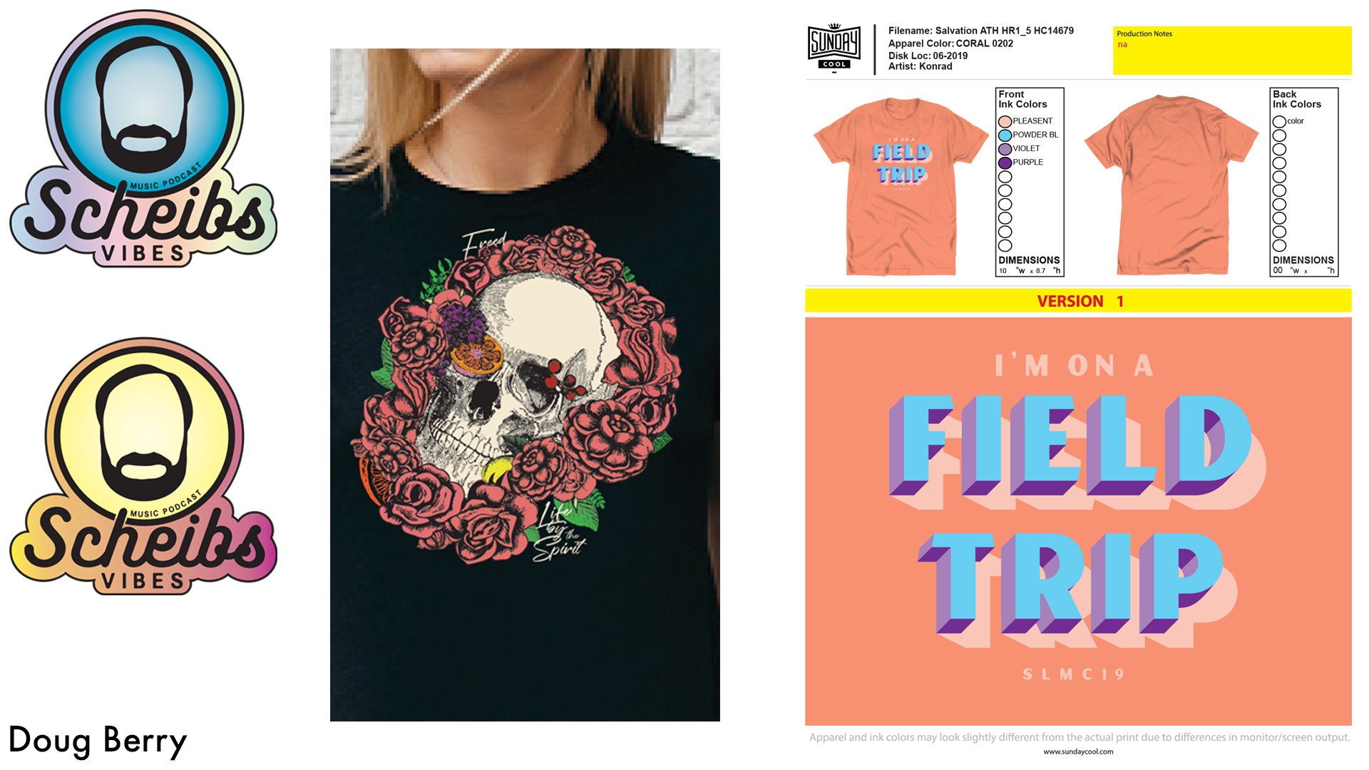
First up, I’m working on a piece for Raised by Rainbows Puppet Pals, a show curated by the very talented Luke Flowers to be shown virtually at Gallery 1988 this November. I am blown away by the caliber of other talented artists Luke has brought together for this, and I cannot wait to see what everyone brings to the table!

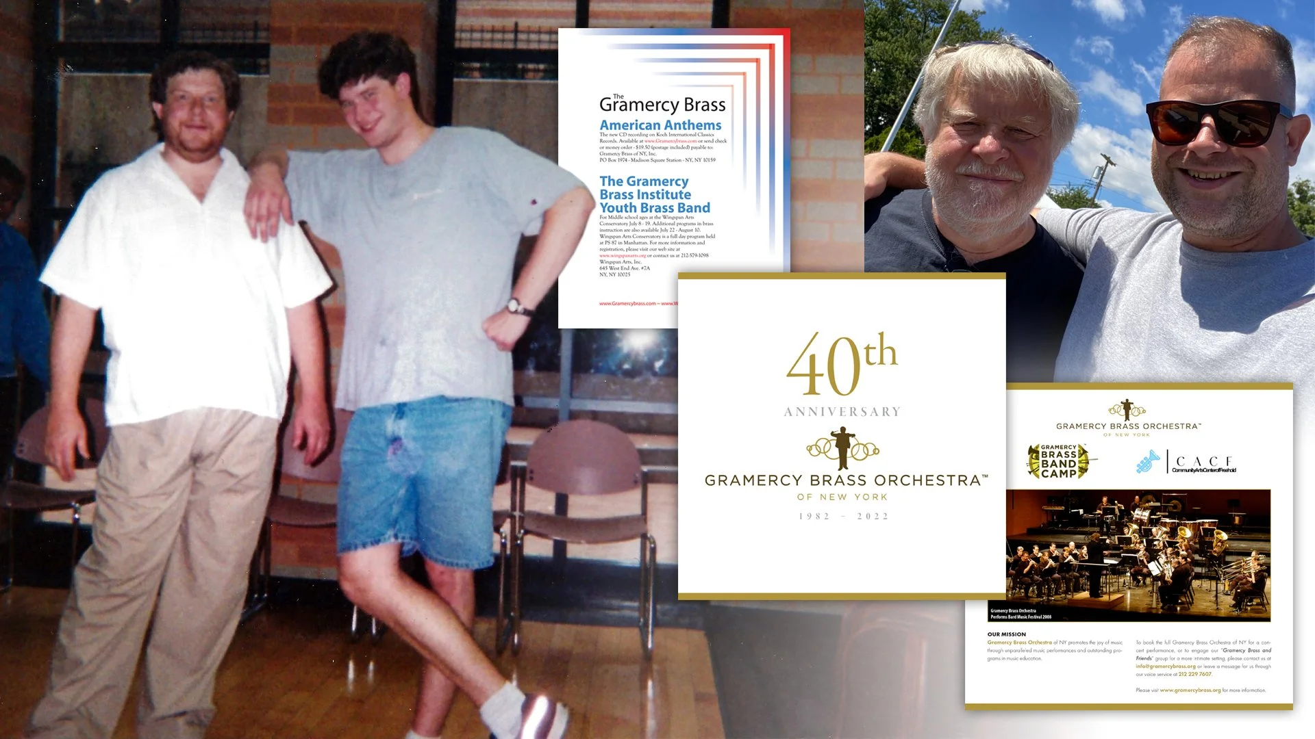
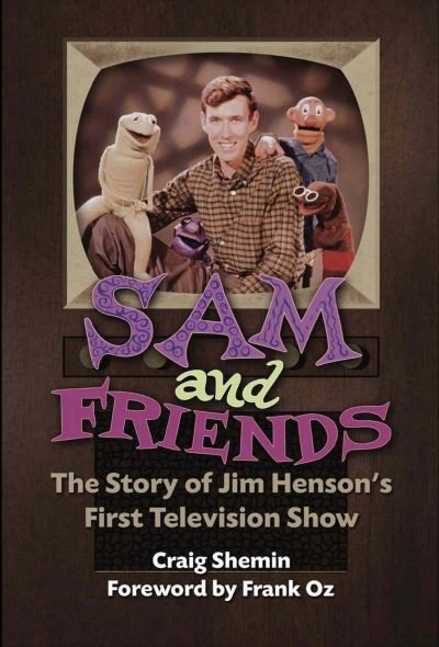
I’m also working on another project with Craig Shemin! It’s very exciting to get to be a part of another Henson related project and next year it should be available. I’d also like to take a minute to thank my brother–in–law and fellow monster puppet enthusiast Jerome Green for his help so far too.

Writing has become a bigger part of my personal life as well and I’m hoping to write a book! That’s the dream at least, but I only mention it now because hopefully soon I’ll be able to open up a bit more about it. In the meantime, I’m learning so much about how to properly do research, interview people, and (hopefully) become a better writer. It is most definitely a personal passion project and I hope that I can turn it into something for a more general audience.
This Blog
As I mentioned at the top of this post, coming up with articles that stay within the guardrails of graphic design, illustration, and inspiration create unique challenges while simultaneously providing a helpful road map of how to write. I am excited to let you know I’m currently interviewing an insanely talented artist that will hopefully be ready to post in the next couple weeks. I also have some fun ideas too. All of these posts should be coming out over the next few months and weeks.
That doesn’t mean I have tons of things planned to post, but I’m very curious if there are any topics you’d be interested in reading about. What about a tips and tricks article focusing on Procreate (the software I use to draw almost exclusively)? Are there any design trends you have strong feelings about? Step–by–step drawing guides? Are you a creative professional who’s interested in writing a guest article? Maybe you (or an artist you admire) would like to take part in an Artist Games back–and–forth like I’ve done with Will Carroll, Noah Ginex, or Justin Piatt?
I really would love to hear from you! So please comment below, or hit me up on Instagram, Twitter, TikTok, or Substack! You can also use the form submission page right here on my website to get in contact with me. Thanks again for stopping by!