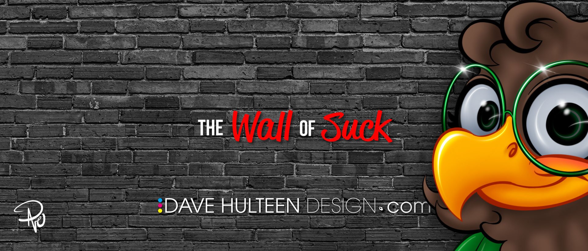
Man oh Manischewitz am I excited about today's post! This is one I've been putting together for a few years now and it is all inspired by my good friend and talented graphic designer & illustrator, Jamie Carroll (who is also available for hire and deserves the big bucks people!). Nearly a decade ago now, I interviewed Jamie for Muppet fan site ToughPigs about some of his work and he introduced me to his own home–brewed mood board he called the wall of suck. I know! I was just as intrigued as you are right now. Here's an excerpt from that interview explaining today's post's namesake:
Dave: ...What about the pieces that get completely rejected? Or even better, the ones you yourself scrap?
Jamie: That’s a good question. It’s an incredible privilege to be able to do this stuff. It’s also rather soul crushing when it doesn’t work out. It’s two sides of the same coin. We’re not supposed to admit that, but it stings. I assembled this thing that I refer to as the “wall of suck” in order to deal with the angst. I’m not saying the work sucks. A great deal of care goes into even the simplest pitch. The suck part is in reference to the time and effort. It seems wasted and I can’t really post the full pieces for public view. Those are the breaks. Still, it all needs to go somewhere so it goes to the wall. Projects get nixed for all sorts of reasons. Many of them can’t be predicted. The wall helps me keep a healthy perspective on all the silliness.
Artists often crow about the successes yet hide the many failures that lead up to them. I think all of it should be celebrated!
If you're in a creative field where you have to submit multiple concepts or have brought something nearly to completion if not finished and ready for the world to see it—only to have it completely go down the toilet for one reason or another—than the idea of an essentially failed trophy case for all the "Coulda' Shoulda' Woulda's" probably resonates with you too.
I have had countless concepts rejected that I knew with my whole heart were bangers, or projects that I worked on for hours, days, or weeks, that were scrapped and it can be so discouraging and frustrating when that happens. Most of them I'll never ever be able to show because of nondisclosure agreements (NDA's), or because I technically don't own the work. There are a few other nuanced reasons, but the work I'm writing about today doesn't fall into those categories! These are projects that I'm really proud of, and/or was super excited to develop further, but for one reason or another are now D.O.A.
10 Minute Portraits
I've written extensively about figure drawing and how much I have benefited from taking classes. For awhile, I was consumed with getting better and better with creating more realistic art using traditional mediums. I love soft charcoal on newsprint and was simultaneously discovering I had a knack for it too, so I decided to expand my abilities further. Figure drawing focuses on the body, but I was also interested in creating people's likeness in portraiture as well. So I had the idea of doing free portraits of my coworkers during lunch time. I would get the opportunity to study and draw multiple different models, get comfortable drawing in front of people, get an opportunity to talk with employees I normally wouldn't otherwise, and in turn my coworkers would get a free portrait drawing.
Figure drawing with Maria
I spoke to my boss about it and she gave me tips on how to present the idea to Human Resources. HR then had me write a full proposal on what, why, how, when, and where I planned to do this and how it would ultimately benefit the workplace. That proposal then went up to the building's advisory cabinet who set a trial period to test it out before evaluating further if it was something that could then be done regularly. I was so excited and worked really hard on the proposal. I did several more portraits of celebrities and created a poster to help sell the idea, and brother did it work! Everyone else was excited too, and it was eventually promoted as a trial period where for the next three weeks I would set up an easel and stool in our cafeteria with a small modesty wall to block my models from other coworkers, but put me on full display where anyone could come up and look over my shoulder and ask me questions.
On the premiere day, the front desk used the P.A. system to announce, "Dave Hulteen will be offering free portraits to anyone willing to sit and model for 10 minutes today at lunchtime in the cafeteria!" So cheesy, I know, but I was really proud that I managed to pull this together. That afternoon I did about 4 portraits and it went great! I got to meet new people, got some great feedback, and that feeling that this was going to be the start of something pretty great. I packed up, and left to go home for the weekend. It was Friday, March 6, 2020.
For those of you that need me to explain the punchline, this is right when the United States closed up shop for the Covid 19 Pandemic. My job shut the building down the following Monday, and while we all know how most everything played out, the opportunity to pick right back up kind of passed. Now yes, things are better again and I could resubmit my proposal and try again, but there are some interruptions that put ideas on hold indefinitely for various reasons, and for now, that's where this one will continue to chill.
Our backs are now against the wall? Listen all y'all, it's a sabotage
There are so many other concepts I want to show but can’t!
A common theme you may notice among each of these things is a sense of self–sabotage. I pride myself as a creative who doesn't take constructive criticism personally. "You don't like it? Well then neither do I. See? I'm a big boy!" I also pride myself on my passion and commitment to a project. "You like this direction? Well then I'm going to steer this thing all the way to the finish line and give you the best work you've ever had. See? I'm a big boy!" There are many times however when these two philosophies contradict themselves. That's self preservation lingo for, "Sometimes I can be a monumental pain in the @$s." For example, when I was given the opportunity to design the cover to one of our quarterly publications—something I was honored to even be asked to do—I took the direction of creating Wedha's Pop Art Portrait (WPAP) style to an overly scrutinous level, driving my poor boss crazy as I lectured him over the art form's intricacies that I was now an expert in and he was grossly out of his league to say otherwise. I was quick to admit he made the right call when he handed the work over to another artist. I'm still really pleased with my version, but it joins a growing collection of concepts I've created that were rejected at the time, but occasionally are retooled and resubmitted for other projects that are never quite the right fit for those either.
Coloring Book
Spoiler alert: this one goes the same way my 10 minute portraits did with coronavirus ruining everyone's capitalist dreams. But in a nutshell, I illustrated a coloring book that helps guide kids with how to visit the elderly in nursing homes—something that was absolutely taken off the table when the pandemic hit. What makes this one sting though is that I had nearly complete creative control. The original coloring book was created in 1989 by a brilliant Salvation Army officer who created a valuable resource for kids. The only issue with it was that she wasn't a great illustrator. So I was given carte blanche to recreate all the art however I wanted, and I jammed it with Easter eggs and references to 1980's pop culture, mixing in tributes to the Netflix original series Stranger Things and even nods to PAW Patrol (my daughter’s biggest fandom at the time) as well.
This is one that has the potential to make a come back though. I regularly check in with the client (who has changed over the years as departments continue to merge), and sometimes I get an encouraging update and other times my check in serves as a reminder for them to do do something about the coloring book.
School Mascot
Hoofa, I'd like to introduce this exhibit as the catalyst for this entire post.
I write about my daughter a lot on my blog. She is my world, so when her elementary school sent the call out for a community wide effort to design the school's new mascot, I saw multiple opportunities flash before my eyes. I have designed tons of characters for books, television, animation, puppets, brand identity, and even full bodied walk around costumes. So not only was this right up my alley, but I have dozens of contacts that could then develop my designs into physical media and even merchandising! After doing some quick research, I also learned that school mascots are a pretty limited subset of creatures; namely cubs. Do you have any idea how many school mascots across the country are cubs? Most are unisex creations, but when they're not, they almost always lean male. The sole direction of the mascot design challenge was to encourage kindness and my daughter is the poster child for being kind. After some rough sketches, I had the idea that my design would be an homage to my daughter and the best animalistic choice was an eaglet. "Fly high with the Evergreen Elementary Eaglet!" You guys, I went so hard on this.
I knew as I was working on every little thing that I was putting the cart in front of the horse, writing my own feel–good story of the decade that would appear on the front page of the local newspaper and this very blog. "Local Father Saves All of Humanity with School Mascot Competition That Resembles His Daughter." Oh my gosh you guys, I went way too hard on this.
I knew with every fiber of my being that I was getting way too involved and wrapped up in my presentation. I even sold myself as the professional illustrator to the principle who would work alongside the school to create clip art, promotional material, and provide possible vendors for merchandising opportunities. You guys... even my ego was begging me to step way off. I went so very hard on this.
Now I don't want to blame my friends and family for getting me so hyped, but they were all so supportive that I really wanted to exceed their expectations. In the end, I was actually really relieved when my design wasn't chosen. I was the overly excited dad you roll your eyes at during little league practice. Fortunately all that effort and exertion stayed within the walls of our home with my wife being the one who suffered the loss. I got her just as riled up as I was, so she took the rejection of the Evergreen Eaglet a lot harder than I did. That doesn't mean I'm not bummed out about it, but for the purposes of this post, my cute little eaglet now occupies the wall with a reminder not to overly invest oneself in similar future situations.
I have so many other pieces that belong on the wall of suck that I still can't show or talk about. Perhaps one day I'll do a follow up, but for now, I'd love to hear if you have your own wall of suck and what's on it? Follow me on Instagram and check back in a week here for a new post!


