My Story with Sam and Friends, Part III

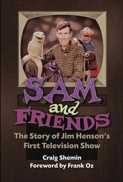
I was hired by Craig Shemin to work on promotional materials for his new book, Sam and Friends – The Story of Jim Henson’s First Television Show. Then he brought me on to fine tune the book’s cover. This week I’ll be talking about how it all ended up!

Right off the bat I need to be honest and tell you this post is rather self–serving as I will be gushing about how I got to be involved with some of the promotional events for the book, but I promise I’ll keep the arrogance level low… low–ish. Somewhat modest for sure. You know what? It will have nice pictures if you want to skip reading, deal?

Heading to the Museum of the Moving Image with my family, Sept. 24, 2022

I’ve written about my fan experiences and how the Museum of the Moving Image is kind of a mecca for Muppet fans, so when Craig asked if I would sign the Sam for President posters I created next to him at the book launch on Jim Henson’s birthday, I was ecstatic. For starters, being on the other side of the table was huge. Getting to have moments like meeting Bob McGrath, or chatting with other fans I only knew through Instagram or Twitter @’s was so much fun. I was also grateful to have my wife, daughter, sisters, and my parents all there as well.

Top left: Craig Shemin, bottom left: Stephanie D'Abruzzo, Heather Henson, top right: with Craig and Ryan Dillon, and meeting Bob McGrath

Top left to right: ToughPigs’ Shane Keating and Matthew Soberman, @gollygeemel and the beautiful Dr. Teeth key chain she gave me. Bottom Left to Right:Richard Gomez and the Snerf he built and gave me, Will Carroll, and finally Joe Hennes and Peter Savieri.

Two weeks later, I got to attend New York Comic Con and be on a panel with Craig, Muppet performer Ryan Dillon, and Henson Company Archivist Susie Tofte. Getting to chat with fans, fellow artists, and friends again tops finding any merchandise or rare treasure. It was a real blast and something I will never forget!

Please follow me on Instagram and Twitter and you should also totally buy Sam and Friends – The Story of Jim Henson’s First Television Show at Bear Manor Media in soft and hard cover.

My Story with Sam and Friends, Part I

I’ve been waiting to really break down a huge and wonderful experience I had and today is the day I finally (start to) talk about the work I did for Sam and Friends: The Story of Jim Henson’s First Television Show. There’s a lot to cover so let’s start with some basics. As I have written about numerous times, I’m a huge fan of Jim Henson and all his creative works. Jim has always been my leading creative influence starting when I was a toddler all the way through to today. When Jim was a kid himself, he was fascinated with television and broke onto the scene with a black and white puppet series in 1955 on WRC–TV in Washington, DC. Craig Shemin—who I’ll also talk a whole lot more about in a bit—took on the huge task of writing a book about this particular introductory foray into Jim’s career, and would eventually bring me on to this fantastic adventure. But let’s slow it down now and get into more detail.

Images from the MuppetWiki

Every true Muppet fan knows who Craig Shemin is, but to the lay person, he’s a massive contributor to preserving the memory and legacy of Jim Henson. At his core, Craig is a writer who has written for television shows like The Wubbulous World of Dr. Seuss, Telling Stories with Tomie dePaola, Donna's Day, and Dog City. He's also written short stories, video game scripts, press interviews & appearances, text for licensed products, concert scripts, and liner notes. He's also hosted live events, screenings, & panels and prepared additional video content for such things. He has a ton of other credits like director, curator, and consultant as well as his current title of president of The Jim Henson Legacy. To say he is incredibly talented is putting it mildly, but he's also genuinely a wonderful person.

Sam and Friends saw the birth of a lot of what would be in store for Jim Henson's future including the unique and newly innovated techniques in puppetry for what would become the Muppets as we know them today. Chief amongst those Muppets would be Kermit the Frog who was only vaguely amphibian at the time. Jim Henson's complete creative collective would be splintered after his untimely death in 1990 with Kermit and his friends from The Muppet Show eventually being purchased by The Walt Disney Company, Sesame Street transitioning full ownership to Sesame Workshop, and things like Fraggle Rock, Labyrinth, and The Dark Crystal remaining with the Henson Company. Sam and Friends would become known as a "frozen property" essentially meaning that nothing new can be developed with the characters. I'll expand on that later, but ultimately this is a long and convoluted way of saying that if you really want to know more about Sam and Friends, then you should absolutely buy the book.

So now we come to late April of this year when Craig reached out to me asking if I'd be interested in creating promotional materials for the book. There were a few things I was really excited about for this, but the main draw was that I was being hired to create printed materials that would look like Jim Henson had created them himself. This was huge and I was stoked and honored. Initially I had to create four pieces: a bookplate that Craig could sign at publicity events, a campaign poster that was inspired by a 1960 sketch where Sam ran for president, a sticker, and a bookmark.

Professor Madcliffe's Bookmark

Of all of these, the bookmark was the most ambitious. Professor Madcliffe's Manual Marking Machine for Books would be completely illustrated save for the character himself whom I meticulously but lovingly masked from a 1959 photograph. This was where I set some guidelines for myself from here on out. Because I was drawing every other element aside from the professor, I wanted this particular piece to look like it was actual set design that would have been painted on wood or cardboard much like Jim had done for the actual show. As a result, the pieces that would be further set deeper in the background would be out of focus slightly on camera, so layering everything in Photoshop not only allowed me to move everything freely and easier, but the depth of field was changed as well. A subtle film grain was also added.

I need to quickly add something here that I neglected to before. While Craig was the gatekeeper on what I did, everything had to then be approved by The Jim Henson Company. For the most part that meant just making sure nothing from the show was being used without proper permission from the lawyers, but it also had to meet merit as to how it looked comparatively to what Jim was doing back in the late 50s and early 60s. I've talked about how a committee can complicate this process sometimes but also how scrutinous it can be. Higher–ups tend to need very good visual representation, so early on I was advised to have more fully fleshed out illustrations as opposed to sketches. Again, I've walked down this road thousands of times, so this wasn't a huge ask. Some of the notes that came back though made me tighten up where I found my creative direction.

All the props I created for the bookmark including the rejected ones!

For example, while I used a fantastic (and now out of print) book called Imagination Illustrated by Head Archivist for The Jim Henson Company, Karen Falk for reference, I quickly realized there wasn't quite enough material to re–create Jim's aesthetic without directly plagiarizing it. I found most of my design inspiration from the classic Rocky and Bullwinkle Show. The mid century style was fun to create and a style I've enjoyed emulating for quite some time now.

Imagination Illustrated by Karen Falk and screenshots I took from Rocky & Bullwinkle

One of the notes that came back that I appreciated was the push to stray away from things like mechanical gloved hands and wooden signs as they were too reminiscent of the Looney Tunes, whereas Jim used more ornate and flowing designs as opposed to Warner Bros. more industrial style props. I did try and hide a few Easter eggs though. Here they are:

  • Professor Madcliffe's "Mirth–Meter" was changed from "Smiles per Second" to "Smiles per Page"

  • The wooden board is taken from a sketch where Chicken Liver plays a sheriff from the old west

  • A Wilkins Coffee cup (a main commercial entity who sponsored a lot of Jim's work) is obscured just enough to the left of Professor Madcliffe

  • The television EKG monitor, tape reals, machine with bulbs on it, and the odd phone looking device are all illustrations of things found from various Madcliffe sketches

  • The pickle jar is a reference to the campaign sketch from the Sam for President poster where the character Moldy Hay discovers there's no surplus of pickles

  • The red phone is my own tribute to the Muppet Newsman from The Muppet Show

  • The intricate round mirror on the back is a recreation of the frame used for their sponsor Esskay Meats

However, the best Easter eggs are the ones Craig created when I requested to label the dials, knobs, switches, and screens (much like Jim did on the show). Almost all of them are obscured, but he wrote so many great ones and then wrote more!

Paper Thickness
Ink Opacity
Avg. Read Speed (WPM)
Page Turn Count
Between the Lines Content
Font Definition
Binding Integrity
Indexing Index
Recycled paper content
Subtext Comprehension
Page Density
Chapter Adapter
Margin Marginalization
Hinge Protector
Colophonograph
Gutter Guard
Comprehension Override
Pulp Friction
Kerning Kompensation
Print Offset Offset
Paper Strength
Appendix Inflammation
Little to Big Word Ratio

Sam for President

The campaign poster seemed like it should be more straightforward and easy, but other campaign posters of the time were relatively bland. In 1960, the notable comparison was that of Kennedy and Nixon. To a modern audience though, it was important that Sam's poster looked nothing like favoring one political party over the other. I had varying degrees of making the poster look aged 60+ years, but the main goal was to reproduce (at least in aesthetic) how it would have looked printed from a 1950s press so I leaned heavily on exploiting its color halftone look.

I didn't realize it at the time, but just creating the "Sam for President" text (to match the Sam and Friends title card) would play a huge role later when I would design the cover, but I'll get more into that next week.

ToughPigs.com editor–in–chief and co–owner Joe Hennes and designer/illustrator extraordinaire Jamie Carroll (who frequently consults on classic Muppet character design for toy companies) became integral to me for notes and critiques. I relied heavily on their input to make sure everything I created here on out looked and felt authentic. When I say none of this stuff was created in a bubble, I genuinely mean it.

Sticker & Bookplate

The last two promotional pieces were the sticker and bookplate. As I mentioned before, Karen Falk's Imagination Illustrated was very helpful, particularly for these two pieces, especially because they really relied heavily on Jim's fanciful and fun, yet intricate border designs. Craig was insistent on having my art credit listed on all of these things primarily so no one thought Jim actually created them. This was one of the most appealing things for me because not only did I share legit credit with my hero, but a few people missed it and thought they actually were drawn by Jim.

Aside from a few non–specific looking creatures that may or may not evoke certain classic characters from all the Muppets, the only true Easter egg was my daughter's (and coincidentally, Craig's grandmother's) name in the first draft of the sticker's border that ultimately was removed.

Ironically, none of this is what I would be known for once the book's official release date was announced and I was then credited as the cover artist! But that's another story for part 2! Tune in next week when I discuss getting the honor to be a much bigger part of the history for Sam and Friends! In the meantime, follow me on Instagram and Twitter and you should also buy the book at Bear Manor Media in soft and hard cover.

Part 2

Part 3

[Nearly] Every Instance of Kermit the Frog I've Ever Drawn [More Or Less... I Think]

Confession: This week’s blog was supposed to be a tribute to vintage advertising art, but that fell through and I was hard pressed to scrape through my ideas list which had little to nothing I could just slap together. The problem then became, “What the heck do I write about?!” The answer came when I realized this past week was Kermit the Frog’s 67th birthday. Not exactly a milestone year, but then @StarmansArt Tweeted this incredibly sweet shout–out.

Thanks, Richard!

I am a huge Muppet fan, and Kermit is my personal patron saint of sanity and my true north example when it comes to good leadership. Plus, I get a significant and disproportionate amount of likes when I post Muppet stuff so I thought I’d try and see how much Kermit the Frog art I’ve done that I can find. Let’s do this!

Now I drew Kermit a lot as a child, like a lot. Unfortunately I can’t seem to find anything before the 90s, so we’re starting there. Kermit appeared more in tribute rather than in focal portraiture back then because you didn’t get a lot of girls phone numbers like that. Lesson learned though: everybody digs the frog.

Top left: Kermit (and Robin—not that Robin) drawn with a mouse in Microsoft Paint, circa 1995. Bottom left: My Commercial Art semester final illustration in graphite, 1996. Right: Kermit makes a cameo in front of Wayne & Garth whilst I pretend to take notes in Community College, 1997.

2000–2008

Oofa, okay, please understand that every illustrator likes to experiment, especially when they are learning Photoshop for the first time and fresh from graduating. I was an avid member on the Muppet Central forums way back in the early aughts and was anxious to share some fan art. I was having a bit of an identity crisis as a Muppet fan and wanted to stand out so I drew a lot of weird shit. I’m sorry to curse, but you can see for yourself, even I didn’t know what I was trying to pull off.

I was huge into Anime and wanted to desperately mash that with the Muppets. The kawaii Kermit front and center was the pinnacle of those efforts. I was so darn proud of him (I still am now that I think of it). It was the halcyon days of online interactivity, Photoshop held no serious or practical value, and i can has cheezburger was a staple of daily life.

Keeping with the Anime vibe, I pushed hard on this idea. 2008

2009–2012

Commissioned work from Joe’s wife, Sarah.

It was around this time I actually started to try and learn how to properly use the tools I had at my disposal to create art that was actually, you know; good. Adobe Illustrator was fast becoming a tool that I relied on heavily, but it also was a time that I got to know a very amazing human being by the name of Joe Hennes; Co–owner and editor at ToughPigs.com. Joe was instrumental in not only getting me online exposure (something I am eternally grateful for and remind him of regularly) but also to actually draw, you know; good.

Despite being over a decade old, The Immaculate Jim, 2010 remains one of my favorite pieces of fan art I’ve ever done.

In 2012, my wife and I went on a cruise. She said to me, “I want this vacation to be really romantic!” so I drew several cards that I gave to her each night. This was one of them (and my favorite). See? Ladies totally dig the frog.

The Muppet Madness Tournament kicked off in 2010 and it was a huge collaborative effort between myself, Joe Hennes, Ryan Roe, Steve Swanson, and Ryan Dosier. It also got decent press online, so understanding my work would be seen by a ton of people, I brought my A game to the table.

It was during this time I started using the full capacity of the Adobe Creative Suite to push my illustrative work further. Kermit was the natural guinea pig to test different techniques on.

Some of the attention the tournament got.

2013–2014

It was during this point in time that I was starting to get noticed. I don’t mean popular because that still hasn’t happened. I mean that actual Muppet people and Muppet adjacent people would make my acquaintance. It was an exciting time, and I was fully immersed in the fandom as I never had been before. The Muppets—I mean the actual people involved with the Muppets—started to know who I was, and I was getting opportunities to know them too.

Transitioning back to working almost exclusively in Illustrator again, I began keeping a consistent color palette for all the Muppets.

I always had a full bin of ideas, but many of them never made it to fruition. One day I plan to finish a tribute to Dan Jurgens Superman the Man of Steel # 37 (DC, 1994) Zero Hour comic cover.

One hundred thousand years ago in 2013, there was a very brief moment in time where an app called Draw Something rivaled the popularity of even Wordle today. I used every opportunity I had to draw the Muppets.

2015

In 2015, I began to steer more towards drawing Kermit my own way rather than on model. Now that didn’t necessarily set a precedent from there on out, but it marked a moment where I considered my fandom and my relationship with it completely my own. In many ways, I had arrived… Exactly where? I can’t say but it smelled a lot nicer and people stopped trying to trip me when I went to the mall.

At this point, I was also creating all Muppet art with the express purpose of showcasing it on ToughPigs.

The most exciting thing about 2015 was being commissioned by Bill Barretta to create individual pieces as gifts for the cast of The Muppets ABC television series. I’ve never ever shared any of those pieces until now. This was done for Steve Whitmire.

2016–2018

At this point I learned that drawing Kermit was becoming gratuitous. I knew if I posted an illustration of him, I’d get attention, so admittedly I was throwing stuff at the wall just to see what would stick.

The bottom right illustration was a thank you gift to Mike Quinn, the performer of Nien Nunb from Star Wars and Kermit’s regular “right hander.”

2019–Present

When I draw Kermit nowadays, it’s usually a therapeutic exercise. Drawing him off model or otherworldly is the next evolutionary step most of the time. My friend and fellow Muppet cupcake enthusiast Zach Woliner commissioned me to do a bunch of Kermits as various pop culture movie iterations for his KermDubs YouTube channel.

Muptober eventually replaced Inktober for me.

If this makes you uncomfortable, then I accomplished what I was setting out to do!

So that’s every Kermit I’ve drawn… that I could find… and “slap together a blog post” that effectively took 12 hours to create. If you want to see more illustrations of Kermit, please follow me on Instagram and Twitter and stay tuned to this blog!

You can’t get a better model than this. 2016

Also, a big thank you to Richard for inspiring this post and being so kind. I’m more than twice his age and I’d wager he’s already drawn Kermit more than I have!