Inspiration: Volk Clip Art

It’s 1995, and a teenage me (Hi! I’m Dave!) is up against the proverbial wall as my senior year of high school begins and I have absolutely no idea what the future holds for me. I have zero direction or ambition to know where I’ll go to further my education (if at all), I’m not even sure what I want to do in a best case scenario, and the bad news is there isn’t a best case scenario anyway because I may not even have enough credits to graduate with the rest of my class. My dad is getting frustrated because all I ever say that I want to do is draw, but how that translates into any kind of career is spectacularly vague and naive at best. Seemingly moments before the first day of school even starts, I’m enrolled in Monmouth County, New Jersey’s stellar vocational education program at the zero hour where my father finds a commercial art class which will give me a far better chance at achieving the necessary math and science credits I’ll need to get a high school diploma. The vocation curriculum is technically two years, meaning I’ll only complete the first and my fellow classmates will all be juniors, but there’s no time to split hairs. As far as Dad, the state of New Jersey, and any future higher education prospects are concerned, the name of the game is to simply graduate Neptune High School with a modest GPA.

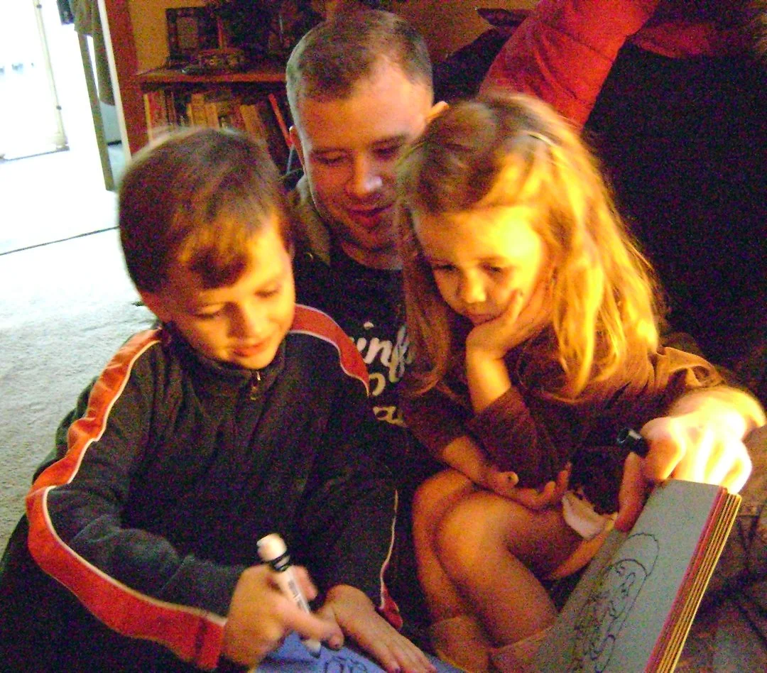
Me and my fellow MCV classmates, 1996

If you know me or have read any other blog post here, you know that it all worked out. But I’m not actually writing about my time with the Monmouth County Vocational Commercial Art School in Aberdeen, nor how that class arguably saved my future career, how I made some great friends, or how we all relentlessly tortured our teacher Ms. Camp (I’m so sorry for all those headaches Ms. Camp! We all genuinely love you!), but rather how I discovered an art form that continues to inspire me to this day, the world of Volk Clip Art.

First let’s take a quick crash course through the history of what clip art actually is. As I mentioned when I wrote about stock image sites, designers are busy people, and may not always have the time or ability or money to cultivate graphics and images for their projects, so they turn to other methods by relying on pre–made works with varying licensing managements. Clip art specifically covers illustrated pieces for publishing products that offer a huge variety of content and illustrative styles. The term clip art comes from physically cutting images from printed works and pasting them into new publishing projects with type and/or other graphics. This would be done by a layout artist, mechanical artist, or production artist on a printing press back in the day. Thanks to desktop publishing though, we’ve condensed all that down to the noble graphic designer.

Now there’s a lot more to cover, but for brevity’s sake we’re just going to hit some bullet points here. Many publications and smaller businesses didn’t have the budget to hire illustrators, so clip art became a mainstay for consumption. I’m going to briefly skip over the main course of today’s post for a minute here, but eventually the ink–based, comic book style of clip art that I’m referencing today became dated, but not useless. So sometime in the 1970s, those higher quality, older designed and stylized clip art made it’s way into trade paperback books for the masses. At that point, all you needed was a collection of (mostly) public domain illustrations and a Xerox machine, and now anyone could create relatively high quality designs. Flash forward to today, and you can very easily get your hands on quality, royalty free clip art from a variety of online locations for dirt cheap or even free. In fact, a lot of those cool, vintage illustrations that we’ll be talking about in a second are even archived on sites like Flickr!

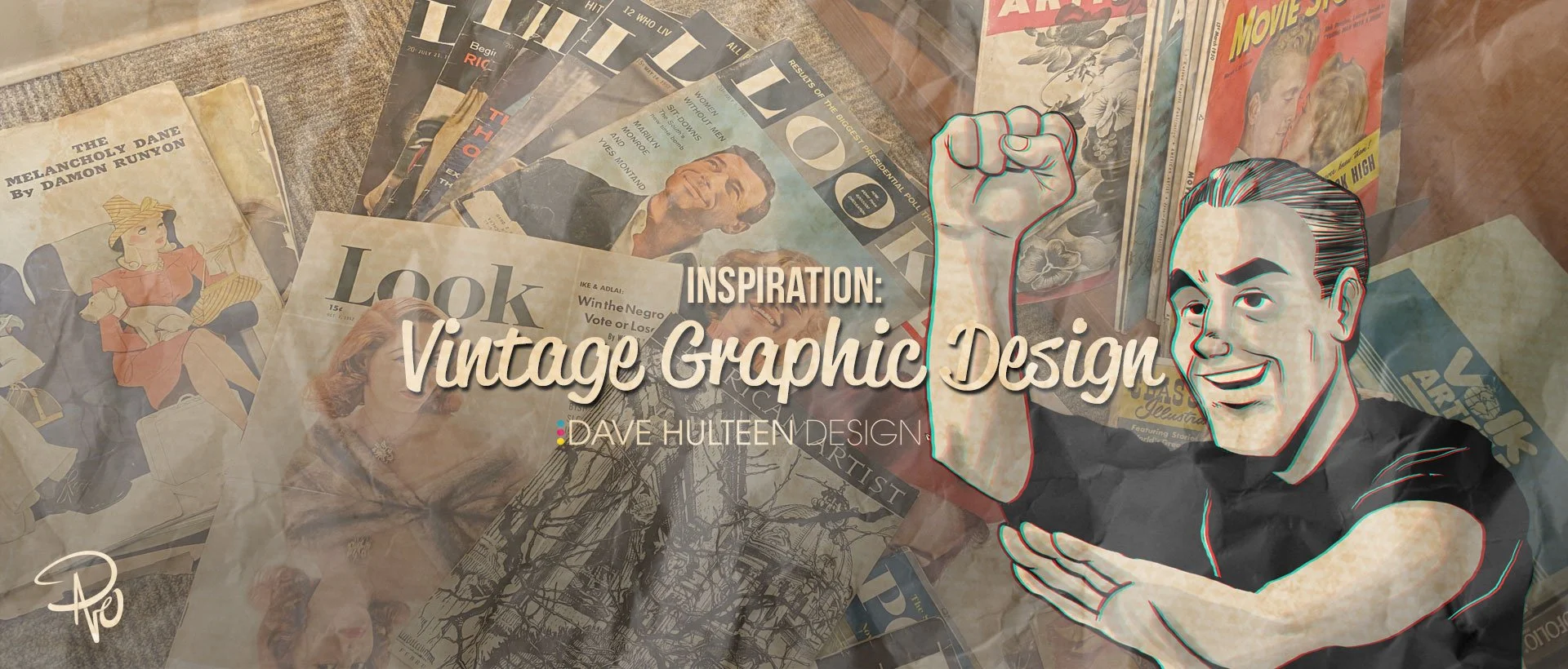
Back to 1995 and a young and green Dave is confronted with a fantastic collection of clip art and unlimited Xerox privileges. It’s at this point where we finally get to the meat of this post and the very specific art house that was arguably the titan of clip art: Volk. I’ve mentioned a few times before that even if you’ve never heard of a certain so–and–so, their work probably crossed your path. Unless you’ve been living under a rock and outside of the United States (and even then there’s an excellent chance), you have most definitely seen something from a Volk catalog. Ironically located just 84 miles south from my former vocational school, Harry Volk, Jr.—a former journalist—opened his art studio in Pleasantville, New Jersey in the mid 1950s that pumped out high quality, copyright free, clip art in saddle stitched paper booklets. These collections were organized into various themes that covered absolutely everything from popular holidays, space exploration, school activities, sales gimmicks, various occupations, elections, travel, and practically everything in between. Each booklet would cost just a few dollars and would be packed with fantastic, high quality illustrations that simultaneously reflected American values and societal changes surrounding race & gender, all at the same time somehow maintaining a specific but generic look.

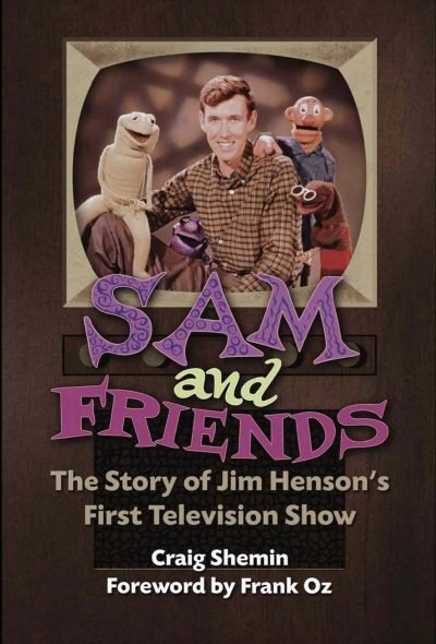
The superstar of Volk was a man named Tom Sawyer. Yes, I know, but trust me, his name is the least intriguing thing about him. Thomas B. Sawyer’s work for Volk was ubiquitous, seen internationally in magazines, newspapers, pamphlets, sign boards, and on television. Mr. Sawyer isn’t just a top notch illustrator though. He’s a best selling novelist, author, screenwriter, playwright, producer, and story editor; but his biggest claim to fame was as the head writer and show runner for the classic CBS series Murder, She Wrote starring Angela Lansbury. I reached out to Mr. Sawyer for an interview seeing as his book, The Adventures of the Real Tom Sawyer shares the same publisher (Bear Mountain Media) as Sam and Friends – The Story of Jim Henson’s First Television Show by Craig Shemin, but I never heard back from him.

But Tom Sawyer was just one of the illustrators working for Volk. The vast collections of notable mid–century style drawings from Volk’s studio are exceptional. The weird thing is how little information there is anywhere about those other illustrators or even Harry Volk, Jr. himself! Seriously, there is almost nothing about him, his studio, or its employees other than Thomas Sawyer online. This blog post will hopefully garner him a few more fans. Perhaps one day I’ll even make the pilgrimage to his old studio!

Roughly a decade or so ago, I was helping a client/friend/coworker of mine who was working as the head preservationist, curator, and director of The Salvation Army’s Eastern Territory Heritage Museum when she presented me with a huge collection of Volk clip art, not only well preserved, but still in its plastic organizing case—an even rarer find than the art contained within! Opening that case (even still) is like a time machine, not only transporting me back to the essence of 1950s & 60s design, but even more specifically to Ms. Camp’s Commercial Art class to a host of Gen X teenagers irresponsibly taking advantage of the school’s copy machine and trying to get high off sniffing Krylon far away from the designated ventilation booth. Initially, that institutional green colored box was bound for the trash, but she gave it to me (a million thank you’s again, Kathy!).

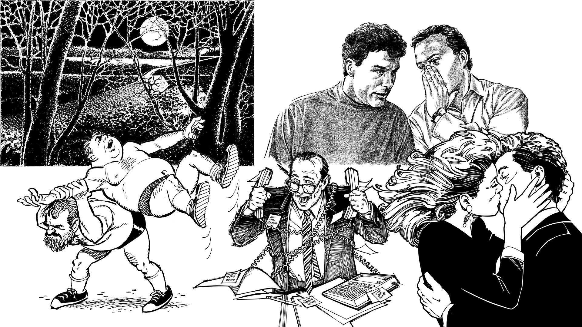
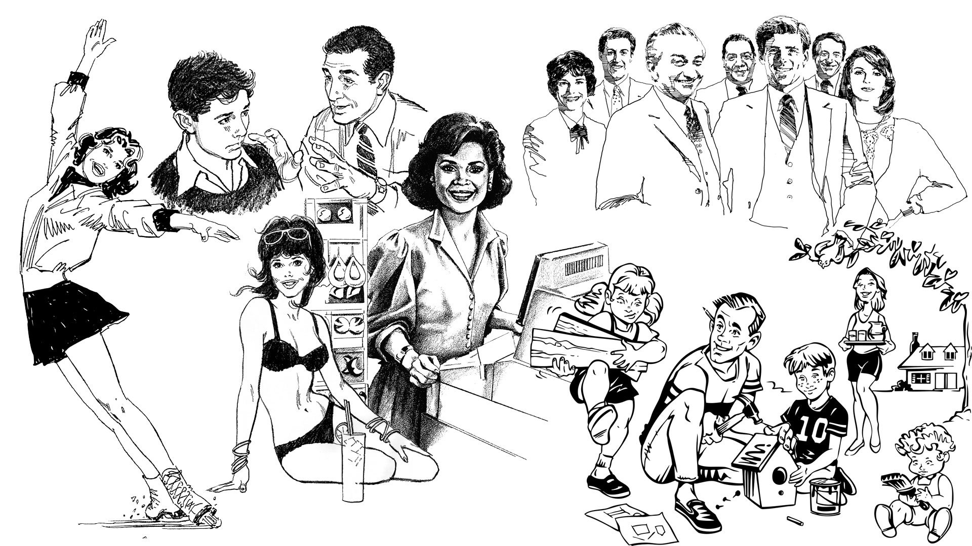
Most of my collection is from the 70s through 90s

Ironically, this tale shares a much bigger, real world counterpart to publicly available clip art from Volk and other studios as well. A New York Times employee named Bart Solenthaler who worked in the advertising department was tasked with throwing away a massive collection of clip art, but instead took the time to scan and upload it to Flickr! You should absolutely check that collection out here.

Did you ever use clip art from Volk? All the images in this post are from my personal collection which are primarily from catalogs from the 80s and 90s, so they don’t reflect that cool mid–century style I’ve been talking about. However, you can find even more classic Volk clip art here. If you’d like to learn a little more detail about this type of clip art, check out my sources by visiting this article on Tedium and this one on Fast Company. For more vintage design inspiration, check out this article I wrote about my classic magazine collection.

Follow me on Instagram and Twitter and check back here on Fridays for more creative thinking and inspiration!

Professional Illustrator

My daughter just turned six and is the most wonderful part of my life. She’s at that amazing age where she’s aware there is a bigger world that exists beyond our neighborhood, but still young enough that her imagination is foundational to that worldview. Case in point, if you were to ask her the most trite and stifling question that all adults ask every child without a hint of comprehension, “What do you want to be when you grow up?” she won’t hesitate to reply, “A princess rock star singer with one hundred kitties living with me in my castle” and hell yes, by the grace of God I want that for her more than she does. Deep down, we all know what a mean–spirited question that is even if we don’t intend for it to be so. “Hey small person who is completely uninformed and currently uncaring about the real world… when you’re neurotic and old like the rest of us, how would you choose to pass the majority of your day so that you have enough money to then retreat to a place where you can contemplate that choice?

When I was six and some dumb adult asked me what I wanted to do when I grew up, I thought to myself, “Well, I have a puppy, I love that puppy, I would very much like to be around more puppies, so a veterinarian seems like a solid way to make that dream happen.” Forget the fact that I am squeamish around blood, do not care to clean up after my own puppy, and have less than a zero interest in medicine, treatment, or healthcare in any form; that two–faced laugh from the dumb adult that just heard that response from me sounds more condescending than quaint, so for that reason alone they can take a long walk off a short pier.

The old adage, “Do something you love and you’ll never work a day in your life” however, is equally threadbare. Now I realize this is all taking a pessimistic tone, but it’s crucial for today’s post which centers around the fact that I am a professional illustrator. I won’t lie, it feels really really good to say that. I am in fact a professional illustrator who gets paid to draw as my full–time job. The irony is that the link from that “I love puppies so I want to be a vet” ideology isn’t a far–fetched detraction from when I was a kid to now as an adult. As I got a little older, I realized the second part of the question, “What do you want to be when you grow up?” Isn’t just tangential to what you want to do, but what you can do. I thought I was decent at drawing so maybe that could play into a full–time job, but in all honesty, the older I got, the more I didn’t know what type of “job” those skill sets could accommodate. But I’m not going to bore you with that trajectory. Let’s just all get on board with the fact that I got to where I am, and today I’m going to explain the pros and cons of that.

Side note: I am hereby dedicating this entire post to my mother. The inside family joke is that one time I was very proud to show her a huge project that I had completed to which she enthusiastically said, “Wow! It almost looks professional!” Granted I had been an actual professional for over a decade by that time, but sure, “almost professional” is better than, “It sucks” I guess. I love you, mom.

As I mentioned a few weeks ago, I have been feeling the lack of a desire to draw on my free time because I’ve been doing so much of it on my paid time. I’m doing what I love, but arguably I’m doing it for other people, so I thought I’d talk about the pros and cons of what that is like. And seeing as we’re already out the gate with the negative, let’s keep that pessimistic vibe going and start with the cons of being a professional illustrator.

The Cons of Being a Professional Illustrator

Real quick, all of this is me venting and not meant to discourage anyone from pursuing their dreams or goals, whether they be an illustrator, veterinarian, or rock star singing princess. Case in point, the first con of being an illustrator?

Little Wooden Drawing Mannequins

Figure drawing is arguably a key skill set to have and it absolutely raises any illustrator’s game tremendously. The human figure is by far the most illustrated subject world wide. Sometimes it’s not possible to have an actual human model on demand and available to pose exactly how you’d like (and most friends and family won’t be keen to do this in the nude either as is traditionally expected). You can try Googling a pose that’s close to what you need, but even in today’s limitless selection of online images, you’ll never get exactly what you’re looking for. So what’s the the next traditionally available substitute? Androgynous No–Face McSlipper–Hands over here, that’s who.

A standard wooden mannequin, my snazzier wooden mannequin (who was also a mascot from my original website), and the interface of my poser app

The wooden drawing mannequin is as ubiquitous a traditional art tool as a nib pen. They practically give them away with certain drafting supplies at craft stores, but if you’ve ever used one, you know how fallible they are. They don’t hold a pose quite as dynamically as you’d like, they have no defining qualities like muscle or fat, they are completely featureless, and you just know that if they were real, they’d just bore you with bland trivia and complain about the lighting in your studio. If Pinocchio were initially a wooden drawing mannequin come to life, the Blue Fairy would urge Jiminy Cricket to immediately escort him to the fireplace. Yes, they make other, more dynamic mannequins but who cares? Incidentally, I use a poser app instead myself.

You Rarely Draw Cool Stuff

Yes, it’s a thrill to be a published illustrator and having the chance to work on a project that has (or soon will have) a huge following, but when you are an illustrator for any number of blanket projects, you’re not first in line to draw cowboys riding dinosaurs fighting ninjas. It comes up occasionally, but usually it’s things like a graphic to accompany an article about mental health, a helpful hand sign pointing the way to services for mental health, or a cartoon cat who is seeking guidance with their mental health. Yes you’re drawing, but you constantly wonder if it’s having an impact on your own mental health.

Draw Worser

This is an odd one, but you’d be surprised how often I receive the direction to “draw poorly.” I’ve worked on several projects where my work was criticized for being “too refined” or “too professional.” Sometimes it’s because the style of the illustration is supposed to look fast and loose like something from a tourist trap map. Sometimes the art is intended to look like a child drew it which always seems to translate more to “draw like someone who has just suffered severe head trauma and rather than go to the hospital has opted to sketch their family having a sad dinner.” I get the idea of what the client wants, but “drawing like a child” should never mean, “Draw like a wild animal is violently slashing a crayon around in its mouth.” There’s cute, there’s bad, and there’s subjective. Besides, why would someone who can’t draw, direct someone who can? Incidentally if you’re wondering, this assignment usually comes to talented artists because you actually have to be able to draw pretty good to effectively draw pretty bad. It should be a weird breath of fresh air to get notes back that insist that you’re drawing too well and it should be crappier, but I can assure you that it is not.

Unseen Work

The most frustrating aspect of being a professional illustrator is how much work never sees the light of day. There are drafts upon drafts upon drafts that nobody cares about of course, but I’ve done so many fully rendered (or at least nearly fully rendered) illustrations that never saw print or publication for hundreds of reasons. Sometimes the client changes their mind, sometimes deadlines quash the concept, sometimes you’re working with other illustrators and they manage to get the job done to greater satisfaction before you can, sometimes the project is just cancelled, and sometimes you just can’t show anything because of the professional illustrator’s thorn–in–their–side: the NDA. It’s all part of the job and there’s nothing that can be done.

Occasionally something may get resurrected way down the line, but by then, you the illustrator are no longer happy with the initial work and decide to start over. If you’ve ever checked out a book that features a lot of concept art for a project, you should know you are looking at an incredibly tiny fraction of the total work done. That’s just the stuff the publisher wanted (or rather allowed) you to see and it’s usually so they can claim ownership of those unused ideas as well. No artist just draws one picture for a job and that’s all there is. Whether it’s dozens of concept sketches or previous versions that needed further contemplation, every illustrator could literally fill a book with the work that has never nor will ever be seen.

My mom thinks I’m cool

The Pros of Being a Professional Illustrator

Okay, enough Debbie Downer talk, let’s chat about what’s great about being a professional illustrator! Being able to draw is one of those cool parlor tricks everyone wishes for; like sitting down and playing piano at a party, or randomly speaking a foreign language when a distressed stranger needs you to help solve an international crime, or juggling for everyone waiting at the doctor’s office before an invigorating colonoscopy. “You draw for a living?” A bright–eyed little boy marvels as you doodle a helpful sign pointing the way to services for mental health. “I do!” You reply knowing there’s now someone on earth who will briefly see you the way you’ve always dreamed of being seen.

Kids Are Impressed

Being a professional illustrator always catches kids off guard when they find out what I do. I am not exaggerating when I say literally every single child who has ever stumbled upon me drawing always, always asks, “Are you an art teacher?” This question comes to me so often that it depresses me to my core. Not because I think “art teacher” is a bad job (quite the opposite in fact, I think art teachers are the greatest and most inspirational humans on the planet), but because that’s the real world extent kids think an illustrator can do. Illustrators typically aren’t billionaires who like to eat trail mix before paying for it whilst browsing the dollar section at Target such as myself, but there are so many other opportunities other than just functionally rolling out other talented teachers. This is what expectations are though when schools eliminate the arts and music; you force kids to think there’s no other place for them.

But that’s all to say when they find out there are other options, they start to think (and dream) beyond their initial expectations in regards to their own future. That’s right boys and girls, this middle–aged, dollar section bargain hunter can be you. You’re welcome.

Work Pays For Stuff!

If you’re a freelance artist this does not directly apply to you, in fact this may be a con for you, but as an in–house illustrator, my job pays for all my supplies! Adobe CC? Work covers the subscription. My 22” Cintiq HDT? Work. New nibs for the Apple Pencil my job provided me? You guessed it, work! Because I draw professionally, all these toys and tools may not belong to me personally, but I get to use them that way. If you’re a freelancer, you can claim that stuff on your taxes I suppose. Freelance artists will create their pros and cons lists differently I imagine.

I Don’t Know How To Label This Next Part

Nowadays I do 99% of my illustrative work on an iPad Pro which means I get to stretch out on the couch while Netflix drones on in the background. That’s it. That is definitely a pro.

I’m sure there’s a fourth thing to tip the balance in favor of the pros, but honestly if you’ve read this far, let’s call it even and we can all go home early.

A letter from my grade school art teacher after I had reached out to him

I want to take one last opportunity here to mention my love of school art teachers with two short examples. My grade school art teacher Mr Megill was the first person who really encouraged me to see art as an extension of myself. He got me excited to try new techniques and I know all my classmates felt the same. He is one of those educators you think of when you hear about those special teachers who keep the world turning. Mr Megill is a super human and I adore him. The other is my daughter’s art teacher. One day, she came home from school and told me, “Daddy, Mr. Fourre is a way better artist than you! He’s amazing!” You think that would have knocked me down a few pegs but I was so thrilled to hear that. Kids need real world heroes other than their parents and the idea that she sees her art teacher as superior to me absolutely filled me with so much joy. Effectively, she separated me from something she admires more in someone else and man am I so proud of that. Granted, it meant the cat illo I was working on looked too refined and happy for the mental health guidance they were seeking, but I intend to watch season 5 of The Crown while I make those changes anyway.

Thank you so much for stopping by! Follow me on Instagram and Twitter for more reverse mermaids, Muppets, and whatever else I normally push.

My Story with Sam and Friends, Part I

I’ve been waiting to really break down a huge and wonderful experience I had and today is the day I finally (start to) talk about the work I did for Sam and Friends: The Story of Jim Henson’s First Television Show. There’s a lot to cover so let’s start with some basics. As I have written about numerous times, I’m a huge fan of Jim Henson and all his creative works. Jim has always been my leading creative influence starting when I was a toddler all the way through to today. When Jim was a kid himself, he was fascinated with television and broke onto the scene with a black and white puppet series in 1955 on WRC–TV in Washington, DC. Craig Shemin—who I’ll also talk a whole lot more about in a bit—took on the huge task of writing a book about this particular introductory foray into Jim’s career, and would eventually bring me on to this fantastic adventure. But let’s slow it down now and get into more detail.

Images from the MuppetWiki

Every true Muppet fan knows who Craig Shemin is, but to the lay person, he’s a massive contributor to preserving the memory and legacy of Jim Henson. At his core, Craig is a writer who has written for television shows like The Wubbulous World of Dr. Seuss, Telling Stories with Tomie dePaola, Donna's Day, and Dog City. He's also written short stories, video game scripts, press interviews & appearances, text for licensed products, concert scripts, and liner notes. He's also hosted live events, screenings, & panels and prepared additional video content for such things. He has a ton of other credits like director, curator, and consultant as well as his current title of president of The Jim Henson Legacy. To say he is incredibly talented is putting it mildly, but he's also genuinely a wonderful person.

Sam and Friends saw the birth of a lot of what would be in store for Jim Henson's future including the unique and newly innovated techniques in puppetry for what would become the Muppets as we know them today. Chief amongst those Muppets would be Kermit the Frog who was only vaguely amphibian at the time. Jim Henson's complete creative collective would be splintered after his untimely death in 1990 with Kermit and his friends from The Muppet Show eventually being purchased by The Walt Disney Company, Sesame Street transitioning full ownership to Sesame Workshop, and things like Fraggle Rock, Labyrinth, and The Dark Crystal remaining with the Henson Company. Sam and Friends would become known as a "frozen property" essentially meaning that nothing new can be developed with the characters. I'll expand on that later, but ultimately this is a long and convoluted way of saying that if you really want to know more about Sam and Friends, then you should absolutely buy the book.

So now we come to late April of this year when Craig reached out to me asking if I'd be interested in creating promotional materials for the book. There were a few things I was really excited about for this, but the main draw was that I was being hired to create printed materials that would look like Jim Henson had created them himself. This was huge and I was stoked and honored. Initially I had to create four pieces: a bookplate that Craig could sign at publicity events, a campaign poster that was inspired by a 1960 sketch where Sam ran for president, a sticker, and a bookmark.

Professor Madcliffe's Bookmark

Of all of these, the bookmark was the most ambitious. Professor Madcliffe's Manual Marking Machine for Books would be completely illustrated save for the character himself whom I meticulously but lovingly masked from a 1959 photograph. This was where I set some guidelines for myself from here on out. Because I was drawing every other element aside from the professor, I wanted this particular piece to look like it was actual set design that would have been painted on wood or cardboard much like Jim had done for the actual show. As a result, the pieces that would be further set deeper in the background would be out of focus slightly on camera, so layering everything in Photoshop not only allowed me to move everything freely and easier, but the depth of field was changed as well. A subtle film grain was also added.

I need to quickly add something here that I neglected to before. While Craig was the gatekeeper on what I did, everything had to then be approved by The Jim Henson Company. For the most part that meant just making sure nothing from the show was being used without proper permission from the lawyers, but it also had to meet merit as to how it looked comparatively to what Jim was doing back in the late 50s and early 60s. I've talked about how a committee can complicate this process sometimes but also how scrutinous it can be. Higher–ups tend to need very good visual representation, so early on I was advised to have more fully fleshed out illustrations as opposed to sketches. Again, I've walked down this road thousands of times, so this wasn't a huge ask. Some of the notes that came back though made me tighten up where I found my creative direction.

All the props I created for the bookmark including the rejected ones!

For example, while I used a fantastic (and now out of print) book called Imagination Illustrated by Head Archivist for The Jim Henson Company, Karen Falk for reference, I quickly realized there wasn't quite enough material to re–create Jim's aesthetic without directly plagiarizing it. I found most of my design inspiration from the classic Rocky and Bullwinkle Show. The mid century style was fun to create and a style I've enjoyed emulating for quite some time now.

Imagination Illustrated by Karen Falk and screenshots I took from Rocky & Bullwinkle

One of the notes that came back that I appreciated was the push to stray away from things like mechanical gloved hands and wooden signs as they were too reminiscent of the Looney Tunes, whereas Jim used more ornate and flowing designs as opposed to Warner Bros. more industrial style props. I did try and hide a few Easter eggs though. Here they are:

  • Professor Madcliffe's "Mirth–Meter" was changed from "Smiles per Second" to "Smiles per Page"

  • The wooden board is taken from a sketch where Chicken Liver plays a sheriff from the old west

  • A Wilkins Coffee cup (a main commercial entity who sponsored a lot of Jim's work) is obscured just enough to the left of Professor Madcliffe

  • The television EKG monitor, tape reals, machine with bulbs on it, and the odd phone looking device are all illustrations of things found from various Madcliffe sketches

  • The pickle jar is a reference to the campaign sketch from the Sam for President poster where the character Moldy Hay discovers there's no surplus of pickles

  • The red phone is my own tribute to the Muppet Newsman from The Muppet Show

  • The intricate round mirror on the back is a recreation of the frame used for their sponsor Esskay Meats

However, the best Easter eggs are the ones Craig created when I requested to label the dials, knobs, switches, and screens (much like Jim did on the show). Almost all of them are obscured, but he wrote so many great ones and then wrote more!

Paper Thickness
Ink Opacity
Avg. Read Speed (WPM)
Page Turn Count
Between the Lines Content
Font Definition
Binding Integrity
Indexing Index
Recycled paper content
Subtext Comprehension
Page Density
Chapter Adapter
Margin Marginalization
Hinge Protector
Colophonograph
Gutter Guard
Comprehension Override
Pulp Friction
Kerning Kompensation
Print Offset Offset
Paper Strength
Appendix Inflammation
Little to Big Word Ratio

Sam for President

The campaign poster seemed like it should be more straightforward and easy, but other campaign posters of the time were relatively bland. In 1960, the notable comparison was that of Kennedy and Nixon. To a modern audience though, it was important that Sam's poster looked nothing like favoring one political party over the other. I had varying degrees of making the poster look aged 60+ years, but the main goal was to reproduce (at least in aesthetic) how it would have looked printed from a 1950s press so I leaned heavily on exploiting its color halftone look.

I didn't realize it at the time, but just creating the "Sam for President" text (to match the Sam and Friends title card) would play a huge role later when I would design the cover, but I'll get more into that next week.

ToughPigs.com editor–in–chief and co–owner Joe Hennes and designer/illustrator extraordinaire Jamie Carroll (who frequently consults on classic Muppet character design for toy companies) became integral to me for notes and critiques. I relied heavily on their input to make sure everything I created here on out looked and felt authentic. When I say none of this stuff was created in a bubble, I genuinely mean it.

Sticker & Bookplate

The last two promotional pieces were the sticker and bookplate. As I mentioned before, Karen Falk's Imagination Illustrated was very helpful, particularly for these two pieces, especially because they really relied heavily on Jim's fanciful and fun, yet intricate border designs. Craig was insistent on having my art credit listed on all of these things primarily so no one thought Jim actually created them. This was one of the most appealing things for me because not only did I share legit credit with my hero, but a few people missed it and thought they actually were drawn by Jim.

Aside from a few non–specific looking creatures that may or may not evoke certain classic characters from all the Muppets, the only true Easter egg was my daughter's (and coincidentally, Craig's grandmother's) name in the first draft of the sticker's border that ultimately was removed.

Ironically, none of this is what I would be known for once the book's official release date was announced and I was then credited as the cover artist! But that's another story for part 2! Tune in next week when I discuss getting the honor to be a much bigger part of the history for Sam and Friends! In the meantime, follow me on Instagram and Twitter and you should also buy the book at Bear Manor Media in soft and hard cover.

Part 2

Part 3

My Blogs One Year Anniversary

Just a little more than a year ago, I had read that search engines (Google in particular), love when a website is active and will move that site way up when it comes to searches. At that time, my name would link to either my Instagram or a few ToughPigs articles, but my website didn’t even list. It was at that moment I wondered why I was paying so much money for a site that was—at best—a resume placeholder that literally no one could see. I set out to be more proactive which was a job in and of itself. A year later however and I’m so proud and pleased with how this world of analytics and recognition have come along.

The best part is how keeping this blog up has helped me improve my ability to network. For starters, I learned a lot of valuable lessons on how to connect with others, and a lot of those lessons came through trial and error. In the long run though, it gave me opportunities to reconnect with old friends, introduce a lot of how I operate to new ones, and feature the work and ideas of a lot of super talented people. I’d like to take today to show off some of my favorite things that have happened on here over the last year.

So Much Talent!

Getting to interact with so many talented people has been the most fun by far. I won’t go into lengthy details, but simply present this cast of wonderful human beings who were kind enough to be a part of my journey.

Mike Barreiro

Danny Beckwith

Doug Berry

Nick Bondra

Mike Boon

Jonathan Brangwynne

Jamie Carroll

Will Carroll

Maria Chamra

Thank you again to all of these amazing humans! GO CHECK THEM OUT!!!

Some Freelance I’ve Done

Aside from just having another place to spotlight my work, I’ve enjoyed sharing my process with freelance I’ve done for clients like Matt Vogel or the work I’ve done for my full-time job at The Salvation Army. And of course, I’ll always take the opportunity to show off everything that was done for ToughPigs The Great Muppet Mural.

Personal Lessons

Writing a blog has also been cathartic. I’ve been able to share things that’s I’ve always felt very strongly about and wanted to tell. Coping with passive–aggressive clients and defining myself as an illustrator were two things in particular I’ve wanted to talk about for ages.

Real things people have actually said to me

One of the more exciting aspects for me was having my point of view completely refocused like when I asked if it was even necessary to be creative in order to be a good graphic designer or if being pigeonholed into drawing Muppets was a bad thing.

I’ve also really enjoyed looking at my career through a more personal lens in regards to how much my daughter continues to inspire me, the work that I do, and how that easily spreads across my professional and family life and how rewarding it all is.

Randomness

My blog has also provided me with so many creative challenges and new ways to try things I’ve always wanted to do. I’m itching to do more artist games like I did with Will Carroll and Noah Ginex (more of these are on the way too!). I had a blast trying to find every instance of Kermit I’ve ever drawn. I also dug deep to try my hand at redrawing my old illustrations too! All of these things were creative exercises that helped me learn and grow in so many wonderful ways.

My Favorites

For me, my favorite articles deal with talking about my family and being silly. Of everything I’ve written however, my post about Stock Image Sites is the one I’m most proud of. If you want to support me and this foray into writing, I would love if you read it. I’m super proud of that one.

If you’ve been a reader for even one article, from the bottom of my heart, thank you. I have so many more posts I can’t wait to share with you! Please follow me on Instagram and Twitter and check back here on Fridays for more creative thinking!

The Redraw Challenge: Part II

Last week I talked a lot about growing as an artist, leveling up, getting more familiar with that growth, and recognizing when you’ve just exceeded your own expectations. None of that was possible without this week’s post which was truly an insightful exercise and the whole purpose of this two part series! When I tell you both last week’s and this week’s post almost didn’t happen, it’s not for dramatic effect. I thought I really had hit my apex and I experienced a level of frustration I couldn’t even comprehend! But we’ll get to all that. First, we need to travel back in time again. Not just to last week, but to 2009.

The iconic Alan Moore & Dave Gibbon’s comic, actress Malin Akerman as Silk Spectre II, and the 2009 Zack Snyder film

Watchmen is consistently one of the highest regarded comics of all times, and in 2009, Zack Snyder finally produced a film adaptation that has been recognized as being (in some cases too) faithful to the original source material. I’m not going to waste a lot of time on discussing whether or not it’s a good film as it’s a polarizing movie amongst fans. When I heard the announcement that it was being made however, I set out to read the comic for the first time. I therefore went into the theater with a very fresh understanding of the story and I was very thrilled with the flick. The casting in my opinion was perfect, especially with Jeffrey Dean Morgan as The Comedian, but the redesigned look of Silk Spectre II’s costume starring Malin Akerman was inspired. I had Watchmen fever and over the next couple of years, it served as a great inspiration when it came to drawing.

Of course I drew the Muppets as characters from the Watchmen! Originally featured on ToughPigs, December 2009 and Silk Spectre II, vector illustration 2014

Okay, so just to drive the point home again from last week; I found Silk Spectre II—a strong female comic hero—to be a muse and was also in the process of really honing my abilities with Adobe Illustrator, so in 2010 I had a leveling up moment by “inking” my sketches in Illustrator and then coloring them in Photoshop. This eliminated all digital debris that would be a causal problem from scanning. And hence I created what was at that time, a moment I recognized as a true level up point. I am beyond shocked now just how proud of this new drawing of Laurie Jupiter I was. Ladies and gentlemen, I am embarrassed to present to you the whole basis for this and last week’s post. Behold!

Thank you, BarbbarossaFrigyes for having the courage to say what everyone else was thinking

A second attempt in 2016

Looking back, I’m really struggling to understand exactly why I thought this was so great, but I totally did. I was still a few years away from taking those aforementioned figure drawing classes and I distinctly remember thinking how pleased I was that I didn’t use a model; backwards thinking at the time to compensate for a complete lack of understanding. I don’t need to break down how exceptionally off model she actually is here and the brush I used for the hair doesn’t even attempt to conform to the style I was going for. Still, I flaunted this piece everywhere and even used it in my portfolio! I wasn’t a young kid drawing this either! This is coming after I was thirty so I had no good reason to be so proud other than the line work. I have thought a lot about this piece ever since with an evolving curiosity in regards to everything I just mentioned and I have absolutely no good answer.

I wanted to justify my pride but eventually I couldn’t deny the best way to do that would be to redraw it. I even took a quick stab at it in 2016. This was a lot better but even my adoration of the movie was starting to wear thin. Then I started this blog and the concept immediately went into my ideas folder. “I’m a competent illustrator who’s miles beyond those days. This will be easy!” I thought. God I was so wrong. I ended up redrawing it THREE times and was completely unsatisfied thinking I hadn’t grown and maybe that doe–eyed Silk Spectre really was the best I could do.

First official attempt, 2022

Notice anything different between this first attempt and the original? Yeah, me neither! Initially I was trying to literally recreate the original with more realistic arms and newer color techniques but that was it. This wasn’t an exercise to show growth, this was modern day plagiarism from my initial drawing 12 years ago!

Second official attempt

I realized I was being too literal with my reinterpretation. I just needed to relax and approach it from a figure drawing perspective. After sleeping on it, I had my wife pose and I quickly roughed out a sketch. I wanted to keep the hair big but not like a large bob as I had done previously. The second result isn’t a bad drawing but it ain’t a good one either. What was I getting so wrong?

Third attempt

This time I took a whole week off from trying and got out of my head. I went full body on the pose and went to town hard on the coloring. I finally had an illustration that I liked but with zero soul. I was devastated. I purposely wanted to prove to myself and anyone else who read this blog that I could redraw this stupid old illustration that nobody asked for but had been living rent free in my head for 12 years. I packed up everything related to this post and moved it to the sad “Abandoned Ideas” folder on my hard drive and walked away.

Often when you work on any project—especially one you take a close personal interest in and for an extended amount of time—you get tunnel vision. You can’t see your own mistakes and you lock yourself up in a windowless room of self doubt. The reality was I was trying to not just redraw an old idea, but specifically an old idea that I felt very differently about back in 2010. The Watchmen may have remained relevant with new comics and the HBO series, but Silk Spectre II—specifically as played by Malin Akerman—was a fanboy muse from a time before everything in my current life: the pandemic, political polarization, where I lived, who I worked for, what I watched, who I associated with, what interested me, how I draw, and my daughter! Of course, I’ve talked about my daughter a lot in the past, and she proved to be an even better muse than Laurie Jupiter ever was.

A Luisa doll, a doodle I left in my daughter’s lunchbox one day, and the cool kid herself

As I’ve mentioned repeatedly before, I can draw Luisa from Disney’s Encanto from memory. Why? Because that’s all my five–year–old ever asks me to do. She’s a huge fangirl and I love how excited she gets with anything Luisa related. Plus I really like Encanto and Luisa too, but when you draw a character so often, you really want to branch out and try something different every once in a while. So when my daughter got an actual Luisa figure, I could now use it for reference. One of my favorite artists is Charles Dana Gibson, and prints of his famous Gibson Girls adorn my home and work offices, and I (as seen in the previous attempts at Silk Spectre II) love drawing people in profile. And that is when it finally hit me. I wasn’t just missing the challenge of redrawing my old illustration, I was missing the whole point.

Now it may seem like I’m asking you (and myself) to make a huge leap here to quantify drawing a Disney character in place of a Zack Snyder re–imagined Dave Gibbons character from a very adult comic. The focal point of the subject though is fundamentally the same: a strong female super hero, specifically one with great design, well thought out character traits, and a wonderful arc that helps define and evolve their world view. Then take into consideration that part of my pride in the original drawing was also surrounded by honing a new technique. In the case of Silk Spectre, it was comfortably merging Adobe creative suite products to achieve a look I had only dreamed of up until that point. With my new inspiration focused on Luisa, it’s marrying the fundamentals I learned from figure drawing and fully embracing Procreate & the Apple Pencil. To cap off the epiphany, I was determined to take the fun and cartoonish design of an animated character and change the style to pay homage to the style of Charles Dana Gibson. In short, I was going to take all that I learned and loved and play with it in a new playground with the intentions of achieving something I had never tried before.

Luisa Madrigal (voiced by Jessica Darrow), some of Gibson’s famous Gibson Girls in profile, and my sketch of my newly inspired redraw challenge subject. If you are wondering, I sketched her nude to properly achieve weight displacement and to make sure her muscle structure and limbs were accurate in length and size.

As soon as I finished my sketch (which oddly enough I did in Photoshop), I knew I was finally on the right track. I was excited, I was pleased, and I was in it for the long haul. I wasn’t going to bust this out in a day or two, I was going to immerse myself in it and take all the time in the world to achieve my goal. I’ve been amazed with Procreate and the Apple Pencil’s intuitiveness, but I also wanted to limit myself with brushes so I stayed almost exclusively with it’s ink technical pen (a halftone brush on her skirt was the only exception). Each strand of hair would be drawn as opposed to using a hair brush (not a hair brush in the traditional sense but a digital brush used to simulate human hair). I shaded using the same technical pen brush as well, painstakingly keeping all my line art clean and crisp. I also wanted to avoid my own personal bad habit of spending lots of time on the subjects face and then rushing through the rest. This meant shading and properly recognizing folds in the clothing as well. I wanted to honor Gibson’s style and that meant a lot of time staying zoomed in tight and making sure it all worked up close as well as from a distance.

In the spirit of Charles Dana Gibson (and because of all the intricate line work), I originally intended to keep it black and white, but my daughter insisted it needed color. I digitally painted it with the understanding I would pull the colors way back and the final piece made me feel even more accomplished than Silk Spectre II did so long ago. My faith in myself and this entire blog entry was thus restored. The final illustration took just over 9 hours to complete (not including all the other nonsense I wasted trying to draw Ms. Jupiter).

Man, what a fun experience! I have a huge collection of my old art I’d love to tackle and redraw, but I think I’ll put it on the shelf for now. Please follow me on Instagram and Twitter and come back here every Friday for more creative thinking experiments, interviews, and stories.

The Redraw Challenge: Part I

I am super excited about today and next week’s post because it is all about progress and rediscovery! If you’re truly passionate about anything, you’ll notice growth in your endeavors. Experience and patience develops all skills, hence the old axiom, “Practice makes perfect” or more to the point in today’s post, “Practice makes progress.” I can very clearly remember many specific moments all throughout my life where I would draw something that made me feel like I just leveled up. I don’t just mean I drew something a certain way and was proud; I remember where I was, what I was drawing, and very clearly understanding I had just crossed a new threshold. It’s always exciting but more than anything, it’s rewarding.

Now every time I’ve experienced leveling up (can you tell I’m also a gamer?!)—particularly when I was younger—I believed I had just hit the apex of my ability. In my mind, I had reached my full potential and I was elated. As time passed, I began to understand I was comprehending things I hadn’t fully previously and in looking back, those breakthrough drawings I felt were the best of the best I had ever done and would ever do, in reality kind of sucked… like a lot. What’s also become a revelation is how those specific illustrations—however good or bad they actually were or still are—only now mark any level progression to me. Those moments are very important because they push you to do better, even when you believe that’s your best. They don’t end an era of creating a certain way, they mark the start of learning new techniques and styles. And the absolute best part? They don’t stop when you’re young! You keep leveling up well into adulthood! There are few things in this world that can bring that kind of joy as you age, but furthering your talents is totally one of them! I’ve said it before and I’ll say it again, an old dog really can learn new tricks!

Now reevaluating those pinnacle moments is nothing new; redrawing old artworks can be seen all over social media and other artistic platforms, so I’m not doing anything groundbreaking here. However, today I’d like to look at a few instances where I hit some personal milestones only to go back and figure out what made them so special. This is part one of my Redraw Challenge!

Okay… let’s make this super awkward and embarrassing. As a cisgender male, I have been intrigued with drawing the female form since I was a child. One of my earliest leveling up experiences was drawing ladies as inspired by comics artist Mark Badger, specifically his work on Marvel Comics Excalibur. Even more specifically the mutant Meggan Puceanu. I got really into comics starting with Excalibur Volume 1, #37 and would redraw the panels from it. I stuck tight with Excalibur and gravitated towards Alan Davis’ work on it as well. My versions were much cartoon–ier but they helped me understand some basic structure and lead to an aforementioned level up. Side note: I am actively hoping for an Excalibur movie or Disney + series in the MCU. Come on Mr. Feige! Make it happen!

Excalibur #37: the first comic book I ever bought, Meggan (and other art) by Alan Davis. Meggan & Kurt Wagner (AKA Nightcrawler from the X–Men) had a very flirtatious relationship and I wanted them together more than her main squeeze Brian Braddock (AKA Captain Britain)

One of my biggest moments came when I started taking figure drawing (or life drawing) classes. Even at my first class, I began to understand what I needed to do, and a few months later it all clicked. I had one of the best sessions ever and I noted it was a level up experience and I was thrilled, even though I popped a tire on the drive home from the studio, I was still on cloud nine.

A flat tire right after one of the best classes I ever had. February 19, 2014

Before all that though, in 2006, I was hired to illustrate my first book. Man, what a thrill to be able to say you’re a published illustrator! I had just settled in on a technique to marry my traditional line art drawings with digital coloring and effects that eliminated most residual imperfections/digital debris after scanning. I was ready and I was excited. I worked very close with the author and editors and even the printer to make sure everything I did was exactly how we all envisioned it. I was very proud when it came out, but it didn’t take long at all before I leveled up further, and soon my pride of being associated with an ISBN number felt embarrassing.

Just a couple years later and my techniques had changed again. The figure drawing classes pushed my abilities further along, so my book now felt dated and subpar at best. Eight years and even more classes later, I decided to at least take a second shot at the cover. The cover was something I wasn’t happy with originally anyway, so it felt like a good exercise. Applying what I had learned as well as using new tools like Daz 3D to create a virtual model for reference, I upgraded my original art. Although only a brief yet serendipitous moment, at that time the author had been contemplating a second printing of the book, and my art director excitedly showed him my new and unsolicited art which he liked. The new cover never got the full green light and the book stayed out of print. I would imagine the idea to re–do all the interior illustrations came up as well and possibly added to the decision not to do a separate printing. Regardless, here we are another 8 years later and I’m still not only proud of my redrawn cover, but content with it as well.

A 3D poser model was my reference for the new pose

The original 2006 cover and my 2014 redesign

Not all redrawing is a calculated exercise. Many artists will sketch a rough draft with the intentions of completely redrawing it some other time. The sketch merely acts as a note or reminder to draw it properly later. Anyway, I had seen a picture of an Instagram model posing and taking a mirror selfie and really liked the pose. I did a quick sketch and saved the photo for reference so I could do a better render some other day which I totally did and—as I already mentioned the process—the second illustration came out much better. What I didn’t do however was finalize the drawing immediately after I did the second sketch. I left it alone for awhile and then picked it up again several weeks later. The problem was I used the original sketch! Even as I was inking and coloring, I was wondering why I thought this illustration was worth completing. It wasn’t until I finished it that I found my second attempt. I basically redrew this twice and for no good reason.

The original photo that inspired plus the first quick sketch, and the better second sketch, 2020

Finals up close. Even the phone is done better!

None of these particular creative forays were the inspiration for this post though. The real deal and nightmare that made me want to write and try this exercise will post next week and man was it a journey! Follow me on Instagram and Twitter and please, please, please tune in next week for a real redraw challenge in part 2!

5 Useful [and Fun] Tips & Tricks for Adobe Illustrator

A lot of blogs offer helpful content as opposed to just opinions and stories from an illustrator, so I guess this is my foray into creating some useful tips. I’ve talked about my love for Adobe Illustrator in the past, as well as recognizing it’s a program that tends to scare off a lot of people. While I manage around it relatively comfortably, there are more than a few things I forget how to do. There’s also a few things that I think are small but helpful that I don’t always take advantage of. So in a lot of ways, this post is just as helpful for me as it may be for others and this way I won’t have to go searching for these specific tips scattered across the internet but rather all together here in one place. Let’s go!

Regular/Normal 5 Pointed Star Shape

This seems like a dumb one, but this is one of the most useful tips for me in particular. Illustrator has a very useful shape tool for creating things like a rectangle, ellipse, polygon, and star. The default star shape looks more like something you’d see taped up on a bulletin board in a school classroom rather than the type of star you would see on a flag. The tool creates a star shape based on an outer and inner radius as well as selecting how many points it should have. The default star shape has five points but uses the two different radiuses of a ratio of the second radius being approximately half the size of the first. This results in a bloated looking star where the points aren’t perfectly aligned between its points.

John B. Hall went ahead and did the math to figure out that a normal looking star would have an outer radius of 100 points with an inner radius of 38.2 points. He has also since noted that creating a normal star shape can be done simply by holding down the option (Mac) or alt (Windows) key and clicking and dragging, creating the star from its center point out. Make sure to hold the Shift key as you drag to keep the star perfectly straight and upright!

Make Anything A Guide

Guides are crucial for all Adobe products. They allow you to set boundaries, margins, or just helpful markers for consistency. You can also turn anything with a stroke into a guide as well! While Illustrator has several useful tools for perspective, sometimes you just need a placeholder of sorts to figure out perspective, or maybe a unique shape to help you avoid placing artwork where text or an image will be placed in a different program like InDesign. Simply use the selection tool (black arrow) in Illustrator to pick the shape or line/stroke you want to make a guide and hit Command (Mac) or Control (Windows) and then 5! It won’t work on text, but if you expand text into a shape, that will work too!

You can also have everything snap to your guides by hitting Command (Mac) U or Control (Windows) U to turn Smart Guides on and off

Creating a Long Shadow

There are more complex ways to do this with varying styles, but this is the quickest and easiest way. First, take your object and copy and then paste it either directly behind the original object or create a new layer below it. Change the fill color on the copied object to black (or whatever color you want). With your copied object selected, from the drop down menu select Effect > Distort & Transform > Transform.

In the new pop–up dialog box, you only want to concern yourself with the Move sliders and the Copies input box. You can play around with the Horizontal & Vertical sliders all you want, but keep the numeric values low. I find that between 0.2 pt and 0.5 pt keep the shadow tight (more on that in a second). For copies, enter any number you want understanding the higher the copies, the longer the shadow. Check the Preview box to see your progress. After you click OK, zoom in to see how jagged your shadow actually is. For the most part, you won’t see the copies when viewing your illustration from a reasonable distance.

If it’s too spaced out to your liking, open the Appearance window while having your newly created shadow object selected, and click the Transform property you just applied. This will reopen the Transform Effect options allowing you to go back and tweak your numbers.

Check for Clipping Masks

Oftentimes I’ll get artwork from another designer or stock image site and want to separate pieces that seem to be grouped together. However, after trying several times, the individual elements won’t release or there is no longer anything grouped. Usually that means a Clipping Mask is involved. From the drop down menus go to Object > Clipping Mask > Release. Now your individual objects should be free!

Expand Fonts

Fonts are finicky. For the most part, you’ll live your life day to day with no problems, but a year or so later they can seem temperamental due to Adobe updating, the font licensing change or expire, or any number of things. If your Illustrator file uses text of any kind, make a separate layer and paste all your text there. Then on your main art layer, expand the text. Now you have two copies: One that you can edit down the line (or even just check which font is being used so you can compensate for further designing), and one that maintains the original look you’ve worked on that won’t change years from now.

“Live text” as indicated by the path it rests on and the start and end points for alignment

“Expanded text” as indicated by the anchor points and empty stroke lines

I once lost a logo because I lost the font and had to recreate it from scratch. Having a backup layer that you may or may not be able to edit in the future can save time and headaches.

“Live text” that is missing the proper font, hence the odd substitution, poor kerning, and pink highlight

I realize these tips and tricks are unconventional and unique at best, so if there are any other things you’d like me to cover or tricks and tips you yourselves have discovered, comment below or contact me through my about page! Follow me on Instagram and Twitter and check back here next Friday for more creative thinking posts!

Artist Games Featuring Noah Ginex

Two weeks ago, Will Carroll and I played a game together where we would take a pass at a drawing, back and forth adding to it until it was so crammed with stuff we decided to share it with you. This time around I’m playing again with Noah Ginex! Before we get into any of that, first let’s talk about Noah.

Some of Noah’s characters.

Aside from being a super talented artist (who is also a fellow Muppet Mural alumni), Noah is an award winning puppet builder who has an exceptional sense of humor and is wonderfully and wildly creative. I was very excited to play this game with Noah because he really knows how to look at things from a very different and even unconventional angle. He has also played this type of game with his daughter so this was not his first rodeo. For everyone else who may have missed the first time I played with Will, here’s how this works:

The Rules

One artist draws something rather fleshed out then passes it on to the other. There are no time limits or space restrictions. Either artist can draw as much or as little as they want before passing it on. One artist can add to or obscure the previous work as much as they like as long as they don’t manipulate it (within reason).

The Game

Whenever I play this with an artist, I give them the option of using a full color render of the illustration I did or just the line art. I drew a white gloved cartoon hand holding a phone receiver. Noah chose to stick with the line art.

“It’s for you.”

Noah Ginex: I didnt know what to expect at first. Honestly the first volley was a lot more fully realized than I was expecting, but that just meant i could bite off a bigger chunk myself. I responded with traditional pen and ink the first time, because I didn’t have my Cintiq with me. Which I think directed the piece more to traditional black and white.

Noah’s first pass.

Just as when Will first responded, I was so excited to see that Noah had taken this in a direction I never could have anticipated. For starters, I was excited we were staying black & white, but anthropomorphizing the handset was super cool. My high school nostalgia sparked me to channel my inner Sam Keith and go really off the rails. I also took the opportunity to refine my previous line art to pop more now that the black & white direction had been set.

This weird Radio Shack rabbit then headed back to Noah.

Noah: I see faces everywhere, so it was nice when Dave responded with even more opportunities to add little details. I especially loved the phone cord turning into curly ringlets.

I don’t know what exactly this thing does, but I’m skeptical of its warranty.

Aside from minimal cleanup on my previous passes, I didn’t want to do anything else to the main art. Truth be told, I was completely lost on what I had done and what Noah had done. This fusion that normally marries two different styles together whilst retaining each artists unique styles was somehow obliterated. Noah and I had achieved a very comfortable simpatico… thing and I loved it. Still channeling those Sam Keith vibes I felt before, I opted to add a splash of red and cover it in chaotic text so it looked like a splash page right out of The Maxx.

The final collaboration.

Noah: I think the final piece ended up looking very Ralph Steadman-y, which is fine by me, so I signed it with a Steadman-esque version of my artist stamp. I'm really happy with how it turned out. I think it's perfect.

Again, this was so much fun. I actually am sad when I finish these games because it’s liberating, exciting, and so creatively satisfying. If I were a braver man, I’d consider this for a tattoo!

Thank you to Noah for being a part of this week’s post! Check out all his art by following him on Instagram @artbyNoahginex and his website too: noahginex.com

You can also follow me on Instagram and Twitter and tune in every Friday right here for more creative thinking!

Artist Games Featuring Will Carroll

My nibling, niece, and I. November 21, 2010.

As I’ve noted before, kids are a fantastic and fun resource when it comes to stretching those creative muscles, especially when you have a mental block of some kind. When they were little, my nibling, niece, and I would play a really fun game. I would draw something—something incomplete—and then they would add to it. Sometimes we would have time limits, sometimes we would draw until we felt our part was over, but ultimately we would just keep passing the art on to the next of us until there was no room left to draw or we were in stitches laughing too hard to do anything else. This game was a huge influence creatively for all of us and no doubt helped shaped how each of us saw the world around us and was also a great exercise in true collaboration.

That was a game we played for years and years, and now my daughter and I also continue on the tradition as well. Ever since I first had the idea to do this with my family well over a decade ago, I always wondered what it might be like to try it with another artist; someone with experience, style, and imagination. Flash forward to present day coupled with the constant search for blog topics and voila! It’s here that I want to shine a light on this week’s featured artist, Will Carroll.

One of the great joys of working on The Great Muppet Mural for ToughPigs was getting to know so many artists I hadn’t known before. Will Carroll was one of the big stand–outs for me, so I had been looking for an opportunity to do something else with him. Will has a really fun, retro style. As a graduate from the Art Institute of Philadelphia with a degree in animation, his work is instantly recognizable and oozes charm. He’s fast, talented, and he took to this game like a fish in water. So what exactly is the game?

The Rules

Unlike the more simplified and quicker version I played with my nibling & niece, one artist draws something rather fleshed out then passes it on to the other. There are no time limits or space restrictions. Either artist can draw as much or as little as they want before passing it on. One artist can add to or obscure the previous work as much as they like as long as they don’t manipulate it (within reason). That’s about it! So I’ll start things off.

Just broccoli on a fork, but the fork is gold so that counts for something, right?

The Game

When I play this with kids, I’ll draw an eye or a blank head and then the features get added as the illustration gets passed around. With Will, I had more time and freedom. I didn’t want to explode out the gate though and I have grown familiar with his work and was confident he’d take the reins in a wild new direction. So I started out pretty tame and bland, and you can’t get more bland than broccoli on a fork. There’s not much going on here, nor is there much to work with.

Will Carroll: Looking at the picture for the first time made me think back to an old drawing I did about two years ago, which had a little Doozer looking farmer holding a fork with a grape on it like he was holding a pitchfork, and that also made me remember sketches of a character doodle I’ve been meaning to use, so I decided to use it for this project.

Will’s previous designs for his Farmer character.

I always loved seeing tiny little creatures interacting with normal sized objects and adapting them to help them in life, characters like The Smurfs, The Borrowers and most recently The Tiny Chef comes to mind. So I decided to go down that angle and made them a farmer, who harvested “huge” vegetables.

Will’s first pass.

I knew whatever Will sent was going to be cool, but I was super excited when I saw the direction he took it with the little farmer. The fact that he came up with this was more than I had hoped for. I was tempted to stop right here because it was just so clever, but I thought I’d expand on the tiny size idea and place the group in a real world area, so I drew a woman discovering them. At first the “discoverer” was going to be another other–worldly creature but I felt keeping it grounded would be a better fit. Initially I was also going to draw the interior of a refrigerator, but I wanted to savor the creativity of the exercise and held off. I also muted the line art and color of the woman so the focus stayed on the original pass.

Initial sketches and 100% opacity art work.

My second pass back to Will.

Will Carroll: Decided to add more fully into the camp of “little people, BIG WORLD” angle, including making the blank space around the woman, the inside of a kitchen pantry, and adding a hungry cat behind her, a reference to Azrael from The Smurfs. In addition to the pantry, I also added more little guy farmers, the one in the wall’s design I based on the old cartoon character Farmer Alfalfa.

Will’s second pass back to me.

I was thrilled Will took it upon himself to take on the background art and the pantry was much more preferable to my initial idea of a fridge/freezer. It was at this point I channeled my inner Jamie Carroll (no relation to Will) and went full on overboard. I added a couple extra characters of my own and the bottle of fish oil pills just to complete the pantry aesthetic. I thought I’d go over–the–top with creating a magical lighting system with the idea that this pantry is so infrequently used in the “real world” that the tiny farmers just installed all sorts of accoutrements with complete disregard towards their human landlords. It was at this point that Will and I agreed we were done.

The final image!

Will and I both genuinely had so much fun doing this, noting how much it really got our creative juices flowing and were really happy with how it turned out. We’re looking forward to trying this again in the future! Huge thanks to Will Carroll for having fun with me! Make sure you follow him on Twitter @elaboratesunma1, Instagram @toonheads0215, and Facebook, and check out his website too!

Of course I’d love it if you followed me on Instagram and Twitter too! And tune in every Friday here for a new blog post!

Time Lapse Art And The 3 Ways I Use To Create It

One of the more popular things I post besides Muppet fan art are time lapse illustrations of my work. Time lapse art do two things for me: provide additional content and show my process (the latter being arguably more important). That being said, there are three different ways that I create said time lapse videos, so this week I thought I’d share my actual process as well as some examples.

Various ways to traditionally capture footage for time lapse art. Spoiler: None of these work great.

The first is the most basic. All things start with a sketch, and while I tend to work exclusively digitally, I still lean towards the traditional when it comes to sketching. The following Cookie Monster drawing is an overhead shot of me drawing the blue monster with traditional mediums like colored pencils and a Bimoji ink brush pen. I love watching other artists in real time create art like this (Kim Jung Gi is, in my opinion, the master at this). The problem with this is set up. I’ve talked to so many artists about how they manage to float a camera over their work space without it being too intrusive. Yes, I know there are devices available to purchase but they’re either too cheap and unreliable or way over priced. As you can see, I’ve rigged up several different things to try and make do but I like to draw close to my pad and that can create problems as well.

The second setup is easier and sticks to using only my computer. I’ve actually been asked how to do this a few times and it’s very easy. If you use a Mac, just open QuickTime and you can do a screen recording! This is a great way to capture everything you do in real time and when it comes to programs like Adobe Illustrator, it can really show off how to use the various tools and brushes.

Now the problem with the first two types of recording time lapse art is it records in real time. You can use the time–lapse camera feature if you have an iPhone, but you’ll probably still need to play around with timing, so both of those videos require a bit more editing when it comes to putting out your final product. Procreate is a very popular digital painting program for the iPad and it automatically records your process for you. The big leg up here is it only records when your stylus (Apple Pencil) is actively drawing. In other words, if you stop and take a phone call or take a break, unlike set ups for my previous videos, the recording stops. There have been more than a few times I have had to either cut out giant chunks of down time or stop and restart my other time lapse recordings, but Procreate only records when you’re actually actively working. The double edged sword is that Procreate records everything at full constant size, so there’s no inclination I’m zoomed way in or out. Is it a pro or a con? Who knows.

I edit everything in Adobe Premiere for a few reasons. Number one, I know how to use Premiere and as an old man I fear editing using Instagram. Two, I like to try and keep time lapse videos to one minute nowadays so Instagram and Twitter don’t have a fit. I also like to use royalty free music so there’s no copyright infringements.

This was a light fun post this week so I hope you enjoyed a break in reading. As always, please follow me on Instagram and Twitter and check back here every Friday for a new blog post!

Creative Daddy

I’ve had this website for quite some time now, but only recently decided to start using it more actively via this blog as some of you may have noticed. Part of this is simply to justify my annual registration fees, but the other part is more personal and something I’ve touched on briefly before. The reality is that the pandemic has really hit home the idea of just getting stuff done. As the parents of a toddler/pre–schooler, that’s a different scenario my wife and I have faced than others. I don’t mean to insinuate we had/have it harder than anyone else, only that any creative endeavors or dreams pursuant to such did not have the luxury of “finally getting to with all this spare time” during quarantine, you dig?

I’ll spare you the long version, but in short; we weren’t able to have a child when we were ready to. It was many years of heartache, determination, and frustration before our daughter was born. It didn’t just happen, so when it finally did, I was thrilled to put all my dreams, aspirations, and even just basic creative habits on hold for the time being knowing full well I’d resume them eventually and with a new ethos. A lot easier said than done, especially at first, but now that she’s getting older and we can explore our innovative sides together, the internal creative renaissance I’m experiencing through her is greater than I could have ever imagined. Hence this blog! So fade to black, roll credits, “They lived happily ever after” and toss in a copyright so everyone knows to leave the theater.

My daughter and father coloring one of our big posters (Dec. 4, 2019) and my daughter fixing up my own drawing (Aug. 16, 2020)

What’s actually happened is a wellspring of ideas thanks to seeing the world almost fully through the eyes of a child again, and if I’m being honest, I’m a bit overwhelmed by it.

A fun experiment I did with my niece back in 2014.

I’m gonna’ take it back for a second and heap all this ridiculous need to show love and guidance to a child on my nibling & niece. How dare they make me love them so much. Anyway, being around kids from a creative standpoint is just—and I am not exaggerating here—the best. I once went way off topic on an article I wrote for ToughPigs that touched upon all of this, just so I could use my niece as a way to explore creativity and how effortlessly kids tear down rules in the most brilliant ways. And I’m sure my sister–and–brother–in–law wouldn’t mind if I took fractional credit for the artistic direction my insanely consummate nibling has taken along with their sister who is also a very talented artist. The three of us based almost all of our time together around creating and creativity. Whether it was making up stories, art projects, silly home movies (a continued childhood tradition with my own sister and brother when they were kids), or drawing games where we’d each “add” to the others picture for a minute before passing it back again. Both of them are almost solely responsible for our desire to have a kid of our own (I love you Z & G!).

My nibling, niece, and I draw their amenable uncle (Sept. 18, 2016).

So now my daughter is Little Miss Personality like all toddlers, and instead of putting innovation and imagination on hold, it extends to every inch of our home. We create giant posters that we hang all over the playroom, we have our own “Big Show” where we talk about every and anything that interests us, we play dress up, we do puppet shows, make books, science experiments, crafts all the time, toys, and even a newspaper!

Paper maché helmets (Jan. 12, 2021) and The Bella Daddy News (March 24, 2019).

I swear, I am not putting all this out there to go, “Whee! Parenting is fun and easy when you’re creative! Look at the things I did!” Because every parent will tell you this life is rewarding but exhausting. I’ll expand more in a bit about getting back on the road towards creative independence, but in the meantime, here’s an actual conversation I had with my daughter one night when I was struggling with how to properly channel all my re–found inspiration.

“Daddy, let’s talk about your feelings”
“Okay.”
“Are you feeling sad?”
“Yes, I have a little sadness right now.”
“Are you feeling angry?”
“Um, maybe a little bit angry, sure.”
“Are you happy?”
“Oh yes, I’m very much happy. In fact all my feelings are connected to you and mommy. I’m a little sad and angry I have to leave you both tomorrow when I go to work. But I’m very happy I’m with you right now and that I get to be with you when I get home.”
“Are you feeling tentinary?”
“What’s tentinary mean?”
“Tentinary means you’re feeling a little soddish. And soddish means you’re feeling a little shy about meeting someone you don’t know. Not like somebody you don’t know, but like somebody you do know. Not really that thinkable like your head is feeling a little weird.”
“Bella, I need help coming up with a word to describe how I’m feeling. If I tell you what I’m feeling, will you come up with a word for it? A word that will describe it?”
“Yes.”
“I have a whole lot of ideas in my head. Like, a whole lot of ideas just running around inside my head, but I don’t know how many—if any—of them are good ideas. What would you call that?”
“How about… snotty?”
“Snotty?!”
“Yeah, snotty.”
“Wait, snotty with a ‘T’ or snoddy with a ‘D’?”
“How about snotty with an ‘S’?
“So… snossy?”
Lots of laughing. “Yeah, snossy!”
“We’ll then, tonight I’m feeling very snossy.”

Blocks” of varying sorts happen in all creative fields and the solution is usually to view things from a different point of view. Kids have zero regard or understanding for creative rules that we build around us so they can easily demolish them. They’re not all brilliant ideas, they just facilitate very helpful ways to see around a problem. For example, my daughter doesn’t have any obligation to kerning (optical, metrical, or otherwise) when writing her name or even to keep it aligned, level, or baselined. You could very easily write it off as a little kid just learning to properly write their name, or you could ask her why she does it like that. The insight proves to be a different point of view and it’s refreshing, even if it defies your personal aesthetic.

When my sister, brother, and I were making home movies without any editing suite, we created things off the cuff, spontaneously, and—in the eyes of a cinematographer—completely wrong. That in turn pushed me to learn more by the time my nibling and niece came along and helped form my sense of storytelling. Now my daughter not only gets to enjoy all that experience but help build upon it for both our benefits. I’m not saying these things made me a consummate professional when it comes to media and video editing, but I don’t think I would have ever been able to make The Making of The Great Muppet Mural without those personal points of reference, and yes I absolutely am still talking about that documentary!

Rockin’ out with my sister & brother (circa 1993) and Attack of the Killer Guinea Pig! with my nibling & niece (May 2015)

Now that my daughter is older, I’m finding (a little) more free time of my own creative volition. This is significant in a few ways. For starters, I’m transitioning back into something familiar but with a newfound and invigorated angle. It’s also like having the training wheels taken off all over again as we enter this new stage of her life. A more world–wary five–year–old will bring new ideas, and her old dad will happily navigate those waters with her. If I could find ways to entertain and teach her as a baby and toddler, imagine what she’ll show me with a full vocabulary, fantastic sense of humor, and an end to doggedly asking me to draw Cookie Monster over and over again (now being replaced with Luisa from Disney’s Encanto).

Luisa Madrigal

My whole point and belief has not changed in nearly twenty years though; kids are one of if not the best resource for finding one’s creative wellspring. It’s not just about breaking down walls and getting new perspectives, it’s about tapping into your own unrestricted and unrequited passion for being a creative person. Misery may love company, but creativity cherishes collaboration, even if it’s with someone who is a fraction of your own age. Inject the musings and whims of a child into your process just once and see if it captures any of your old flares and dreams. As a bonus, the child will benefit immensely as well! The best way to foster creativity and imagination is to show how accessible it is. Don’t try to be “cool” in front of other parents or adults. All that does is build back up the walls of restriction and shows a child they’re not your main priority.

We are normal family.

For stuff other than illustrations of Luisa, I’d love it if you followed me on Instagram & Twitter!

Of course one of my biggest thrills was drawing Luisa for her class!

I Know What You Meme

I have a nice long list of ideas for blog topics, so “Yay!” I also love to write and make long in–depth posts that are full of ideas and concepts that can take awhile to read, so “Yay?” My point is I wrote a super long post last week and have a super long post next week, but I don’t want to drown the scant number of people who visit this blog and feel like I’m just lecturing, so today is a little dose of fun and silliness. Plus I stole literally all of these memes.

That dafont one hits hard

TheDesignTip on Instagram has lots of relatable graphic design and artist/illustrator memes as well as some great inspiration and follow suggestions. I think the great part about career specific jokes and memes is that they make you feel like you’re part of a greater collective who’s in on the joke… or in on the pain and suffering. Pick your poison!

Behance also has a bunch of humorous observations, rather than memes, but strangely I couldn’t find any in my collection. They’re also a good place for inspiration.

As always, I would love it if you followed me on Instagram and Twitter! Do you have any favorite graphic design/creative memes? I’ll leave you with my absolute favorite one:

I really do love this so much!

I NEED THIS ASAP! What Every Client Should Know About Actual Deadlines

Recently I had a chat with my boss where we (unfairly probably) lambasted clients behind their backs for not fully comprehending deadlines—both for their own sake and ours. Indeed, it’s a mindset everyone gets into for any number of things. Most people don’t fill up their gas tanks when they’re 3/4s full. If you’re like me, you might push your cars understanding of just exactly what “empty” actually means and push the record of how far you can get after your display informs you the range has been passed. In those instances, filling up really does become “as soon as possible.”

Now from an illustrator/graphic designer’s perspective who tends to like busting chops, if you commission me and say, “I need this ASAP!” I’ll respond, “Okay, so that’s sometime three years from now.” I’ve got Netflix shows to catch up on, comics to read, video games to play, and my daughter and I have tons of toys to play with; so if prioritizing my work based on how important I think what you’re asking for is any kind of barometer of our relationship; you should expect that to be very low.

Okay, okay, but we do it for the money, right? Sure, but let’s really ask about your timeline. Sometimes that’s obvious. “This is a Christmas present, I need it for Christmas and I’d like a few minutes to wrap it.” If you’re making that request in October, we’re looking at a reasonable deadline to get that to you by the beginning to middle of December the absolute latest. Screaming “AS SOON AS POSSIBLE!” before Halloween makes you so full of baloney that you could open up your own deli (my daughter and I came up with that sick burn!).

Now sometimes ASAP really means right away. “I have a wedding in 3 weeks and I still haven’t sent invitations out.” First of all, yikes. Secondly, that’s now a rush and ASAP probably means, “What I really need is a time machine.” Now we’re talking lots of cash too, and don’t think for a minute I’m not going to charge you out the wazoo for your own procrastination. Not just because I have to bust my hump getting these invitations done, but also because your nervous energy is really going to cramp my style as well.

But none of those are what my boss and I were talking about. No, my experience is that most people request ASAP because they are projecting their own self image onto you, the creative. Sometimes, we really don’t take the time to actually figure out when we need something, but more often than not, we just want to be done with it. That’s understandable (if not insulting), but a good freelance artist of any kind is going to manage their time in a way that’s conducive to their client. Again, if you’re like me, you’ll even be up front about that. I have not been very good at all managing my creative free time since my daughter was born because I just happen to love devoting as much time to my own family as I possibly can. Having the benefit of a full–time job also allows me to turn down requests and commissions relatively freely. When a client is persistent or the job seems fun, I’ll lay out my parameters and let them decide if I’m still worth it.

The bottom line is that it’s so important to trust a professional with your deadlines. I can tell you that if I have a super long time to get something done, I’m not putting it off until last minute. I’m either planning, getting it to the client early, or working within my own schedule to properly accommodate the work and clients expectations. In other words, try to avoid saying “ASAP.” The work will suffer for it.

If you are a freelance creative person, Philip VanDusen has a great video on time management you should check out below and follow him for design trends to digital marketing and everything else in between.

As always, please follow me on Instagram and Twitter and thanks for stopping by!

2021: Year in Illustrative Review

Way back in 2013, I started on a mission to draw every single day. Flash forward to becoming a father who completely gave up on trying to properly manage his creative free time and it should be no surprise that mission went out the window. Now that being said, I still try and draw as much as possible and maintain the guise of a “daily sketch” if in organization only. I aim to really illustrate at least a solid 100 pieces that I can post and I managed to do that this year (even though I still haven’t even finished up Inktober!). 

Obviously I’m not going to post everything I did in 2021. My daughter and I like to draw together a LOT and I’ve gotten pretty good with crayons and sidewalk chalk (if I do say so myself). I also went to a couple life drawing classes at duCret, but I won’t be showing any of that off today (although I hope to write and share more about those things in the coming year). 

The Great Muppet Mural by over 70 artists, illustrators, and industry professionals which I not only contributed to but was privileged to be Assistant Art Director on as well.

Of course the work I’m most proud of is on The Great Muppet Mural but that’s something I’ll be sharing about in droves in a month. For now, I’d really like to showcase the other things I did this past year that I’m proud of and learned so much from. 

Gaffer and Robin from The Muppet Show, and the “Why not both?” girl meme originally from an Old El Paso commercial.

Granted there’s nothing particularly fresh or even that great about these pieces, but drawing Muppets and memes is fun, and isn’t that what creating art is really about?

Christmas in July for The Salvation Army, Asbury Park Citadel Corps and my daughter.

The surfing Santa was a commission, and just like any other time I draw Ol’ Saint Nick, I base him on my dad. The quick sketch of my daughter was one my wife loves so much she made it the home screen on her phone! If the person who knows you and what you’re capable of best does something like that, it’s a big deal when they praise a piece of work. My wife is my greatest critic but in an actual constructive way, so I consider that a huge win.

Sheesh.

The only reason thicc Kermit makes this list is because he did exactly what I wanted him to do: make people very uncomfortable! Look, I said I love drawing Muppets—it gets more likes and attention than literally anything else I do—but often I feel pigeonholed into doing so. If I can subvert expectations and change the narrative for my own sake, then you can bet the farm Leg Day Kermit is going to walk all over your socials and make you stare awkwardly while you fidget in your seat.

Things that I think are cooler than they actually are.

Other artists can really relate to this, but sometimes you’ll post something that gets next to no attention, even though it means the world to you. My Dorkus Malorkus (a tribute to Lisa Simpson) and Drunk Dolly did acceptable numbers (for me), but they were favorites of mine that I was so excited to share on Instagram and Twitter. The Skull Woman in particular was a pose I’ve been trying my hand at for years.

Animation created in Procreate.

I’ll go into depth a little more in awhile, but I leaned in hard to drawing almost completely digitally on my iPad using the Apple Pencil and Procreate. These pieces were early explorations into different brushes, techniques, and even features I was curious (albeit hesitant) to explore. Bottom line: An old dog can indeed learn new tricks.

Ella Fitzgerald

My friend Amanda Duncan is a very creative person whom I try and shoehorn into every really big project I take on, and in this case, she approached me to create something for her live online show Soft Pants Nation. I created several time lapse illustrations of Ella Fitzgerald, but this one was my favorite. No matter what new things I learn, Adobe Illustrator will always be my raison d'etre.

Commission work and a concept I keep pushing without luck.

I’m always happy when I get a commission and create something I’m truly proud of (although I should probably be happiest knowing the client is satisfied instead). Fortunately, the family that hired me was also really pleased. I actually did this Rosie the Riveter Sally very late last year, but I posted it early on in 2021 and have been pushing it every chance I get for any concept that even remotely relates to it. Maybe next year.

Sharpie markers, angst, and patience.

Sticking with stuff that found its genesis in 2020, this poster was a pet project I started during quarantine to relax. I found catharsis in free drawing and using just Sharpie markers. It sat in my attic (then garage) for months before I finally finished it. This is one that’s only special to me.

My friend and cupcake enthusiast Zach Woliner commissioned me to do various Kermit illustrations for his KermDubs Youtube videos. I did a lot, but Kermit Borat was my favorite. I also find lots of inspiration on Instagram, and the very creative Dilpreet Kaur Walia has some great posts and allowed me to draw this one.

Dr. Teeth and Bert & Ernie

Believe me when I say I had much bigger plans for Inktober, aka Muptober, but I burned out fast. I was pretty pleased with these in particularly though.

Selling out for the Apple Pencil, iPad, and Procreate!

Okay, so I’m about to schill for Apple products, but I swear I’m not part of the cult… well, not full–time at least. I was encouraged to get an iPad and try the Apple Pencil and I gotta’ say, these are some seriously intuitive products. The above pieces aren’t anything special (although PePe in Squid Games is dope, right?!), but they mark a turning point for me, particularly how I color digitally. Almost every digital artist I follow on Instagram also uses Procreate and the power between this trinity have been so exciting for me.

I would really love to go into the ludicrous debate about digital artists not being real artists here, but I’ll save that for another entry. The short and sweet version is that these products work more like traditional mediums and I am finding real joy drawing with them. I’ve used tablets, a Cintiq, and various stylus pens in the past, but they felt awkward and lacking a grounded or practical sensation when it came to drawing. I really can’t explain how excited I am to learn more in 2022.

Bessie Coleman

Every year for Black History month I like to learn about amazing people and difficult history and this year I read all about Bessie Coleman. As the first African-American woman to hold a pilot license and the first Black person to earn an international pilot's license, I wanted to capture her likeness as it might have been seen illustrated in the early 1920’s when she was a high-profile pilot in notoriously dangerous air shows. It’s simple, but this is my personal favorite illustration I did in 2021.

As always, if you’d like to see all my work, please follow me on Instagram or Twitter. I’m really looking forward to 2022, so stick around and have a Happy New Year!