I’ve never watched Mad Men, I don’t consider myself an old soul, I love being mindful of the present, and I’m allergic to mold. None of that has stopped me from enjoying one of my true delights and a great source of inspiration, vintage graphic design.

Some of the cool items from my collection.
I’ve written about my collection of Muppet memorabilia, and when I was actively coming to the conclusion I wasn’t as interested in collecting that stuff anymore, I moved towards other interests, and my obsessions in vintage advertisements took root. It all started with a book; Ad Boy by Warren Dotz. Others followed from there, but I really got sucked in when I started collecting old magazines and clip art.
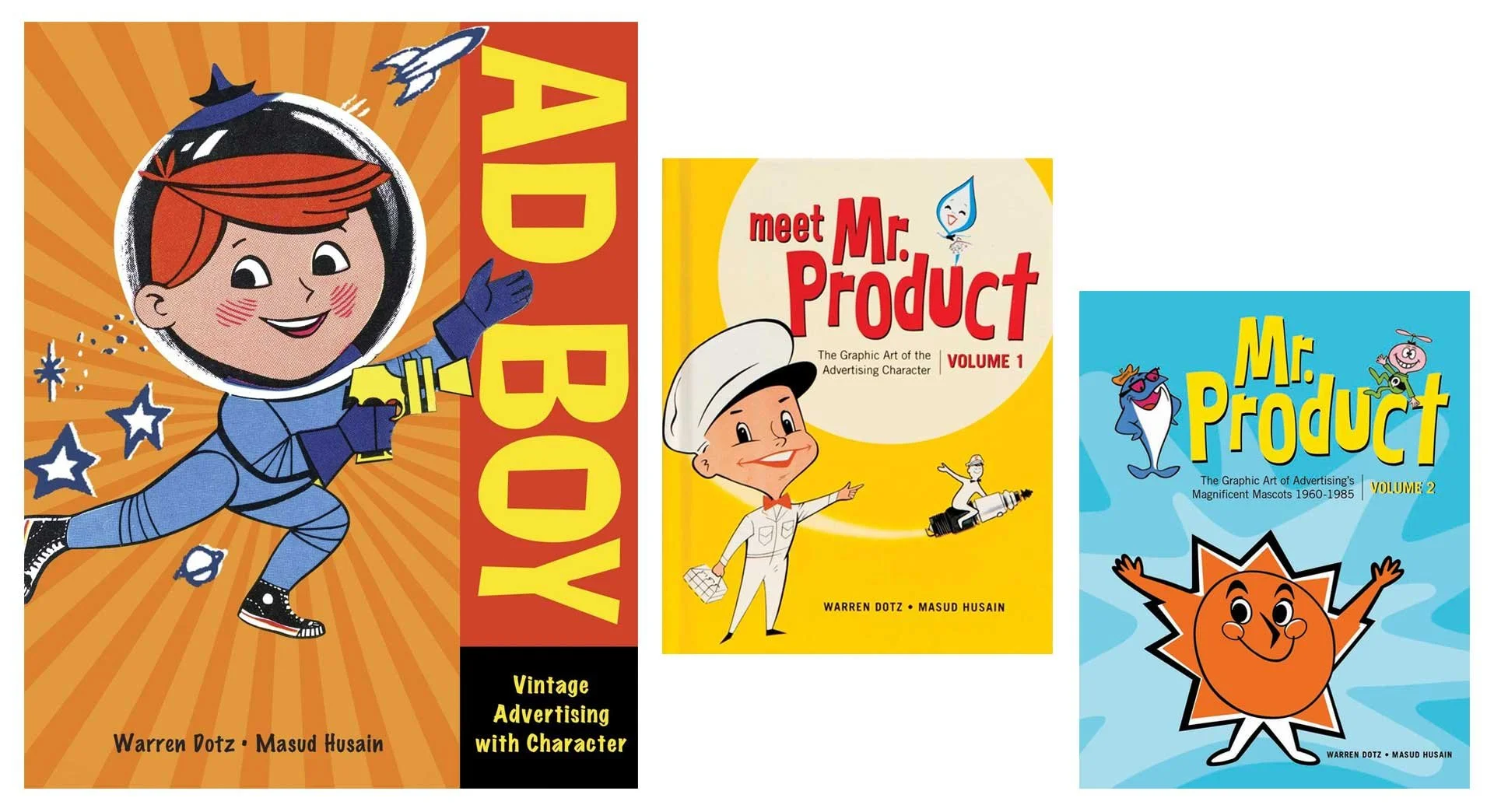
Warren Dotz loves vintage graphic design too!
I honed in on things from the 1930s–1960s (and maybe a few from the early 70s) and fell in love with Collier’s, Life, Look, Movie Story, American Artist, The Saturday Evening Post, Classics Illustrated, and Volk Artfile clip art. Whether the illustrations were simple mascots or full spread paintings, I was hooked.

Several fantastic illustrations from throughout the 1950s.
I love masking images (a reversible way to isolate an image or hide part of a picture), and even restoring some of these old ads. Collecting these dusty old publications then is quite literally a layered process (that was a Photoshop pun if you missed it), giving my hobby more validation than just taking up shelf space.

Ads I restored for the Santa Fe Traffic Office (June 23, 1959), Big Yank from Reliance Manufacturing Co. (April 30, 1957), and Barbasol (May 14, 1957) all from various issues of Look Magazine.
I’m not saying these were simpler times. I know my American history. Vintage advertisements do boil down everything to create an aesthetic that presents an idealized life and country. Life was not simpler, but it’s presentation sure was.

All from Collier’s Magazine, April 1944.

More from Collier’s, March & April 1944
It’s not just advertisements but art accompanying headlines and stories too. As you can see, some are fantastical and care free. The style of art captures the atmosphere of the decade and times. I didn’t live in the 40s or 50s (or 60s or even most of the 70s), but looking at all these great pieces transport me there as if I had.
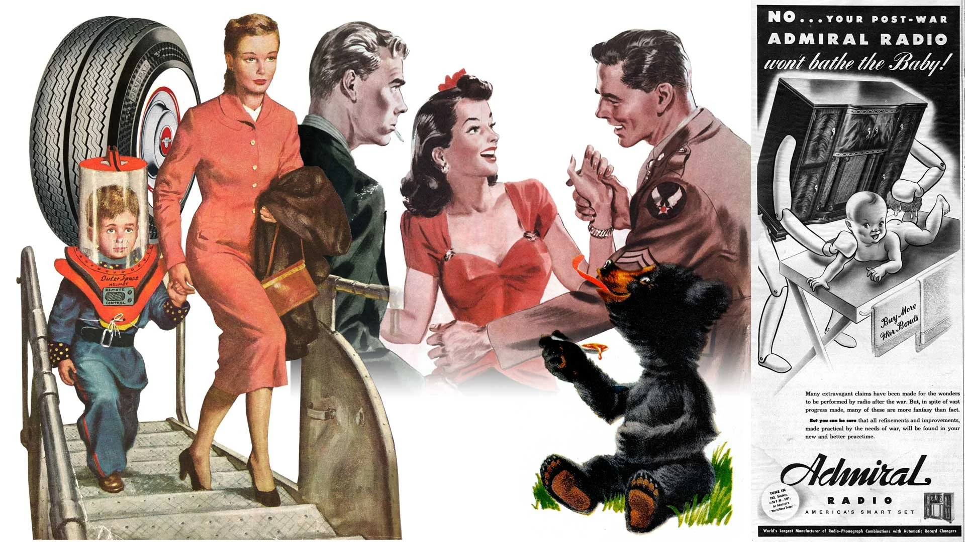
General Dual 90 tires featured in Look Magazine (June 23, 1959), the cover of The Saturday Evening Post (1952), art from the short story Three Day Leave in Colliers (March 1944), Karo Syrup in Look Magazine (June 23, 1959), and a whimsical ad for Admiral Radio in Collier’s (March 1944).
It’s not all cheerful and poppy though. The art and photographs also capture the darkness and troubles of the era as well. Granted it may not always reflect so clear. Many ads and stories are shockingly racist and sexist. I’ve decided not to share those, but to everyone who thinks these were simpler and lighter times, even the public narrative at the time didn’t (always) reflect that. Dramatic paintings project a much stronger emotional reaction.

From the news article Twilight in Germany, Champion Spark Plugs, and Scotch Tape (all from Collier’s March 1944)
Now it wouldn’t be much of an illustrator’s blog about inspiration without a few samples of my own. Anything can be made to look vintage with some paper textures and layer blending, but authenticity feels more parallel to the times when the artwork is pushed to a fun and exaggerated level.

Various illustrations from the last 5 years.