Incompatible Clients

Today I want to write about something that may sound like it’s just complaining about people, but that’s 100% not the case. Well, maybe 80% not the case, but I’ll elaborate more as we go along. As the title suggests, this is about incompatibility. Like every other relationship, there are just some instances where two parties aren’t meant for each other. This is a very hard pill to swallow when it comes to a client and server/service relationship because of one key difference: an agreement based on work for pay.

Okay, maybe 70% not the case in regards to complaining.

This isn’t prevalent in any other relationship, but when it comes to a client and server/service based relationship, it’s foundational. The issue is that from every other angle, it resembles so many aspects of traditional relationships. Whether it’s familial, friendship, coworker, romantic, online, or even temporary; a client and server/service relationship hits a lot of the same bullet points. At the core, its strongest relational bond is that of collaboration. When you work with someone closely on anything, you can’t help but learn more about who they are and what makes them tick. You may find you really like each other too, but nothing is getting accomplished. The client doesn’t seem to like any of the server/service’s (Good grief, I’m just going to call the server/service a “designer” from here on out) concepts, the designer doesn’t seem to be understanding the client’s requests or critiques, and before you know it; there’s a general consensus that everyone is just wasting each other’s time.

In my experience, there are two four key reasons for these failings. This is going to seem very biased, but usually the problem is the client (Crap, maybe we’re at 60% not the case that this is just complaining). This isn’t a character flaw, but let’s dive deeper.

1. The Client Doesn’t Actually Know What They Want

Shots fired! Of course it’s their fault! How could it ever be that of the perfect designer (or illustrator… man, I’m already confounding the language again—we’re really flying by the seat of our pants here!). Okay, hear me out: a client traditionally hires a creative person to accomplish something they cannot. It could be because the client doesn’t have the tools or talents to do so or because they don’t know what they should even be going for. A healthy relationship then builds from collaboration to create something. Sometimes that lack of knowledge or understanding can be too much of a hurdle and the client realizes they may need to do a lot more soul searching to figure out what it is they need.

Now this is rare, as I’ve stated in the past, many times the client legitimately trusts the person they have hired. It can become clear and possibly even a little overwhelming at just how much thought (should) goes into things like personal branding or creating something that is attached so closely to the client.

2. The Client Is Too Passionate About Their Idea

I considered making this a subcategory of the first reason, but I have personal experience that’s unique. I was commissioned by an absolutely lovely human being who had a very clear vision for what they wanted. There was a lot of passion behind this project; real honest–to–goodness love that wasn’t just important to the direction, but the overall feel as well. If I were obtuse, I’d just brush it off as emotional baggage as the project was very much a tribute to people who are no longer alive. The truth was that this client had a lot invested in the project and had a difficult time disconnecting some of those emotions from the people they were now celebrating.

Maybe you can’t be too passionate about anything and the subtitle for this section is a little callous (I swear this post is 58% not about complaining about people). The point is that the world will continue to move on—even from the worst of tragedies—and that’s always going to be a lot harder for some people over others. This particular client really is a wonderful person, and we parted ways amicably. Just as I ended the last reason, when this happens, the client may need to do a lot more soul searching to figure out what it is they need, and it may not be something a creative person can fix.

3. The Client Is Insane

54% not the case that this post is complaining about people. Of course, while every human being has horror stories in regards to dealing with anyone, I have been very fortunate that I’ve never had a truly bad client. However, my friend and fellow creative Scott Modrzynski has. Here is his story.

There was a sobriety house in Los Angeles that I got in contact with through a mutual. The owner was looking for a logo, and I was more than happy to help. I don't remember what we settled on, price-wise, but it was inexpensive because 

A) I'm terrible-to-me at pricing, and
B) I have the additional guilt of charging people money for doing the lord's work. 

The initial concept, as it was conveyed to me, was vague, so I came up with something based on the operation's initials. The owner thought my usage of negative space to create letter forms was cool, but not his style. No problem. He sent me some examples of something he liked. It was sleek, classy, and minimalist. I mocked up some examples, and they weren't working for him. He liked Viking runes. I came up with something gruffer, that had a Nordic tilt to it. He thought it was great, but was hoping for something with a SoCal vibe. Throughout all our email exchanges, and occasional phone calls, there was a lot of flowery, bullshit language from his end that made no sense, and completely divergent ideas that seemed utterly incongruous to our previous contact. At that point, I realized what a piece of shit designer I am, because I don't know how to make a minimalist, Viking-inspired, SoCal logo that dives into the beating heart my own soul. I gave it a final go, and he said he'd get back to me after the weekend. That was at least five years ago. 

It was my first experience with a nightmare client, and made me appreciate my day job, since I wasn't really in a position where I needed to chase down these side gigs for any reason other than making some extra coin.

4. The Designer is Overly Ambitious

Every so often during a total solar eclipse while a volcano is erupting on your birthday as you and your ambidextrous twin sibling ride a two–headed Laquita porpoise on your way to pick up a winning lottery ticket in the Namib desert; a creative person will bite off more than they can chew. It’s easy for an inexperienced designer to insist everything they do needs to go in the portfolio and will go out of their way to convince the client that because of their creative experience (however extensive or limited it may be), they simply know best. That is to say it’s possible if not improbable that it’s the designers inability to communicate or properly deliver what’s been discussed and promised.

Such instances require a federal judge to prove such a rarity in which most cases prove it was actually the client who was wrong.

Okay, this post is officially drawing a line in the sand insisting that it is 52% not the case that it is complaining about people.

Yes, But What Should You Do?

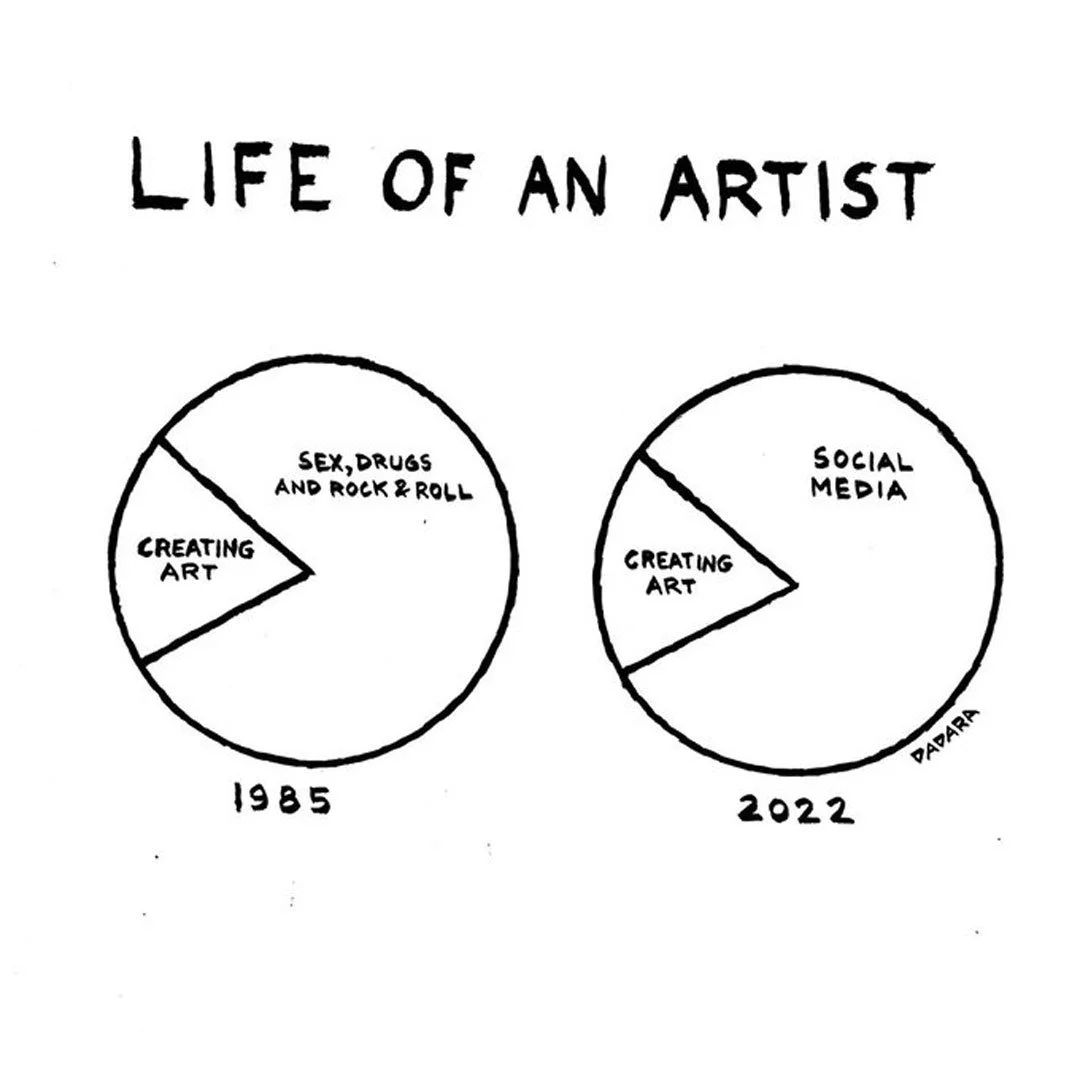
Okay, let’s talk practically about solving these problems. Patience is key. Word of mouth about incompatibility is going to spread faster than any good work that you do, so remember the client is paying you and not everything has to go in the portfolio! Bad design is everywhere and the real shock is that good designers continually add to that because some clients just don’t care about the golden ratio, proper kerning, that a caricature is meant to exaggerate certain features, or that what you offer is actually a niche service that can’t be obtained at Target or created by AI (yet). Sometimes the best way through is to accept all directions regardless of how counter–intuitive they actually are to good taste, get paid, and forget about them; making sure to make a mental note to always be on vacation should they return for repeat business. Most importantly, separate your personal feelings from your work. I know I sound like a broken record, but not every piece has to go in the portfolio or on social media. Keep your emotions out of your responses and if you are feeling particularly revved up, make sure to burn off those heavy feels before contacting a client. I have seriously over–soured one or two bad business relationships because I didn’t walk off some anger and frustrations first.

Inevitably, there may come a tipping point where it’s clear that a particular relationship just isn’t going to work. Be honest with your client. It’s always good to know a bunch of other creatives in your field that you can recommend in place of yourself. Obviously make sure you give your buddies a heads up first, but having alternatives and providing other solutions really helps you out here. I always strive to never say, “no” to a client. That doesn’t mean I roll over and let someone take advantage of things, but saying, “You know what we can do…” shows you respect their opinion and that you’re listening as well. Solve the problem before acknowledging there actually is one.

If money has already been exchanged, there are a number of variables that could determine if anything is returned or still owed, so there’s no definitive answer you’ll find here. However, Scott’s nightmare is reason enough to consider applying the formula of deciding how much of a loss you may be willing to take just to bail. There may be zero chance of salvaging the relationship, but see what you can endure to make sure your reputation doesn’t take much shrapnel.

Don’t write off the client’s frustration either. They may not be able to communicate their ideas well at all, and as a non–creative person that can be difficult. It bears repeating to make sure your head is out of the fire when responding so that if there is a strong hate–hate relationship; you’re not the hothead. Openly admit you’re not the right fit for the job and that you don’t want to waste the client’s time, even if they’ve wasted yours. Remember, you want out of this, so take it on the chin and never look back. If the client is a real problem, make sure you warn all your creative peers on the down low.

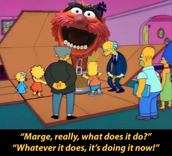
If all else fails, start a blog and write about how you’re totally not complaining about people and vent your problems there!

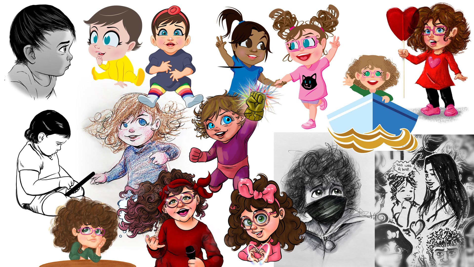
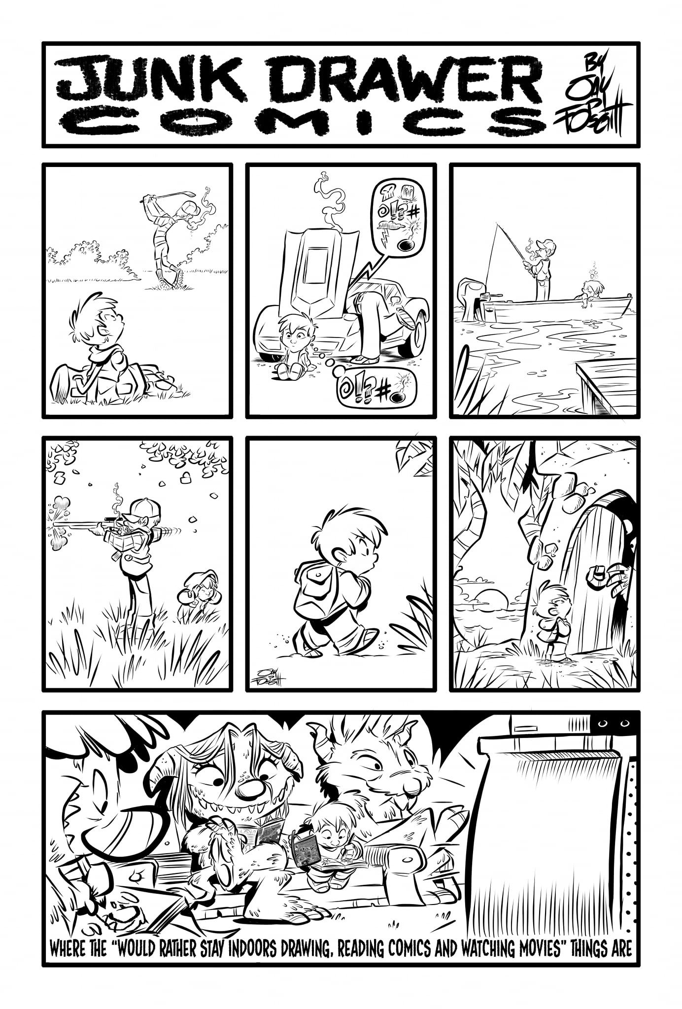
A big thanks to Scott Modrzynski for taking the time to share his insights today! The dude is a very talented artist and designer who I’ve had the privilege of working with on three different collaborative projects together.

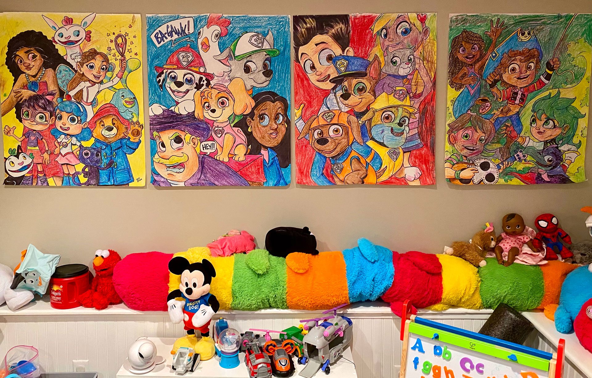
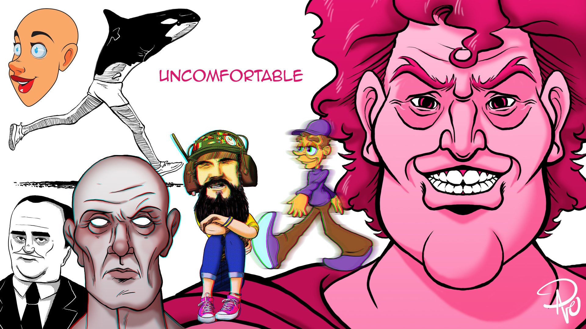
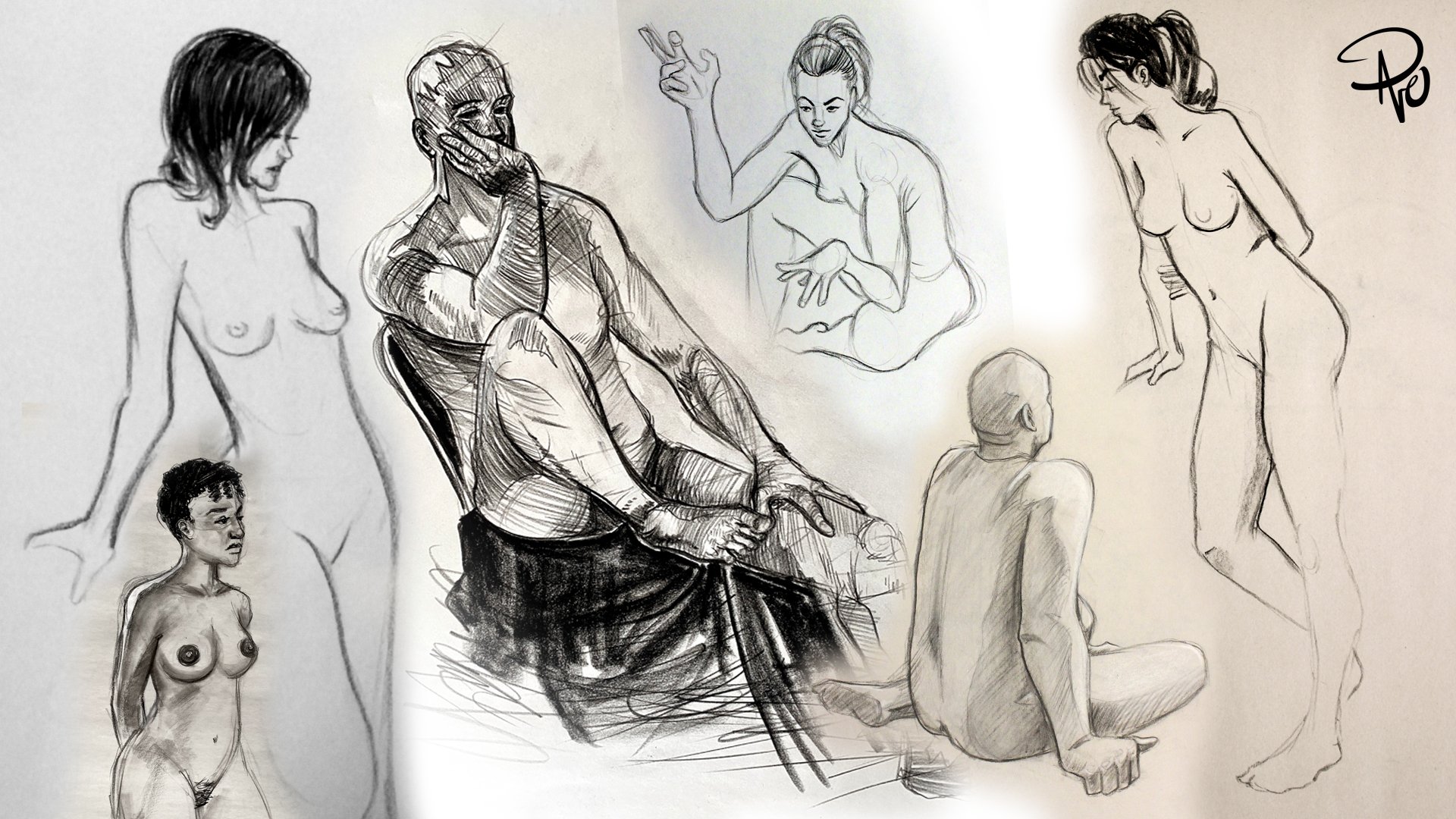
Just some of Scott’s incredible work!

Check him out on Instagram and Twitter, and also take a peak at some of his really cool stuff like this Batman Typography or his Cereal Freaks. You can also follow me on Instagram and Twitter and come back here on Fridays for more creative thinking!

I [still] Know What You Meme!

There’s nothing like laughing your life away with a batch of memes that may or may not hit just a little too close to home. So with that being said, here are some memes!

Not quite what you expect with figure drawing

This more accurate than anyone wants to admit

This one is legit my favorite.

Follow me on Instagram and Twitter and tune in to this blog on (most) Fridays for more fun!

Starry Eyed & Tongue Tied

Last Friday I ended a 25 week streak posting my blog and while the world did not end because I didn’t post, I was bummed out. The problem is I am over my head with freelance and full–time work and some of what I’m working on is super cool and very loosely and indirectly related to this post and I cannot wait to share it with you!

Anyhoo, starting in the early aughts, I began attending comic cons regularly. Before I go any further, if you have never been to a comic con, you absolutely need to go. It doesn’t matter if you’re 8 or 88 and it also doesn’t matter if it’s a humongous convention like SDCC or a tiny one in the basement of a VFW hall. Of course, comic cons back in the first part of the 21st century were slightly different than they are now. For starters, they really were all about comics. Today they tend to be more of a “pop culture convention,“ but they are still a blast.

Wizard World Philadelphia. May 30, 2003

Over 20 years ago, they were also primarily populated with mostly male attendees. When my girlfriend (now wife) would accompany me and our friends, there would be somewhat of an awed hush for a moment when she would first walk on the convention floor. This was more of an initial reaction to her sex over her radiant beauty, but times slowly changed and soon conventions became a much more homogeneous experience. Now that we are married, she will often mention she no longer does comic conventions because she “served her time.

Anyway, in 2006, I dragged her along yet again to Wizard World Philly with my primary goal of meeting comic artist Skottie Young. He is a well renowned artist today, and while he was certainly hot back then, he was arguably still an up-and-coming creator. This can be proved by the fact that he had his own table with no line of swarming fans or even an assistant! It was just Skottie hanging out and drawing alone all day and excited to talk to anyone. 

At the time, he was working on a run of Venom, continuing Marvel’s unconventional trend at the time of showcasing more cartoonish and exaggerated styles on Spider–Man titles along with other artists like Humberto Ramos. I was a super fan, constantly visiting his site to see all his sketches and drawings of any and everything. He wasn’t just an incredible artist, but a super cool guy as well who seemed to have similar pop-culture interests as myself. Not a surprise considering he’s barely 2 months younger than me!

Checking our convention guide, I located where Skottie’s table was and we made a B line so I could ask him to sign my Venom comic and maybe even take a picture with him. As I mentioned, he was alone and just drawing away. When we approached, he lit up like a Christmas tree with excitement. What a fantastic guy! I was so pumped and excited to gush over how great he was. I opened my mouth to greet him and introduce myself only to discover I had completely forgotten the English language. 

Skottie’s table was our very first stop at the con and the one and only thing I truly wanted to do and now that we were finally here I was so star struck that I literally couldn’t speak. I was like Ralphie Parker meeting Santa Claus at Higbee’s in A Christmas Story. I stood with a dumb, open–mouthed smile for a ludicrously long time that made Skottie and my wife shift awkwardly as they waited for me to do absolutely anything. Finally my wife stepped in to save me with a prompting and encouraging, “Hello.” Yes! Hello! What a novel way to start a conversation! I will try saying that, and so I blurted out much too loudly and abruptly, “HELLO!” “Hey! How’s it going!” Skottie replied with renewed energy and a warm friendly smile. I resumed my blank admiring mannequin face as if I was a Make–A–Wish patient who no doubt suffered severe injuries from his love of drinking gasoline straight from the pump. My wife—now staring at me incredulously—saved my bacon again with another encouraging prompt. “He really likes your art.” she said sweetly as I stepped over her last word obnoxiously, “I REALLY LIKE YOUR ART!” 

For the next few minutes, this was pretty much how we communicated. My wife patiently told Skottie what I admired about him and his work and then I would loudly repeat her words in the first person. It was like a bizarre avant–garde ventriloquist act where I was the dummy, my wife the puppeteer, and Skottie as the beleaguered volunteer pulled randomly from the audience. What a complete and total $#!t show. Somehow I managed to get my comic signed and a picture as well. Skottie was polite, patient, enthusiastic, and so kind. He was exactly the type of person I anticipated him to be and I blew it. 

Me still in complete disbelief that is indeed Skottie Young. June 2, 2006

As soon as we were out of earshot from Skottie, my wife turned to me shocked and somewhat exasperated. “What in the world was that?!” she asked. I had returned to earth at that moment as well and was equally stunned. “I have no idea!” I admitted. It was at that exact moment that I had a very serious problem on my hands and I needed to rectify it immediately. My main concern at the time was the realization of just how much this could hinder my own illustrative career. Thanks to sites like ToughPigs and the exposure I was getting from such a niche fandom, I was sure it was only a matter of time before I would have the opportunity to meet actual Muppet performers and maybe even work for them. At my core I knew it was vital they saw me as a peer and not just a fan. Of course if I couldn’t chat up a fellow artist just because he was successful, how would I speak to someone who was partly responsible for molding my childhood, affecting my overall trajectory as a creative person? 

It turned out it was even worse than I imagined as not long after that, I bumped into a family friend—yes, a family friend—whom I greatly admired. Now I had never met him prior, but I had seen pictures and heard recordings of him (he was a very talented musician) so imagine my horror when I got tongue–tied chatting with him as well!

I took the “Face Your Fears” approach by attending every book signing I could find, hung outside every service entrance after a concert, waited in autograph lines at conventions, and attended any speaking engagements featuring celebrities that interested me; all in the hopes I could act like a normal human being around anyone with a modicum of fame so that one day I wouldn’t completely lose my mind if I met someone really famous.

Weird Al Yankovic (2/2/2011), Jesse Ventura (4/7/2011), and Gary “Baba Booey” Dell'Abate (11/9/2010)

I very quickly realized “fame” wasn’t the crux to my star struck nature, it was admiration. If I somehow found myself face to face with someone like Hugh Jackman—something that actually happened —I was excited but maintained my composure easily. However, if I met the likes of Trace Beaulieu, Lorraine Cink, Doc Hammer, Louise Gold, or Stanley Lau, I’d start to choke up. Interacting with them at events did become easier and was also very safe. I was able to see them as actual people and before you knew it, I could at least fake acting casual. When I finally met those lofty Muppet people, at the very least I wasn’t a hot mess. 

MST3k’s Trace Beaulieu (11/27/2010), Marvel’s Lorraine Cink (7/24/2016), and Doc Hammer (4/19/2008) co–creator of The Venture Bros.

I still get very excited when I meet someone I admire—famous or not—and on the inside I’m fan freaking out. If I ever meet Lois Van Baarle or Frank Oz or Jamie Hewlett I think my heart would still explode. At the very least, my wife knows I can control my basic bodily functions without her by my side the entire time. 

Skottie Young, if you’re reading this, thank you so much for being so pleasant and patient and inspiring. Not just to draw better but to get my act together and focus. It changed my career. You really are the GOAT!

I’m not posting much now on Instagram and Twitter but follow me anyway so when I clear my slate you’ll see what I’ve been up to! And come back here every Friday for more creative thinking!

The Redraw Challenge: Part II

Last week I talked a lot about growing as an artist, leveling up, getting more familiar with that growth, and recognizing when you’ve just exceeded your own expectations. None of that was possible without this week’s post which was truly an insightful exercise and the whole purpose of this two part series! When I tell you both last week’s and this week’s post almost didn’t happen, it’s not for dramatic effect. I thought I really had hit my apex and I experienced a level of frustration I couldn’t even comprehend! But we’ll get to all that. First, we need to travel back in time again. Not just to last week, but to 2009.

The iconic Alan Moore & Dave Gibbon’s comic, actress Malin Akerman as Silk Spectre II, and the 2009 Zack Snyder film

Watchmen is consistently one of the highest regarded comics of all times, and in 2009, Zack Snyder finally produced a film adaptation that has been recognized as being (in some cases too) faithful to the original source material. I’m not going to waste a lot of time on discussing whether or not it’s a good film as it’s a polarizing movie amongst fans. When I heard the announcement that it was being made however, I set out to read the comic for the first time. I therefore went into the theater with a very fresh understanding of the story and I was very thrilled with the flick. The casting in my opinion was perfect, especially with Jeffrey Dean Morgan as The Comedian, but the redesigned look of Silk Spectre II’s costume starring Malin Akerman was inspired. I had Watchmen fever and over the next couple of years, it served as a great inspiration when it came to drawing.

Of course I drew the Muppets as characters from the Watchmen! Originally featured on ToughPigs, December 2009 and Silk Spectre II, vector illustration 2014

Okay, so just to drive the point home again from last week; I found Silk Spectre II—a strong female comic hero—to be a muse and was also in the process of really honing my abilities with Adobe Illustrator, so in 2010 I had a leveling up moment by “inking” my sketches in Illustrator and then coloring them in Photoshop. This eliminated all digital debris that would be a causal problem from scanning. And hence I created what was at that time, a moment I recognized as a true level up point. I am beyond shocked now just how proud of this new drawing of Laurie Jupiter I was. Ladies and gentlemen, I am embarrassed to present to you the whole basis for this and last week’s post. Behold!

Thank you, BarbbarossaFrigyes for having the courage to say what everyone else was thinking

A second attempt in 2016

Looking back, I’m really struggling to understand exactly why I thought this was so great, but I totally did. I was still a few years away from taking those aforementioned figure drawing classes and I distinctly remember thinking how pleased I was that I didn’t use a model; backwards thinking at the time to compensate for a complete lack of understanding. I don’t need to break down how exceptionally off model she actually is here and the brush I used for the hair doesn’t even attempt to conform to the style I was going for. Still, I flaunted this piece everywhere and even used it in my portfolio! I wasn’t a young kid drawing this either! This is coming after I was thirty so I had no good reason to be so proud other than the line work. I have thought a lot about this piece ever since with an evolving curiosity in regards to everything I just mentioned and I have absolutely no good answer.

I wanted to justify my pride but eventually I couldn’t deny the best way to do that would be to redraw it. I even took a quick stab at it in 2016. This was a lot better but even my adoration of the movie was starting to wear thin. Then I started this blog and the concept immediately went into my ideas folder. “I’m a competent illustrator who’s miles beyond those days. This will be easy!” I thought. God I was so wrong. I ended up redrawing it THREE times and was completely unsatisfied thinking I hadn’t grown and maybe that doe–eyed Silk Spectre really was the best I could do.

First official attempt, 2022

Notice anything different between this first attempt and the original? Yeah, me neither! Initially I was trying to literally recreate the original with more realistic arms and newer color techniques but that was it. This wasn’t an exercise to show growth, this was modern day plagiarism from my initial drawing 12 years ago!

Second official attempt

I realized I was being too literal with my reinterpretation. I just needed to relax and approach it from a figure drawing perspective. After sleeping on it, I had my wife pose and I quickly roughed out a sketch. I wanted to keep the hair big but not like a large bob as I had done previously. The second result isn’t a bad drawing but it ain’t a good one either. What was I getting so wrong?

Third attempt

This time I took a whole week off from trying and got out of my head. I went full body on the pose and went to town hard on the coloring. I finally had an illustration that I liked but with zero soul. I was devastated. I purposely wanted to prove to myself and anyone else who read this blog that I could redraw this stupid old illustration that nobody asked for but had been living rent free in my head for 12 years. I packed up everything related to this post and moved it to the sad “Abandoned Ideas” folder on my hard drive and walked away.

Often when you work on any project—especially one you take a close personal interest in and for an extended amount of time—you get tunnel vision. You can’t see your own mistakes and you lock yourself up in a windowless room of self doubt. The reality was I was trying to not just redraw an old idea, but specifically an old idea that I felt very differently about back in 2010. The Watchmen may have remained relevant with new comics and the HBO series, but Silk Spectre II—specifically as played by Malin Akerman—was a fanboy muse from a time before everything in my current life: the pandemic, political polarization, where I lived, who I worked for, what I watched, who I associated with, what interested me, how I draw, and my daughter! Of course, I’ve talked about my daughter a lot in the past, and she proved to be an even better muse than Laurie Jupiter ever was.

A Luisa doll, a doodle I left in my daughter’s lunchbox one day, and the cool kid herself

As I’ve mentioned repeatedly before, I can draw Luisa from Disney’s Encanto from memory. Why? Because that’s all my five–year–old ever asks me to do. She’s a huge fangirl and I love how excited she gets with anything Luisa related. Plus I really like Encanto and Luisa too, but when you draw a character so often, you really want to branch out and try something different every once in a while. So when my daughter got an actual Luisa figure, I could now use it for reference. One of my favorite artists is Charles Dana Gibson, and prints of his famous Gibson Girls adorn my home and work offices, and I (as seen in the previous attempts at Silk Spectre II) love drawing people in profile. And that is when it finally hit me. I wasn’t just missing the challenge of redrawing my old illustration, I was missing the whole point.

Now it may seem like I’m asking you (and myself) to make a huge leap here to quantify drawing a Disney character in place of a Zack Snyder re–imagined Dave Gibbons character from a very adult comic. The focal point of the subject though is fundamentally the same: a strong female super hero, specifically one with great design, well thought out character traits, and a wonderful arc that helps define and evolve their world view. Then take into consideration that part of my pride in the original drawing was also surrounded by honing a new technique. In the case of Silk Spectre, it was comfortably merging Adobe creative suite products to achieve a look I had only dreamed of up until that point. With my new inspiration focused on Luisa, it’s marrying the fundamentals I learned from figure drawing and fully embracing Procreate & the Apple Pencil. To cap off the epiphany, I was determined to take the fun and cartoonish design of an animated character and change the style to pay homage to the style of Charles Dana Gibson. In short, I was going to take all that I learned and loved and play with it in a new playground with the intentions of achieving something I had never tried before.

Luisa Madrigal (voiced by Jessica Darrow), some of Gibson’s famous Gibson Girls in profile, and my sketch of my newly inspired redraw challenge subject. If you are wondering, I sketched her nude to properly achieve weight displacement and to make sure her muscle structure and limbs were accurate in length and size.

As soon as I finished my sketch (which oddly enough I did in Photoshop), I knew I was finally on the right track. I was excited, I was pleased, and I was in it for the long haul. I wasn’t going to bust this out in a day or two, I was going to immerse myself in it and take all the time in the world to achieve my goal. I’ve been amazed with Procreate and the Apple Pencil’s intuitiveness, but I also wanted to limit myself with brushes so I stayed almost exclusively with it’s ink technical pen (a halftone brush on her skirt was the only exception). Each strand of hair would be drawn as opposed to using a hair brush (not a hair brush in the traditional sense but a digital brush used to simulate human hair). I shaded using the same technical pen brush as well, painstakingly keeping all my line art clean and crisp. I also wanted to avoid my own personal bad habit of spending lots of time on the subjects face and then rushing through the rest. This meant shading and properly recognizing folds in the clothing as well. I wanted to honor Gibson’s style and that meant a lot of time staying zoomed in tight and making sure it all worked up close as well as from a distance.

In the spirit of Charles Dana Gibson (and because of all the intricate line work), I originally intended to keep it black and white, but my daughter insisted it needed color. I digitally painted it with the understanding I would pull the colors way back and the final piece made me feel even more accomplished than Silk Spectre II did so long ago. My faith in myself and this entire blog entry was thus restored. The final illustration took just over 9 hours to complete (not including all the other nonsense I wasted trying to draw Ms. Jupiter).

Man, what a fun experience! I have a huge collection of my old art I’d love to tackle and redraw, but I think I’ll put it on the shelf for now. Please follow me on Instagram and Twitter and come back here every Friday for more creative thinking experiments, interviews, and stories.

The Redraw Challenge: Part I

I am super excited about today and next week’s post because it is all about progress and rediscovery! If you’re truly passionate about anything, you’ll notice growth in your endeavors. Experience and patience develops all skills, hence the old axiom, “Practice makes perfect” or more to the point in today’s post, “Practice makes progress.” I can very clearly remember many specific moments all throughout my life where I would draw something that made me feel like I just leveled up. I don’t just mean I drew something a certain way and was proud; I remember where I was, what I was drawing, and very clearly understanding I had just crossed a new threshold. It’s always exciting but more than anything, it’s rewarding.

Now every time I’ve experienced leveling up (can you tell I’m also a gamer?!)—particularly when I was younger—I believed I had just hit the apex of my ability. In my mind, I had reached my full potential and I was elated. As time passed, I began to understand I was comprehending things I hadn’t fully previously and in looking back, those breakthrough drawings I felt were the best of the best I had ever done and would ever do, in reality kind of sucked… like a lot. What’s also become a revelation is how those specific illustrations—however good or bad they actually were or still are—only now mark any level progression to me. Those moments are very important because they push you to do better, even when you believe that’s your best. They don’t end an era of creating a certain way, they mark the start of learning new techniques and styles. And the absolute best part? They don’t stop when you’re young! You keep leveling up well into adulthood! There are few things in this world that can bring that kind of joy as you age, but furthering your talents is totally one of them! I’ve said it before and I’ll say it again, an old dog really can learn new tricks!

Now reevaluating those pinnacle moments is nothing new; redrawing old artworks can be seen all over social media and other artistic platforms, so I’m not doing anything groundbreaking here. However, today I’d like to look at a few instances where I hit some personal milestones only to go back and figure out what made them so special. This is part one of my Redraw Challenge!

Okay… let’s make this super awkward and embarrassing. As a cisgender male, I have been intrigued with drawing the female form since I was a child. One of my earliest leveling up experiences was drawing ladies as inspired by comics artist Mark Badger, specifically his work on Marvel Comics Excalibur. Even more specifically the mutant Meggan Puceanu. I got really into comics starting with Excalibur Volume 1, #37 and would redraw the panels from it. I stuck tight with Excalibur and gravitated towards Alan Davis’ work on it as well. My versions were much cartoon–ier but they helped me understand some basic structure and lead to an aforementioned level up. Side note: I am actively hoping for an Excalibur movie or Disney + series in the MCU. Come on Mr. Feige! Make it happen!

Excalibur #37: the first comic book I ever bought, Meggan (and other art) by Alan Davis. Meggan & Kurt Wagner (AKA Nightcrawler from the X–Men) had a very flirtatious relationship and I wanted them together more than her main squeeze Brian Braddock (AKA Captain Britain)

One of my biggest moments came when I started taking figure drawing (or life drawing) classes. Even at my first class, I began to understand what I needed to do, and a few months later it all clicked. I had one of the best sessions ever and I noted it was a level up experience and I was thrilled, even though I popped a tire on the drive home from the studio, I was still on cloud nine.

A flat tire right after one of the best classes I ever had. February 19, 2014

Before all that though, in 2006, I was hired to illustrate my first book. Man, what a thrill to be able to say you’re a published illustrator! I had just settled in on a technique to marry my traditional line art drawings with digital coloring and effects that eliminated most residual imperfections/digital debris after scanning. I was ready and I was excited. I worked very close with the author and editors and even the printer to make sure everything I did was exactly how we all envisioned it. I was very proud when it came out, but it didn’t take long at all before I leveled up further, and soon my pride of being associated with an ISBN number felt embarrassing.

Just a couple years later and my techniques had changed again. The figure drawing classes pushed my abilities further along, so my book now felt dated and subpar at best. Eight years and even more classes later, I decided to at least take a second shot at the cover. The cover was something I wasn’t happy with originally anyway, so it felt like a good exercise. Applying what I had learned as well as using new tools like Daz 3D to create a virtual model for reference, I upgraded my original art. Although only a brief yet serendipitous moment, at that time the author had been contemplating a second printing of the book, and my art director excitedly showed him my new and unsolicited art which he liked. The new cover never got the full green light and the book stayed out of print. I would imagine the idea to re–do all the interior illustrations came up as well and possibly added to the decision not to do a separate printing. Regardless, here we are another 8 years later and I’m still not only proud of my redrawn cover, but content with it as well.

A 3D poser model was my reference for the new pose

The original 2006 cover and my 2014 redesign

Not all redrawing is a calculated exercise. Many artists will sketch a rough draft with the intentions of completely redrawing it some other time. The sketch merely acts as a note or reminder to draw it properly later. Anyway, I had seen a picture of an Instagram model posing and taking a mirror selfie and really liked the pose. I did a quick sketch and saved the photo for reference so I could do a better render some other day which I totally did and—as I already mentioned the process—the second illustration came out much better. What I didn’t do however was finalize the drawing immediately after I did the second sketch. I left it alone for awhile and then picked it up again several weeks later. The problem was I used the original sketch! Even as I was inking and coloring, I was wondering why I thought this illustration was worth completing. It wasn’t until I finished it that I found my second attempt. I basically redrew this twice and for no good reason.

The original photo that inspired plus the first quick sketch, and the better second sketch, 2020

Finals up close. Even the phone is done better!

None of these particular creative forays were the inspiration for this post though. The real deal and nightmare that made me want to write and try this exercise will post next week and man was it a journey! Follow me on Instagram and Twitter and please, please, please tune in next week for a real redraw challenge in part 2!

Too Many Cooks in the Kitchen

Whether it’s freelance or work from my day job, I usually work for one client per job or with a very small team. This allows for good collaboration but without causing too many unnecessary problems. A couple weeks ago I wrote in depth about how unnecessary opinions from other peoples can influence a client, especially when they’re not even directly involved with the project to begin with. 

Occasionally I will work on a project that has to go before a committee for final approval. Where I work, they are known as “the cabinet.“ The cabinet is a substantive collection of management that needs to review larger projects that will have a national or even international audience. Fortunately, by the time a project goes before them, they aren’t necessarily making changes or suggesting frivolous design choices, but rather ticking off all the boxes to make sure the project is ready for final approval. Things like making sure there is proper representation, a clear message, that there’s no misinterpretation, and that it includes all necessary information. Of course there have been a couple nightmare situations in the past, but for the most part, the cabinet exists as a good eye for checks and balances.

The Cabinet” sounds like an NBC crime drama series, right?

Joe Hennes and Cookie Monster

As I love to do, I reached out to some creative professionals to see if anyone had any unique stories when it came to dealing with a situation where there were just too many cooks in the kitchen as the old axiom goes. Writer extraordinaire, co–owner & editor of ToughPigs, and my dear friend, Joe Hennes responded with the penultimate and quite literal interpretive telling of having too many cooks in the kitchen. Here’s his fantastic story:

I have very rarely been a project-based "work for hire" type. For most of the projects I've been involved with, I've either created it for my own needs or been a part of a larger, corporate production company. For the latter, it can be very difficult—and yet, very easy—to get a creative project off the ground. Confusing!

There's an unspoken rule on the business side of production that creative choices should be left to the creatives, especially if we're paying them money for their talents. Sure, there are internal think tanks and approval processes, but it's surprisingly difficult to scratch that creative itch when those responsibilities are handed off to the artists. On the flip side, being on the other side of the table means that you have a better idea of what's possible and what's not, what the company really wants, and how to cut every cost before an idea gets too big.

Back in 2014, I was working in an administrative role at Sesame Workshop, and constantly trying to find ways to be a part of creative projects. A truly bizarre viral video hit the internet that year - "Too Many Cooks", an 11-minute long spoof of sitcom opening sequences that originally aired on Adult Swim. And as all viral videos do, it was the hottest thing for a few days.

Part of my (unofficial) role at Sesame Workshop was to try and brainstorm fun content for grownup fans like myself. Very few of my pitches came to fruition (the most notable being "Big Birdman" - a spoof of the Oscar-winning film "Birdman", starring Caroll Spinney), but when "Too Many Cooks" hit our radars, it seemed like it'd be a HUGE opportunity to develop a "Too Many Cookies" spoof starring Cookie Monster. I mean, the joke was right there in the name!!

Joe with Big Bird & Oscar the Grouch performer Caroll Spinney

This is where that "business side of creative" stuff comes into play. What's the pecking order for getting something like this approved and made? As always, money comes first. Since this would be aimed toward adults, that meant it would be released on social media, so that division of the Marketing Department would be paying for it. I pitched the idea to the head of the social media group, and he agreed that we should do it. But he also recognized that there's no predicting how long things can be viral, so we had to act FAST.

Literally running down the hallway, we went to the Production Department, as they'd be the ones actually putting the video together. The Executive Producer wasn't in her office, but since time was of the essence, one colleague volunteered to start pulling videos of Cookie Monster and editing them together. Once this thing was approved, at least the work would have already started.

Our next stop was with Curriculum & Research, as all things at Sesame Workshop need to be approved through them. It took some convincing (there was literally nothing educational about what we wanted to make), but since there was nothing harmful, and the video would be aimed primarily toward adults, they reluctantly gave us the go-ahead.

Looping back around to Production, the Executive Producer was still absent. We couldn't do anything without her approval, and the clock was ticking. By the end of the day, we couldn't get in touch with her and the social media director made the call to cancel the project. Understandably, if we couldn't get it all approved and created by the end of the day, there was no guarantee that this little video would still be relevant 24 hours later.

Feeling a little dejected, I went home that evening and realized that there was no reason I couldn't keep moving forward with the project on a smaller level. I wouldn't have the resources of a big production company, but that's never stopped me before. I quickly wrote lyrics for a spoof of the "Too Many Cooks" song and recorded myself playing it on the ukulele while my wife Sarah sang. I ripped some videos of Cookie Monster off of YouTube and edited a short video together. (In case you were wondering, I figured out that the original "Too Many Cooks" video featured the "Full House" font.)

In the end, we were right - the video needed to go up at that exact time to benefit from the viral buzz. "Too Many Cookies" currently has over 74k views, almost all of which came in those first few days. Naturally, those numbers would probably be in the millions if Sesame had created it, but I got to keep all that attention for myself. Sure, I didn't make any money off of it, and it didn't do much to help increase my clout at work, but it just goes to show that when the kitchen truly has too many cooks, it just takes one absent sous chef to bring the whole thing crashing down.

For what it's worth, the next day the missing Executive Producer said that she absolutely would've greenlit the project. Oh well!!

Me, my daughter, and Joe, January 29, 2022

What a blast! Joe busts his hump over at ToughPigs, so I am very grateful he took the time to retell his experience here. Make sure you are following ToughPigs everywhere: on Facebook, Instagram, Twitter, and YouTube! If you like, you can also me on Twitter and Instagram and check back every Friday to this blog!

5 Useful [and Fun] Tips & Tricks for Adobe Illustrator

A lot of blogs offer helpful content as opposed to just opinions and stories from an illustrator, so I guess this is my foray into creating some useful tips. I’ve talked about my love for Adobe Illustrator in the past, as well as recognizing it’s a program that tends to scare off a lot of people. While I manage around it relatively comfortably, there are more than a few things I forget how to do. There’s also a few things that I think are small but helpful that I don’t always take advantage of. So in a lot of ways, this post is just as helpful for me as it may be for others and this way I won’t have to go searching for these specific tips scattered across the internet but rather all together here in one place. Let’s go!

Regular/Normal 5 Pointed Star Shape

This seems like a dumb one, but this is one of the most useful tips for me in particular. Illustrator has a very useful shape tool for creating things like a rectangle, ellipse, polygon, and star. The default star shape looks more like something you’d see taped up on a bulletin board in a school classroom rather than the type of star you would see on a flag. The tool creates a star shape based on an outer and inner radius as well as selecting how many points it should have. The default star shape has five points but uses the two different radiuses of a ratio of the second radius being approximately half the size of the first. This results in a bloated looking star where the points aren’t perfectly aligned between its points.

John B. Hall went ahead and did the math to figure out that a normal looking star would have an outer radius of 100 points with an inner radius of 38.2 points. He has also since noted that creating a normal star shape can be done simply by holding down the option (Mac) or alt (Windows) key and clicking and dragging, creating the star from its center point out. Make sure to hold the Shift key as you drag to keep the star perfectly straight and upright!

Make Anything A Guide

Guides are crucial for all Adobe products. They allow you to set boundaries, margins, or just helpful markers for consistency. You can also turn anything with a stroke into a guide as well! While Illustrator has several useful tools for perspective, sometimes you just need a placeholder of sorts to figure out perspective, or maybe a unique shape to help you avoid placing artwork where text or an image will be placed in a different program like InDesign. Simply use the selection tool (black arrow) in Illustrator to pick the shape or line/stroke you want to make a guide and hit Command (Mac) or Control (Windows) and then 5! It won’t work on text, but if you expand text into a shape, that will work too!

You can also have everything snap to your guides by hitting Command (Mac) U or Control (Windows) U to turn Smart Guides on and off

Creating a Long Shadow

There are more complex ways to do this with varying styles, but this is the quickest and easiest way. First, take your object and copy and then paste it either directly behind the original object or create a new layer below it. Change the fill color on the copied object to black (or whatever color you want). With your copied object selected, from the drop down menu select Effect > Distort & Transform > Transform.

In the new pop–up dialog box, you only want to concern yourself with the Move sliders and the Copies input box. You can play around with the Horizontal & Vertical sliders all you want, but keep the numeric values low. I find that between 0.2 pt and 0.5 pt keep the shadow tight (more on that in a second). For copies, enter any number you want understanding the higher the copies, the longer the shadow. Check the Preview box to see your progress. After you click OK, zoom in to see how jagged your shadow actually is. For the most part, you won’t see the copies when viewing your illustration from a reasonable distance.

If it’s too spaced out to your liking, open the Appearance window while having your newly created shadow object selected, and click the Transform property you just applied. This will reopen the Transform Effect options allowing you to go back and tweak your numbers.

Check for Clipping Masks

Oftentimes I’ll get artwork from another designer or stock image site and want to separate pieces that seem to be grouped together. However, after trying several times, the individual elements won’t release or there is no longer anything grouped. Usually that means a Clipping Mask is involved. From the drop down menus go to Object > Clipping Mask > Release. Now your individual objects should be free!

Expand Fonts

Fonts are finicky. For the most part, you’ll live your life day to day with no problems, but a year or so later they can seem temperamental due to Adobe updating, the font licensing change or expire, or any number of things. If your Illustrator file uses text of any kind, make a separate layer and paste all your text there. Then on your main art layer, expand the text. Now you have two copies: One that you can edit down the line (or even just check which font is being used so you can compensate for further designing), and one that maintains the original look you’ve worked on that won’t change years from now.

“Live text” as indicated by the path it rests on and the start and end points for alignment

“Expanded text” as indicated by the anchor points and empty stroke lines

I once lost a logo because I lost the font and had to recreate it from scratch. Having a backup layer that you may or may not be able to edit in the future can save time and headaches.

“Live text” that is missing the proper font, hence the odd substitution, poor kerning, and pink highlight

I realize these tips and tricks are unconventional and unique at best, so if there are any other things you’d like me to cover or tricks and tips you yourselves have discovered, comment below or contact me through my about page! Follow me on Instagram and Twitter and check back here next Friday for more creative thinking posts!

Opinion = Influence

Several years ago I learned a very valuable lesson about how an innocuous and common gesture all creatives deal with, can dramatically change an entire concept. Now that that weighty and boring introductory sentence is out of the way, let me tell you a story.

I was creating concepts for a client who is very talented, smart, and respected. She held a significant position in management where I work and had impeccable taste, especially when it came to design. She was genuinely invested in the work I was helping her to produce and we worked very well together. I was really proud of the final concept I had done for her which I have to admit was a truly collaborative effort. I was excited for it to go into final production when on my way out of her office she uttered a very common phrase I hear many clients say, “I just want to show it to a few people first to get their opinion.

Sure, no problem. All designers have heard this and usually it results in either a few changes or the client deciding they’re not interested in others opinions and just moving forward. This time things hit a little differently though. For starters, my client had a real eye for what she wanted and worked very hard with me to attain that aesthetic. She was also a trend setter herself who exuded class, grace, and style. The only reason she even needed me was because she didn’t have access to Adobe Creative Suite. We created something perfect for her needs. Naturally I assumed this was a courtesy she was extending to her colleagues and little, if anything, would change.

A few days later, she came back to me with a long list of notes; things her peers suggested and boy was it a tedious list. What bothered me was her commitment to making these changes, not because she believed in any of them, but out of professional courtesy to her coworkers. None of these changes made any logical sense (change the font color to a slightly darker blue, move this text box a quarter inch up, make the logo 5% smaller, etc.) That’s when I recognized the big problem: A smart and successful person asked someone their opinion and they then felt obligated to give one. As I mentioned before, this particular client was a very prominent person and everyone felt special when they got to interact with her. The changes they suggested reflect that as they were inconsequential and insignificant. Having been able to work so closely with her though, I definitely understood the excitement those people felt at the chance to be a part of her project. “She wants my opinion?! Wow! I must be important!”

Don’t get me wrong, it can be hard to get a proper perspective on something you’re working on, especially if it’s your pet project or you’ve been working on it for an extended period of time and have tunnel vision. Another set of eyes can be crucial. What needs to be considered is the validity of those changes and opinions. Do they bring about substantive change or does someone just like hearing themselves talk? Since this interaction, I always reflect on that when a fellow designer or illustrator asks my opinion. First and foremost, I consider what I would have done and how in line with their concept that idea fits. Then I consider their past works and how those align with their current concept. Then I take my own feelings, tastes, and methods into account and decide how and if they align with this concept. It’s a long thought out way to actually consider if

  1. I have strong feelings about anything related to the concept one way or another

  2. If I have any past experience with the design aesthetic, client, designer, or subject matter and how it might affect my opinion on it

  3. And if any immediate changes I would personally make would have any purposeful impact on the other designers concept or is simply my own personal tastes vs. what I know of theirs

9 out of 10 times I come to the conclusion that my own opinions are simply reflective of my own taste and don’t necessarily impact the message or overall aesthetic of the concept. In other words, my opinion might just be a suggestion for a whole new concept rather than changes to what’s already been done. So despite being quite fond of my own voice, I have to objectively say I have no opinion and that it looks fine. Of course different associates will get different responses depending on how well I know them, but I think that when it comes to getting feedback, it’s important those being asked be honest with themselves as well as the client and recognize that sometimes not having an opinion is just as valid as having one.

TL;DR Just because someone asks you what you think does not mean you have to create a whole new set of values so you sound important.

This can most likely be extended to all areas of life, but the bottom line is this: if you commission someone to do work for you and you really like it, trust your gut. Now if you really don’t know and want honest feedback, trust your designer. You didn’t hire them just for their access to design software.

As always, I would love if you follow me on Instagram and Twitter, and please check back here for creative thinking ideas!

A Gonzo Father's Day Gift

For the first nine years of my life, it was just my dad and I. As a child, he was a superhero to me. As a teenager, we certainly had our ups and downs and I can’t say I was his biggest fan. As an adult (and especially now as a father myself), he is again a superhero to me. The ultimate superhero. 

I very vividly remember going to something of a book fair when I was in kindergarten and getting him the first gift I ever bought; a coffee mug with “Dad“ repeated over and over which he still has today.

I mentioned before that my dad is largely responsible for my love of the Muppets. Being the two swinging bachelors that we were back in the early 80s, we would have dinner together in our tiny guestroom where our television set was and watch The Muppet Show or Fraggle Rock. We would laugh and look back and forth at each other—him on the couch and me nestled in our green and blue shag carpet—musing over a gag or song (Quick parenting pro tip: actually watch TV with your kids. Don’t go on your phone or whatever. Bond over your child’s interests in that program. I know it’s hard, I struggle too sometimes. A lot of kids shows today are actually pretty good though!).

My dad and I in the ball pit at Sesame Place in Pennsylvania, circa the early 1980s

I would often draw pictures of the Muppets for my dad including the above, nifty picture of Gonzo which is the focal point of the story I am sharing today. I had found this crude drawing a while back and thought it was so funny how I’ve essentially been drawing these characters my whole life. I knew I wanted to do something else—something new—with this fading illustration on dot matrix printer paper, but I wasn’t exactly sure what. 

A few illustrations of the famous weirdo a few years after the original drawing I had done for my dad

Not too long after, I was lucky enough to be invited to the set of the 2015 sitcom, The Muppets. What an absolutely amazing day in my life, but the real opportunity was to use this old illustration to my advantage. Like most dads with their kids, my father is very proud of me, and the opportunities I’ve had to work for the Muppets have been a super fun subject for us to focus on. I decided I was going to give this drawing I did of Gonzo for my dad back to him, only this time with an upgrade. So on the day I went to the set in Burbank, I tucked my old art away until I could show it to the muse who inspired it.

On set talking to Dave Goelz (and Peter Linz hidden behind me). John Kennedy looks on from the side. February 4, 2016

I had briefly met Dave Goelz before, and I was very grateful he remembered me. Goelz has been The Great Gonzo’s performer since 1976 and he is incredibly kind and gracious. Getting to hang out with him and the rest of the crew is easily one of the greatest moments of my life and I wanted to make sure I used my time well. After lunch, people were just hanging out, so I took my chance and approached Dave with my very old, very crude fan art with one request, “Please sign it.” Dave was floored that I would ask him to “ruin” something so special I had made for my dad so long ago. “These things are so precious to me!” he protested. “I can’t!” Here’s where I was able to tell this man who inspired me creatively so much as a child—and well into adulthood—about my father. How we watched everything together when I was a kid, how much we both love the Muppets, how proud he was of me that I was there and having the opportunity to be commissioned by them, and how special it would be now if Gonzo could circle back and justify not just the trajectory of my career, but our entire fandom.

Dave Goelz acquiesced and then asked, “Who should I sign it to?” I explained my father and I both had the same name and are both artists, so it could effectively be for both of us. Dave then added, “Hope this art thing works out for you!” Signed by both Dave himself and everyone’s favorite Whatever. Perfection!

Four months later, I not only gave this newly autographed art back to my father, but included a picture of me around the age I would have been when I first drew it holding a Fisher Price plush Gonzo dress up doll, the Gonzo illustration that was included in one of the commissioned pieces I did for the performers that hung in Dave’s dressing room, and a shot of me holding the old art alongside its subject matter—Gonzo himself.

Little me with my plush Gonzo on top of the Howard Johnson’s in Asbury Park, NJ circa 1983 on the far left

One could make the argument this is a slightly cooler Father’s Day gift than that mug I first got him, but for me it’s confirmation that my dad is really the one who gave me such an incredible gift: a loving superhero of a dad who inspired me just as much if not a whole lot more than the Muppets themselves ever could.

Dad and I with a certain Frog (Christmas 1980), my whole family going to see The Muppets (November 24, 2011), and my dad and Abby Cadabby on the set of Sesame Street (November 1, 2018)

Happy Father’s Day to all you amazing dads who make your kids feel like they can do anything, especially my own father and Dave Goelz too! Follow me on Instagram and Twitter and tune into this blog every Friday for more fun and creative thinking.

Creative Daddy II: The First 5 Years

When I wrote about finding a creative outlet through kids and how exciting it can be, I neglected to really show off what that entailed. I suggest you check that post out first if you haven’t already, but with Father’s Day a little over two weeks away, I thought I would share some of what that actually looks like and present some of what my daughter and I have a blast doing.

She couldn’t directly contribute to our shared creative endeavors as a baby, but she was still a huge inspiration

Now initially there wasn’t much she could do being a newborn, but that never stopped her from being my newfound muse. Mostly I drew her and it is always a privilege to draw my daughter. It’s very meta to watch my art of her grow with her and that’s something I’ll do for the rest of our lives. I also found fun ways to incorporate her into other mediums.

Also featured are her cousin and mommy!

Every kid starts with crayons before their parents introduce—then immediately take away—markers. Of course, these are mediums that we’ll use for years to come. My daughter and I still love drawing giant posters that we hang all over the house. At first there was no rhyme or reason to our drawing. I would casually draw while she would climb all over me and scribble all over the paper, me, the floor, the wall, the television, the cat, and most prominently herself. Nowadays we plan what we will put on our posters (usually characters from whatever she’s currently in to) and then wallpaper the playroom. This isn’t just a fun thing to do, it’s decorative and serves a purpose.

I was convinced we weren’t getting our security deposit back on the apartment we moved from there were so many marks on the walls and floors!

The other fun thing about these giant posters is that they are shared experiences for my wife as well as anyone who comes over to visit. Family always contributes time to coloring these posters and its a great activity anyone can share in.

The real irony is how we no longer really watch any of these particular shows anymore, but we still love having them decorate our playroom

Afterwards, we make something of a big deal when we formally place our poster up on the wall and peruse the place like a museum.

One of our more prominent creative outlets have been our Big Show; a fun little talk show style video series where we chat about any and everything. We’ve even occasionally done a news type segment. This gives her a chance to not only be seen but heard and who doesn’t love watching themselves on TV?

What makes everything we do so much fun is often how new it seems for both of us. Paper maché, construction paper stick puppets, our own newspaper, rock painting, or even just regular playtime. She’s even getting more interested in photography.

Dry erase markers on windows is a lot of fun if you remember to explain only those markers on only the windows

However, what we’re known for throughout our neighborhood is chalk drawing in our driveway (in fact, we even recently created an Instagram account for that we would love for you to follow!). Whether it’s taking suggestions from other kids or making huge holiday murals, I tend to get more carried away than she does. What I have to constantly tell myself is that this is our project, not mine. I may draw the lion share of stuff, but it’s 100% okay for her to contribute or draw over. It’s not messing something up if it’s a collaborative effort she loves as well.

Follow us on Instagram @rosestartsp

I’m also grateful that I’m not the only creative influence she has. We have many variations of talented artists in our family and close circle of friends that expose her to music, dance, writing, acting, and just being silly for the sake of silly.

My wife, dad, brother–in–law, and sister are just a few of the other creative people in my daughter’s life

While drawing will always be my immediate go–to with her, I never want her to feel obligated to follow directly in my footsteps. It’s natural for a creative person to be highly influential in a child’s development, but it’s important they have opportunity to find their own voice, their own style, their own approach. Being creative isn’t limited to, “the arts.” It’s about being able to see things differently so that problem solving is an open–minded pursuit. And if you’re wondering, my daughter adores her school art teacher, insisting, “He’s a way better artist than you, daddy” which I absolutely love. Not just because she doesn’t have an obligation to putting me on such a pedestal, but because she feels comfortable enough to set her own boundaries and even start to appreciate different art forms, styles, and approaches.

Sharing artwork together

My (step) mom always said after she married my dad and became my mom, “There’s no manual” referring to how much of a learning curve there is to being a parent. That continues to make more and more sense the older my daughter gets, but I think there’s something to be said for parental instinct. I started drawing her little pictures for her to find in her lunchbox when she started school before someone my wife and I admire suggested we be careful so as not to make it seem like we were forcing any of our interests onto her, or worse; take attention away from her friends and accidentally redirecting it on to us. Having grown up without my mother often meant I felt I had huge shoes to fill and I didn’t want that burden to be placed on my daughter. After a couple weeks of not placing these drawings in her lunchbox however, she read me the riot act about being disappointed that there were no drawings with her snacks anymore. Now I can draw Louisa from Disney’s Encanto from memory.

Princess Tiana (with a special frog), Luisa from Encanto, a cheese bear-ger, and Bruno also from Encanto

In the end, my personal feeling is that whatever my daughter finds joy in, that is where her passion will lie. Having the creative freedom to find that joy is such a fun and wonderful journey, that it’s beyond developmentally stimulating; it’s foundational too. Please follow me on Instagram and Twitter and follow my blog every Friday!

A little bit silly, a little bit fantasy, a lot of fun, and a healthy helping of “throw a ton of stuff at the wall and see what sticks

Hot Dog 🌭

Do you know what annoys me that I have no good reason for being annoyed by? When I see other artists post things that say, “I’m working on some really big stuff that I can’t talk about right now!” then scamper off into the corner. We get it, you’re a big shot! Who cares?!

So anyway, I’m working on some really big stuff that I can’t talk about right now! That is to say that I (again) have to throw together something way too quickly for my blog this week. As I sat around in my mansion wearing imported silk pajamas whilst sipping vermouth and being fanned with a giant palm branch by my assistant Pippy, I thought about what I could write about. My many instances of drawing Kermit the Frog may have set a dangerous precedent as it was paramount to my thinking this morning when I contemplated how it’s Memorial Day weekend. Traditionally a day to reflect but also a time arrested in the celebration of the start of summer, i.e. barbecues.

It was at that exact moment I realized I draw a lot of hotdogs. They’re not even my favorite food, so why this post? Is it an American delicatessen that needs defending? Perhaps a Freudian cliché? An immature whim to still find the alternative nomenclature “wiener” absolutely hysterical? A sporadic and ill–thought out and last minute idea?

Personal note: Make a blog post about all the memes I’ve ever drawn.

Who cares? It’s a holiday weekend! So enjoy those barbecues, your loved ones, and this ridiculous collection of hot dog art.

Okay, this is ridiculous. You should get an achievement just for clicking this link.

Anthropomorphizing hot dogs is where the real artistic journey begins. Hot dog people are lit.

I’m relatively certain a few people will reach out privately to make sure I’m okay.

When I was trying my hand at writing comics, I thought I had struck gold with Weiner–Man (purposely spelled with “ei” rather than “ie”). He was suave, embroiled in political controversy, yet a kind–hearted soul. Was a star born that fateful day? No. But has he gone on to inspire a cult like following? Again, no. But will he one day make his triumphant return? Most definitely not, no.

The debut of an icon

I can’t even begin to tell you how proud I was with the creation of this character. He was legitimately on my resume and business cards at one point. I’m so ashamed!

Wiener–Man, the all American hero with the rich and mysterious Señior Weñior

And that about closes out this week’s fluff piece. Please follow me on Instagram and Twitter for more exciting hot dog art!

Inspiration: Vintage Graphic Design

I’ve never watched Mad Men, I don’t consider myself an old soul, I love being mindful of the present, and I’m allergic to mold. None of that has stopped me from enjoying one of my true delights and a great source of inspiration, vintage graphic design.

Some of the cool items from my collection.

I’ve written about my collection of Muppet memorabilia, and when I was actively coming to the conclusion I wasn’t as interested in collecting that stuff anymore, I moved towards other interests, and my obsessions in vintage advertisements took root. It all started with a book; Ad Boy by Warren Dotz. Others followed from there, but I really got sucked in when I started collecting old magazines and clip art.

Warren Dotz loves vintage graphic design too!

I honed in on things from the 1930s–1960s (and maybe a few from the early 70s) and fell in love with Collier’s, Life, Look, Movie Story, American Artist, The Saturday Evening Post, Classics Illustrated, and Volk Artfile clip art. Whether the illustrations were simple mascots or full spread paintings, I was hooked.

Several fantastic illustrations from throughout the 1950s.

I love masking images (a reversible way to isolate an image or hide part of a picture), and even restoring some of these old ads. Collecting these dusty old publications then is quite literally a layered process (that was a Photoshop pun if you missed it), giving my hobby more validation than just taking up shelf space.

Ads I restored for the Santa Fe Traffic Office (June 23, 1959), Big Yank from Reliance Manufacturing Co. (April 30, 1957), and Barbasol (May 14, 1957) all from various issues of Look Magazine.

I’m not saying these were simpler times. I know my American history. Vintage advertisements do boil down everything to create an aesthetic that presents an idealized life and country. Life was not simpler, but it’s presentation sure was.

All from Collier’s Magazine, April 1944.

More from Collier’s, March & April 1944

It’s not just advertisements but art accompanying headlines and stories too. As you can see, some are fantastical and care free. The style of art captures the atmosphere of the decade and times. I didn’t live in the 40s or 50s (or 60s or even most of the 70s), but looking at all these great pieces transport me there as if I had.

General Dual 90 tires featured in Look Magazine (June 23, 1959), the cover of The Saturday Evening Post (1952), art from the short story Three Day Leave in Colliers (March 1944), Karo Syrup in Look Magazine (June 23, 1959), and a whimsical ad for Admiral Radio in Collier’s (March 1944).

It’s not all cheerful and poppy though. The art and photographs also capture the darkness and troubles of the era as well. Granted it may not always reflect so clear. Many ads and stories are shockingly racist and sexist. I’ve decided not to share those, but to everyone who thinks these were simpler and lighter times, even the public narrative at the time didn’t (always) reflect that. Dramatic paintings project a much stronger emotional reaction.

From the news article Twilight in Germany, Champion Spark Plugs, and Scotch Tape (all from Collier’s March 1944)

Now it wouldn’t be much of an illustrator’s blog about inspiration without a few samples of my own. Anything can be made to look vintage with some paper textures and layer blending, but authenticity feels more parallel to the times when the artwork is pushed to a fun and exaggerated level.

Various illustrations from the last 5 years.

Please follow me on Instagram and Twitter and tune into this blog every Friday for more creative thinking and inspiration!

Artist Games Featuring Noah Ginex

Two weeks ago, Will Carroll and I played a game together where we would take a pass at a drawing, back and forth adding to it until it was so crammed with stuff we decided to share it with you. This time around I’m playing again with Noah Ginex! Before we get into any of that, first let’s talk about Noah.

Some of Noah’s characters.

Aside from being a super talented artist (who is also a fellow Muppet Mural alumni), Noah is an award winning puppet builder who has an exceptional sense of humor and is wonderfully and wildly creative. I was very excited to play this game with Noah because he really knows how to look at things from a very different and even unconventional angle. He has also played this type of game with his daughter so this was not his first rodeo. For everyone else who may have missed the first time I played with Will, here’s how this works:

The Rules

One artist draws something rather fleshed out then passes it on to the other. There are no time limits or space restrictions. Either artist can draw as much or as little as they want before passing it on. One artist can add to or obscure the previous work as much as they like as long as they don’t manipulate it (within reason).

The Game

Whenever I play this with an artist, I give them the option of using a full color render of the illustration I did or just the line art. I drew a white gloved cartoon hand holding a phone receiver. Noah chose to stick with the line art.

“It’s for you.”

Noah Ginex: I didnt know what to expect at first. Honestly the first volley was a lot more fully realized than I was expecting, but that just meant i could bite off a bigger chunk myself. I responded with traditional pen and ink the first time, because I didn’t have my Cintiq with me. Which I think directed the piece more to traditional black and white.

Noah’s first pass.

Just as when Will first responded, I was so excited to see that Noah had taken this in a direction I never could have anticipated. For starters, I was excited we were staying black & white, but anthropomorphizing the handset was super cool. My high school nostalgia sparked me to channel my inner Sam Keith and go really off the rails. I also took the opportunity to refine my previous line art to pop more now that the black & white direction had been set.

This weird Radio Shack rabbit then headed back to Noah.

Noah: I see faces everywhere, so it was nice when Dave responded with even more opportunities to add little details. I especially loved the phone cord turning into curly ringlets.

I don’t know what exactly this thing does, but I’m skeptical of its warranty.

Aside from minimal cleanup on my previous passes, I didn’t want to do anything else to the main art. Truth be told, I was completely lost on what I had done and what Noah had done. This fusion that normally marries two different styles together whilst retaining each artists unique styles was somehow obliterated. Noah and I had achieved a very comfortable simpatico… thing and I loved it. Still channeling those Sam Keith vibes I felt before, I opted to add a splash of red and cover it in chaotic text so it looked like a splash page right out of The Maxx.

The final collaboration.

Noah: I think the final piece ended up looking very Ralph Steadman-y, which is fine by me, so I signed it with a Steadman-esque version of my artist stamp. I'm really happy with how it turned out. I think it's perfect.

Again, this was so much fun. I actually am sad when I finish these games because it’s liberating, exciting, and so creatively satisfying. If I were a braver man, I’d consider this for a tattoo!

Thank you to Noah for being a part of this week’s post! Check out all his art by following him on Instagram @artbyNoahginex and his website too: noahginex.com

You can also follow me on Instagram and Twitter and tune in every Friday right here for more creative thinking!

Dave's Muppet Collection 2.0

Unless you’re completely unfamiliar with me or my work (in which case, welcome to my blog and thank you so much for visiting!), I’m a huge Muppet fan. Well, that’s not exactly accurate, I’m a fan of Jim Henson, easily the most influential person to me as a creative professional and dreamer. That being said, I think “Muppet fan” is an acceptable blanket term for me and all my fellow fans, so we don’t take offense. Naturally, as a fan of anything, a collection of merchandise and memorabilia is one of the more defining traits every enthusiast of some form or another has.

Me and all around amazing human Ryan Dosier at The Museum of the Moving Image in Queens, NY for a tribute to Muppet Performer Jerry Nelson, October 27, 2012

Ten years ago (oh my God, TEN years ago?!) I made a nifty little video of my complete collection of Muppet things for my friend Ryan Dosier; then the founder and owner of The Muppet Mindset. I thought I’d cringe at it (more) today, but I’m still pretty proud of that video. It’s moot however, as I have almost none of it in my possession anymore. That’s not to say I don’t have any Muppet collectibles today, in fact I’d argue what I do have is more valuable, even if that value is more personal and sentimental.

Jerome Green, Lisa Bober, and I visit Puppet Kitchen’s Monitor Night with Paul McGinnis. A great time and experience with so many other fans! Photo by Michael Schupbach. December 6, 2016

First let me address what I don’t have and why. I’m willing to bet that most collectors tend to get pigeonholed by their friends and family in regards to their fandom. Not that loved ones define you by your specific likes—even if they are a domineering factor in life—but come birthdays and gift–giving holidays, things from said fandom are very easy go–to’s in that regard. In my aforementioned Muppet collection video, I’d guess that 60–80% of my collection from that time were given to me by very sweet and good intentioned people who love me. I’m very grateful for those things too, and they increased the size of my collection tremendously. The problem is displaying anything—especially a lot of things—can be difficult and impractical. The Muppets in particular are a brand that have had difficulty finding their footing over the last twenty years, so merchandise can be execrable or subpar at best. Yes, that paltry painted, bendable Gonzo dressed in an exercise unitard was very thoughtful, but my limited shelf space isn’t exactly where it should go. I want people to admire my collection, not turn my wall into a bargain basement curio shop. So most of that late 90s/early 21st century stuff (the bulk of my collection) went on eBay or to the Thrift Store. Thanks, I hate it!

J.C. Penniey in 1976. Photo from Birmingham’s Century Plaza

J.C. Penney at Monmouth Mall. Photo from Wikipedia Commons

One of the more prominent pieces I had were the Sesame Street mannequins formerly on display in J.C. Pennies back in the 70s and 80s. So a quick recap here as well; I was hired to work in the art department at the J.C. Pennies at Monmouth Mall in Eatontown, New Jersey back in the mid 90s. Early on we had to clean out the old display storage area which had these life size Sesame characters of Bert, Ernie, Cookie Monster, and Big Bird (Big Bird being smaller than life size as he was only moderately taller than the other three). I took them all home with me (they were destined for the trash!) which was quite the sight as heads and limbs stuck way out the windows and trunk of my car. Cookie Monster and Big Bird were almost immediately damaged from a water leak in my parent’s basement but Bert & Ernie were fine. I even began to restore them, but it became clear very quickly that this was a skill that needed to be left to a professional. They then went up in my parents attic where they waited patiently for 18 years. My parent’s house is (to this day) possessed by water demons, and moisture damage ruined pretty much everything in their attic also, including the iconic duo.

We had fun placing the old pals all over my parent’s house on Memorial Day weekend back in 2010 before they headed back up into the attic

I was heartbroken. My goal was to eventually put them on display at Christmastime for everyone to see, but now I felt like I was also being a really bad fan having let two more very rare treasures succumb to irreparable damage. I reached out to a professional to see if they even could be repaired, but not only would it be costly, the black mold that had developed inside their heads just wouldn’t be worth the trouble. I think about them often as now I finally own a home and think how neat it would be for my daughter and the rest of my neighborhood (which is flush with kids) to see and enjoy something so special from over 40 years ago.

Five years later cleaning out our parent’s attic, my siblings and I discovered extensive moisture damage, July 2015

The stuff I kept are all things deemed high quality merchandise. My Palisades figures, books and toys from the 70s and 80s, and a few plush Kermits as well will be cherished forever. I’ve even added to that with vintage stuff from online auctions and good finds elsewhere. I still have my prized possession, my original Fisher Price Kermit the Frog doll that I’ve owned since childhood, but I also found one still in the box that I got at San Diego Comic Con! Talk about precious! Occasionally I’ll pick up something smaller and kitschy but that’s exceptionally rare. The last big Muppet item I bought was ironically the nail in the coffin for collecting physical merchandise for me. The Diamond Select bust of Animal is gorgeous and looks so great on my office bookcase, but it was also expensive, and as soon as I opened it up, I realized getting it was more exciting than having it.

Getting a pristine Fisher Price Kermit at San Diego Comic Con, July 23, 2014

It’s cool, but that’s about it

It was at that moment I fully realized what I had been partially aware of for a few years: experiences are more valuable collectibles than material ones. Getting to be on set with and even commissioned by Muppet performers and production & crew members is way more satisfying and special. Now this could be a 21st century mindset in a day and age where we take pictures of everything for proof of the moment, but while there’s definitely credence to that, I think it’s a little more nuanced. The memories I have of my Muppet experiences are far more special because the photos just can’t encompass everything. For starters, they’re shared experiences. The people I was with make them memorable. Whether it was goofing off on the subway on the way to someplace or dinner afterwards; the full day from start to finish is precious. I don’t want to be pretentious here, and all of those experiences are not just dreams–come–true but also personal. That’s why I’m not littering this post with tons of pictures of me and Muppets. They are mine and they are so special.

On set with my best friends, Hollywood, CA, February 4, 2016

Heading to a puppetry class by Muppet performer Marty Robinson with new found friends, September 20, 2014. Photo by Mike Slawinski Jr.

It’s not just direct Muppet and Henson interactions either, but especially fan occasions that are really fulfilling. The Great Muppet Mural alone is a perfect example of this. Not only is my physical print arguably the nicest collectible I have, but getting to know and work with so many other fans was the penultimate venture. The Museum of The Moving Image in Queens is sort of a Muppet Fan Mecca where I’ve been able to spend so much time with so many incredible people. Yes, it’s always a chance to meet your heroes, but it’s the shared moments with people just as fanatic as you that really make those instances unforgettable.

Inside the Museum of The Moving Image for A Tribute to Jerry Nelson, October 27, 2012

Hanging with Austin Michael Costello (and Artie) at The Museum of the Moving Image for Brian Jay Jones’ biography on Jim Henson. October 1, 2013

All that being said, there’s one special anecdote I will share because the total experience is a sweet story. Back in 2013, Gene Barretta took me and my future brother–in–law to the set of Sesame Street for his son’s birthday. Again, truly an epic day that I have tons of pictures and video of but I’m not going to flaunt them. All I will say is that Gene gave me an adventure I am truly grateful for. Before we left, performer Ryan Dillon rushed over handing me one of Big Bird’s feathers that had fallen off (this happens a lot apparently) that he picked from the set floor. Wow, what a treasure! I held on to it tight and was relieved to have a place for it when we stopped at Midtown Comics on the way back home (another high note adding to the personal nature of the day) and placed it in the brown paper bag with the comics I bought.

With Gene Barretta, his son Ben, and Jerome Green just outside of Midtown Comics after a great day. December 4, 2013

The whole day was crammed with truly humongous moments so I was exhausted when I got home and crashed. The next day I was rushing around, straightening up our apartment and still riding on cloud nine. Just a few days later, I decided I wanted to find a way to display my Big Bird feather… now where did I put it? I looked everywhere and started to panic. Did it fall behind my dresser? Did a rogue breeze from an open window blow it away? Had a cat burglar stole it away in the night as I slept? I tried to think back. I had shown it repeatedly to my wife and everyone else that came by and then… then what? I would put it back in the brown paper bag with the comics. Yes! It’s still in the brown paper bag with my comics! Only my comics had since been removed and put in a long box and the bag, the bag had been thrown away! That was days ago! I ran out to our dumpster tearing open garbage bags furiously but that was futile because the waste management company had already emptied it. My Big Bird feather, the physical totem of that wonderful day was now lost and gone forever. Man was I crushed.

Over a year later for my birthday, my wife surprised me with a very special gift. She had pulled some strings and managed to get a hold of a brand new authentic Big Bird feather! The source confirmed it was just like the previous one—felled from a day of shooting and plucked from the floor of the set. The whole point of this being that the story of how I got the feather is just as remarkable to me as the feather itself. That’s not something a manufacturer can create in resin from a mold or sell on Amazon. True, there are still some collectibles I’m gunning for, but the potential for making more and new memories have been opened wide, and as a result, I just don’t think a Fozzie PEZ dispenser will hold up anymore.

My Big Bird feather and 4’ wide print of The Great Muppet Mural in my home office

So as cheesy as it sounds, it’s being able to exist in the world with the Muppets and other fans rather than collect whatever the Disney store deems marketable. And if I’m being really honest, I think I’ve always known that was the case. When I was a kid, my Muppet fandom was practically what defined me. In the late 90s, early 2000s when the internet became a more community driven vehicle, I was initially upset to learn that not only were there so many more Muppet fans, but that a lot of them rivaled my own fandom and I had a temporary identity crisis! Thanks in part to that breech, my fandom has been brought to a new level and my fellow fans and the niche corner we all exist in has not only introduced me to some really amazing people, but I’ve also formed genuine close friendships and been able to do actual work for the frog and some of his associates!

Hanging with Tough Pigs Ryan Roe & Joe Hennes and Unboxing cool stuff at the Jim Henson Company in Queens NY, with Karen Falk and Cheryl Henson. March 13, 2015.

I have a lot more Muppet stories that I’ll share in the future, so make sure you follow me on Instagram and Twitter and stay tuned to this blog!

Artist Games Featuring Will Carroll

My nibling, niece, and I. November 21, 2010.

As I’ve noted before, kids are a fantastic and fun resource when it comes to stretching those creative muscles, especially when you have a mental block of some kind. When they were little, my nibling, niece, and I would play a really fun game. I would draw something—something incomplete—and then they would add to it. Sometimes we would have time limits, sometimes we would draw until we felt our part was over, but ultimately we would just keep passing the art on to the next of us until there was no room left to draw or we were in stitches laughing too hard to do anything else. This game was a huge influence creatively for all of us and no doubt helped shaped how each of us saw the world around us and was also a great exercise in true collaboration.

That was a game we played for years and years, and now my daughter and I also continue on the tradition as well. Ever since I first had the idea to do this with my family well over a decade ago, I always wondered what it might be like to try it with another artist; someone with experience, style, and imagination. Flash forward to present day coupled with the constant search for blog topics and voila! It’s here that I want to shine a light on this week’s featured artist, Will Carroll.

One of the great joys of working on The Great Muppet Mural for ToughPigs was getting to know so many artists I hadn’t known before. Will Carroll was one of the big stand–outs for me, so I had been looking for an opportunity to do something else with him. Will has a really fun, retro style. As a graduate from the Art Institute of Philadelphia with a degree in animation, his work is instantly recognizable and oozes charm. He’s fast, talented, and he took to this game like a fish in water. So what exactly is the game?

The Rules

Unlike the more simplified and quicker version I played with my nibling & niece, one artist draws something rather fleshed out then passes it on to the other. There are no time limits or space restrictions. Either artist can draw as much or as little as they want before passing it on. One artist can add to or obscure the previous work as much as they like as long as they don’t manipulate it (within reason). That’s about it! So I’ll start things off.

Just broccoli on a fork, but the fork is gold so that counts for something, right?

The Game

When I play this with kids, I’ll draw an eye or a blank head and then the features get added as the illustration gets passed around. With Will, I had more time and freedom. I didn’t want to explode out the gate though and I have grown familiar with his work and was confident he’d take the reins in a wild new direction. So I started out pretty tame and bland, and you can’t get more bland than broccoli on a fork. There’s not much going on here, nor is there much to work with.

Will Carroll: Looking at the picture for the first time made me think back to an old drawing I did about two years ago, which had a little Doozer looking farmer holding a fork with a grape on it like he was holding a pitchfork, and that also made me remember sketches of a character doodle I’ve been meaning to use, so I decided to use it for this project.

Will’s previous designs for his Farmer character.

I always loved seeing tiny little creatures interacting with normal sized objects and adapting them to help them in life, characters like The Smurfs, The Borrowers and most recently The Tiny Chef comes to mind. So I decided to go down that angle and made them a farmer, who harvested “huge” vegetables.

Will’s first pass.

I knew whatever Will sent was going to be cool, but I was super excited when I saw the direction he took it with the little farmer. The fact that he came up with this was more than I had hoped for. I was tempted to stop right here because it was just so clever, but I thought I’d expand on the tiny size idea and place the group in a real world area, so I drew a woman discovering them. At first the “discoverer” was going to be another other–worldly creature but I felt keeping it grounded would be a better fit. Initially I was also going to draw the interior of a refrigerator, but I wanted to savor the creativity of the exercise and held off. I also muted the line art and color of the woman so the focus stayed on the original pass.

Initial sketches and 100% opacity art work.

My second pass back to Will.

Will Carroll: Decided to add more fully into the camp of “little people, BIG WORLD” angle, including making the blank space around the woman, the inside of a kitchen pantry, and adding a hungry cat behind her, a reference to Azrael from The Smurfs. In addition to the pantry, I also added more little guy farmers, the one in the wall’s design I based on the old cartoon character Farmer Alfalfa.

Will’s second pass back to me.

I was thrilled Will took it upon himself to take on the background art and the pantry was much more preferable to my initial idea of a fridge/freezer. It was at this point I channeled my inner Jamie Carroll (no relation to Will) and went full on overboard. I added a couple extra characters of my own and the bottle of fish oil pills just to complete the pantry aesthetic. I thought I’d go over–the–top with creating a magical lighting system with the idea that this pantry is so infrequently used in the “real world” that the tiny farmers just installed all sorts of accoutrements with complete disregard towards their human landlords. It was at this point that Will and I agreed we were done.

The final image!

Will and I both genuinely had so much fun doing this, noting how much it really got our creative juices flowing and were really happy with how it turned out. We’re looking forward to trying this again in the future! Huge thanks to Will Carroll for having fun with me! Make sure you follow him on Twitter @elaboratesunma1, Instagram @toonheads0215, and Facebook, and check out his website too!

Of course I’d love it if you followed me on Instagram and Twitter too! And tune in every Friday here for a new blog post!

Time Lapse Art And The 3 Ways I Use To Create It

One of the more popular things I post besides Muppet fan art are time lapse illustrations of my work. Time lapse art do two things for me: provide additional content and show my process (the latter being arguably more important). That being said, there are three different ways that I create said time lapse videos, so this week I thought I’d share my actual process as well as some examples.

Various ways to traditionally capture footage for time lapse art. Spoiler: None of these work great.

The first is the most basic. All things start with a sketch, and while I tend to work exclusively digitally, I still lean towards the traditional when it comes to sketching. The following Cookie Monster drawing is an overhead shot of me drawing the blue monster with traditional mediums like colored pencils and a Bimoji ink brush pen. I love watching other artists in real time create art like this (Kim Jung Gi is, in my opinion, the master at this). The problem with this is set up. I’ve talked to so many artists about how they manage to float a camera over their work space without it being too intrusive. Yes, I know there are devices available to purchase but they’re either too cheap and unreliable or way over priced. As you can see, I’ve rigged up several different things to try and make do but I like to draw close to my pad and that can create problems as well.

The second setup is easier and sticks to using only my computer. I’ve actually been asked how to do this a few times and it’s very easy. If you use a Mac, just open QuickTime and you can do a screen recording! This is a great way to capture everything you do in real time and when it comes to programs like Adobe Illustrator, it can really show off how to use the various tools and brushes.

Now the problem with the first two types of recording time lapse art is it records in real time. You can use the time–lapse camera feature if you have an iPhone, but you’ll probably still need to play around with timing, so both of those videos require a bit more editing when it comes to putting out your final product. Procreate is a very popular digital painting program for the iPad and it automatically records your process for you. The big leg up here is it only records when your stylus (Apple Pencil) is actively drawing. In other words, if you stop and take a phone call or take a break, unlike set ups for my previous videos, the recording stops. There have been more than a few times I have had to either cut out giant chunks of down time or stop and restart my other time lapse recordings, but Procreate only records when you’re actually actively working. The double edged sword is that Procreate records everything at full constant size, so there’s no inclination I’m zoomed way in or out. Is it a pro or a con? Who knows.

I edit everything in Adobe Premiere for a few reasons. Number one, I know how to use Premiere and as an old man I fear editing using Instagram. Two, I like to try and keep time lapse videos to one minute nowadays so Instagram and Twitter don’t have a fit. I also like to use royalty free music so there’s no copyright infringements.

This was a light fun post this week so I hope you enjoyed a break in reading. As always, please follow me on Instagram and Twitter and check back here every Friday for a new blog post!

The Inside Scoop On Figure Drawing and Why You Should Do It

There are two moments in my adult life that changed how I draw and made me a better artist. The first was listening to an interview with comic book legend Jim Lee on Kevin Smith’s podcast Fatman on Batman. Mr. Lee talked about finishing school then drawing every single day like he had a job in comics (before he actually did) with tight deadlines. The purpose was to develop muscle memory so that even if he was having an “off day,” it wouldn’t impede his work. I had never thought of drawing in that context before and set out to do the same. 

The Kubert School in Dover, NJ

The next thing was a progressive journey that ultimately lead to figure drawing. Long story short, I wanted to enroll in the Joe Kubert School of Cartoon and Graphic Art. At the time, my dad felt a smarter decision was to apply my talents to graphic design—a decision that ultimately proved to be the right one—but one that I continued to question for years after I graduated. Eventually, I stopped internally blaming my parents for not letting me attend a comic book school and just decided to go on my own. The punchline to this quick aside is that the school I went to catastrophically crashed and burned and shut down while the newly renamed Kubert School still stands proudly. 

It was here that I met the accomplished Mike Barreiro, an extraordinary artist and my instructor for Life Drawing 101. Mike is a student from both the Art Institute of Pittsburgh and the aforementioned Kubert School where he would eventually end up teaching for five years. Mike has worked for DC, DC Vertigo, Marvel, Dark Horse, Defiant, and TecknoComix as well as an extensive freelance career in the Pittsburgh area. However, before I get to him in more detail, I want to sing my own personal praises about the lessons he taught me.

Some of Mike’s tremendous work including Sophia Loren, Tom Horn & Geronimo, and Endelyn Moongrave.

At multiple points in an artists life, they will create something that marks a step up in their personal journey into the craft. They may even feel that point hits their apex of ability (and years later they will often marvel at their ignorance towards that moment). Figure drawing (or Life Drawing as it’s also sometimes called) brought my own artistic abilities to a level I didn’t think was possible. It forces a creative person to be practical and a pragmatist to be open to a literal different perspective. To some, the idea of drawing a nude model for hours sounds taboo. I love teasing my mother all the time about this too.

Me and my mom, my biggest cheerleader.

But as I’ve done in the past, I wanted to be a lot more diplomatic about this and get some other artists perspectives on this as well. The main voice of course being an actual instructor, and my former teacher, Mike. I asked Mike what most modern day people might wonder, “Why take a figure drawing class when I can just Google ‘models posing’?” Mike responded;

Photos have a tendency to flatten an image. When you're drawing people it's important to emphasize the curvature of a figure. The second thing is you’re at the mercy of the photographer. If it's lighted poorly or out of focus you have to compensate for that in the drawing. Having a live model that you can pose and light the way you want to makes a huge difference in the quality of the finished drawing.

My own personal taste for a model over a photo is also the ability to move my easel and draw from a completely different angle. Few artists like having to do foreshortening, but it’s a great skill to learn. With figure drawing, you also want to draw different models and different poses. Sure, a beach–bodied super model seems ideal, but beauty doesn’t make a perfect model. So what does? Mike explains;

A good professional model will be able to hold a difficult pose for a short amount of time, can be very helpful by suggesting poses, and will let you know when they need to take a break. Dynamic posing is a very difficult job. Being in good condition is important.

Holding still is a super power in my opinion when it comes to having a good model. Again though, a “good” model doesn’t necessarily mean a chiselled god or goddess. As I continued to take classes, I began to crave variety. Not every model is going to appear in a high–end advertisement, but is there a benefit to drawing those different body types? Mike goes on to say;

Sure, it really depends on what you're using the drawing for. I'm usually looking for the unusual, something that's difficult to do out of your head, but all drawing is beneficial. Many illustrations have attractive people in them. If you're doing a slice of life illo (illustration) then different body shapes are important.

Pink Floyd, Marie Devereaux, and Yaphet Kotto by Mike Barreiro

Now here’s where art verses artist can really get combative. In a very condensed nutshell, my first artistic influence was Garfield by Jim Davis, and so all of my portraits resembled the bastard offspring of Jon Arbuckle and then in 2013, I was confronted with drawing actual human beings as they appeared directly in front of me. Drawing what you see as opposed to how your personal style interprets the subject. I initially found that daunting. That got me thinking about artists with very unique styles and their approach to figure drawing. That’s when I turned to C.W. Roederer—an exceptionally talented illustrator and designer—who also found figure drawing to bring a whole new level of ability to his craft. I asked him if it’s a struggle to move beyond his stylistic ways to draw more realistically? He replies,

I still struggle a lot with “this just looks like Muppets” or “this is just what every illustrator does” (specifically the whole “normally-drawn human but they have Peanuts eyes” thing). One of the best pieces of advice I got from my figure drawing instructor was NOT to just copy exactly what I see, but rather, take what I learned in that class, and mesh it with the more caricature/cartoon background I come from. I’d say good illustrative style comes from just looking at life and reshaping it with your own mental geometry.

Mike and C.W. both provide great insights into their respective approaches, but what about someone who’s never taken a traditional figure drawing class? That’s when I turned to my friend Maria Chamra. Maria is an incredible self–trained artist who teaches “Paint & Sip” classes, has had her work featured in several galleries including the Pollak Theater at Monmouth University, and has done tons of unique freelance around Jersey. I had done an alternative drawing event with Maria in the form of Dr. Sketchy’s in Asbury Park back in 2019. It was an unconventional approach to gesture drawing, but it was a total blast. I had been bugging Maria to take a figure drawing class with me ever since and finally convinced her just last week to come along to the duCret School of Art. She talks about her experience;

I loved how different it was from my previous figure drawing classes. Professional and almost relaxing. Everyone was in their own little world. It was wonderful to put some time aside to refine my skills, focus on shapes, and becoming quicker and sharper at laying down the subject. I struggle with getting caught up in details. I made a point to use the quick one minute poses as an exercise to throw all the shapes down first and then go back in and refine the details. I felt more comfortable as the session went on.

So there you have it, high praise and an all around consensus that figure drawing is a game changer when it comes to “upping your game.” Nothing more needs to be said about… oh, right; the elephant in the room.

Some of my own charcoal drawings from various figure drawing classes over the years.

Figure Drawing studio at duCret

Okay, so let’s talk about being in a room with other artists all keenly studying a naked person. I admit, while the first time had a brief moment of surprise, that all goes out the window practically instantly. You take on the perspective of how I assume doctors examine their patients. You become aware of structure, lighting, weight displacement, and—from a religious standpoint—the beauty of the human body. I don’t mean in a fit or attractive way, but just the extraordinary appearance of all humans, how we’re put together and how those bodies interact with the space around them. Of course, if you’ve never taken a figure drawing course, it’s the most asked question you get. Maria puts it this way;

I have done Dr. Sketchy and figure drawing in the past but never with a nude model. I felt I was going to be a bit shy and apprehensive when it came to it, but it was more of a focus on how muscles work and the anatomy of the human body. I found it challenging in a positive way!

Maria and I at Dr. Sketchy’s in Asbury Park, 2019

C.W. speaks to the warm–up exercises of quick poses that forces an artist to push past any unfamiliarity.

The first model I ever drew was a girl, and that was the first time I ever saw a topless girl in the same space as me, so I definitely felt a little flush at the start of it. But figure drawing, if you’re serious about it, really doesn’t leave a lot of room for that outside of first impressions like that. With the mix of artistic math zooming through your head and the adrenaline of just two minutes for a presentable drawing, you don’t really pay attention to the person anymore.

Mike, who’s done and seen it all when it comes to nude models, puts it succinctly;

To each their own. It's not for everyone. Artists throughout time appreciate the human form. It's a stroke of creative genius. What better way to appreciate the divine on Earth?

If you are an artist/illustrator of any kind; regardless of ability, style, or experience and you haven’t taken a figure drawing class, do it! When I was a kid, someone in my family who was eager to encourage my artistic inclinations bought me a copy of Jack Hamm’s Drawing The Head & Figure of which I still have today. This book was very helpful when it came to learning how to draw anatomy even if it was in the crude form of a Garfield comic strip. Looking through it though, I never believed even for a second that I could draw like Mr. Hamm (and most might argue I still can’t). It took an actual figure drawing class to break that stigma and push me in ways I never even thought possible! In the words of Mike Barreiro himself,

Get up and move around. A new perspective can be helpful.

A huge thank you to my former teacher Mike Barreiro for taking the time to answer all my questions. This post not only gave me a chance to talk about something I love, but gave me an excuse to chat him up again outside of constantly fawning over his work in the comments. Speaking of which, you should totally do the same and follow him on Instagram and Facebook and check out his website: mikebarreiroart.com

To the best student, Dave.” my signed copy of Kamandi Mike inked that he signed for me!

Special thanks to C.W. Roederer for his time and thoughts, you have not heard from him for the last time on this blog, I can assure you! Follow him on Instagram and check out more of his work on his website: cwroederer.com

Thank you SO much to Maria Chamra for not only contributing to this post but for letting me drag her all the way up to Plainfield, New Jersey to be my accountable art buddy yet again. Absolutely go follow her on Instagram and Facebook and check out her work at her website: mariachamra.com

And as always, I’d appreciate it if you follow me on Instagram and Twitter and follow this blog which posts every Friday all about art, illustration, graphic design, creative thinking, and occasionally even the Muppets!

Junk Drawer Comics by Jay Fosgitt who will be talking about writing comics here next week!